I am so excited today to be joining several other bloggers for a One Room, Three Ways series hosted by Jennifer Rizzo. I have to say this has been by far one of those most fun blogging things I have done. I have always enjoyed switching things up a bit but always stick with my same general theme so it was fun to mix up my colors a bit more for this! The guidelines for the challenge were to basically take a room and “shop” our home and
show it styled three different ways. We were allowed a $100 budget if need to spruce up with fresh flowers or a few pillows or something, but we didn’t need to spend anything. We were supposed to rely of furniture placement and using what we already had. Today, tomorrow and the next day we would be showing a
different version each day and then Friday will be a recap and link party for anyone that wants to show their restyled spaces.
(If you are new here: we just moved into a new home yesterday. I did this challenge before we packed up our old home. Also, our internet isn’t up and running yet at our new home so it may take me a while to respond to any questions or comments but as soon as I have a chance I will get to them!)
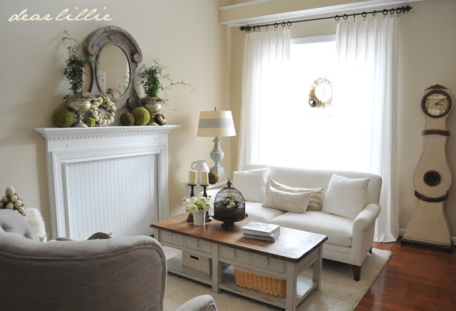
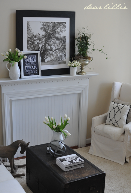
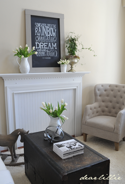
I chose to change up our living room. Here is what it looked like the day that I started playing around with things for this challenge:
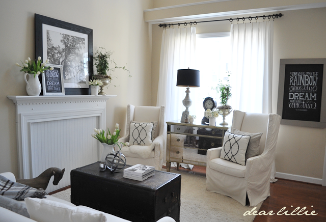
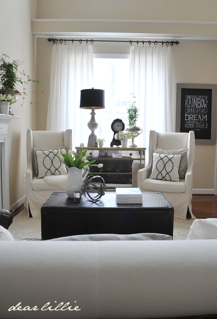
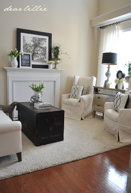
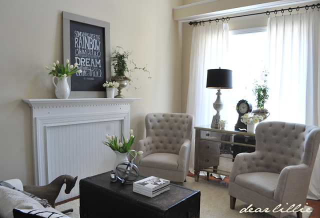
And here is my first new look:
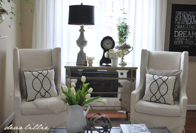
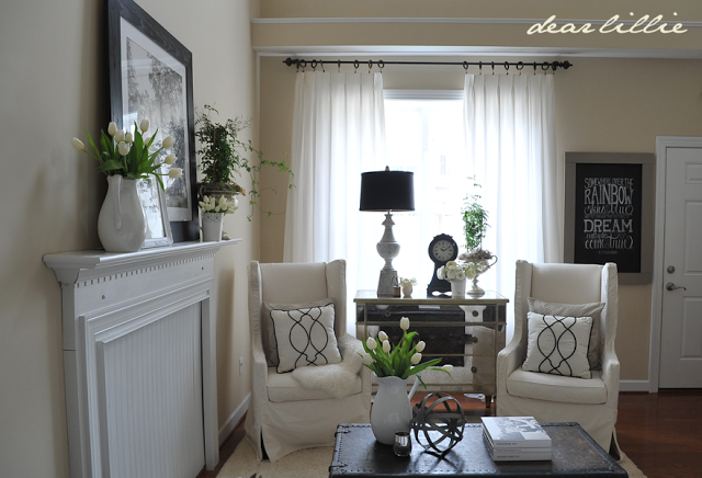
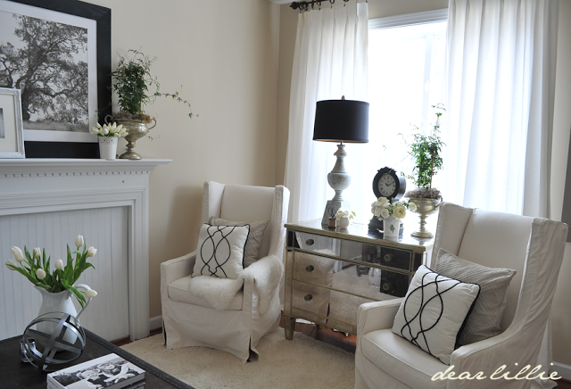
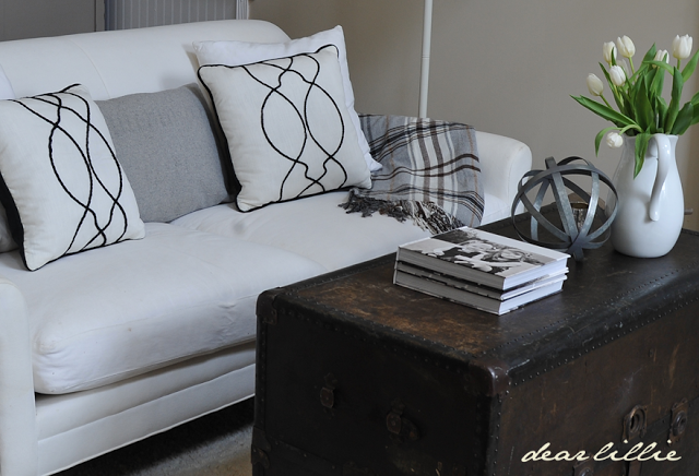
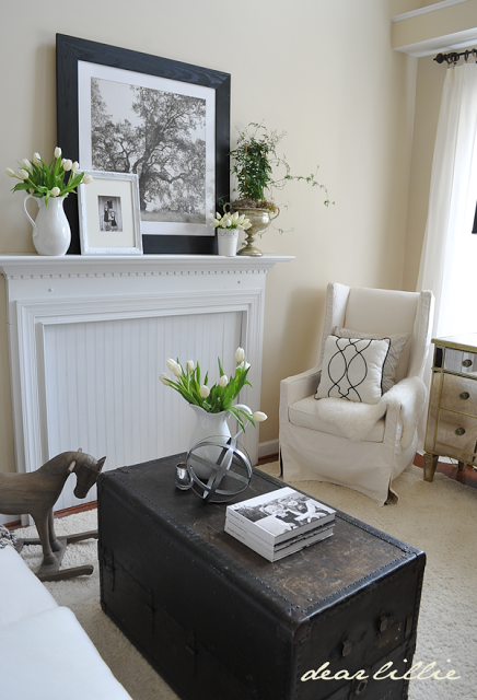
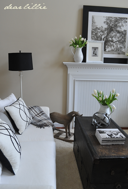
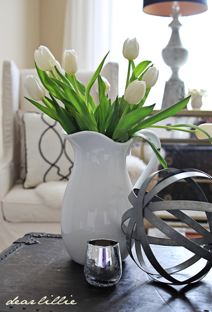
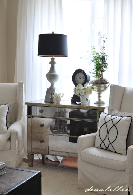
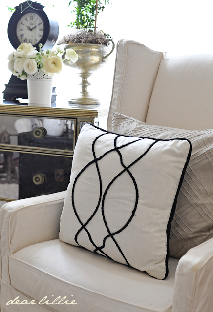
For this look I went a little more modern. I have to admit this was my favorite one but I didn’t keep it this way because it didn’t flow with the dining room space that’s connected. I took the chairs from the living room and flanked the mirrored chest with them. (The mirrored chest used to be in that spot but had been in the dining room since last fall so I moved it back in here). The trunk I bought at an antique mall right after I graduated from college. Eventually I passed it down to Dana, and then Jason and then it came back to us and it was fun to use it again. I think I have a spot for it in our new house. The black and white pillows are from Target and I bought them for something else but was able to use them for this project. I had planned on swapping out the draperies for the striped gray and white ones in our master bedroom but ran out of time that day (I did all of this right around the time we put our house on the market so I had to work quickly to get everything back in it’s place!)
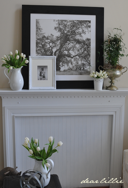
This large picture over the mantel came from our bedroom. I bought it from Pottery Barn back when I was in college with my “birthday money” one year. 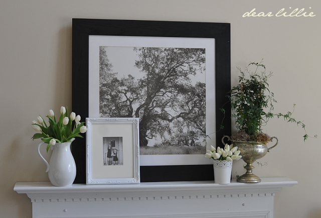

I moved the large chalkboard in from the dining room.
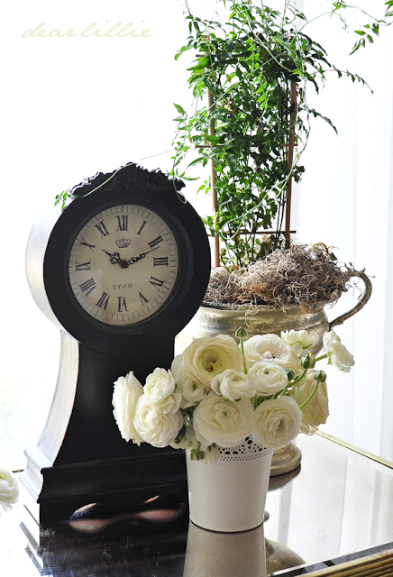
The black lampshade and the clock were in our bedroom too so I brought those in to add some black to the mirrored piece.
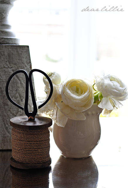
I love this little spool and scissors from Savvy!
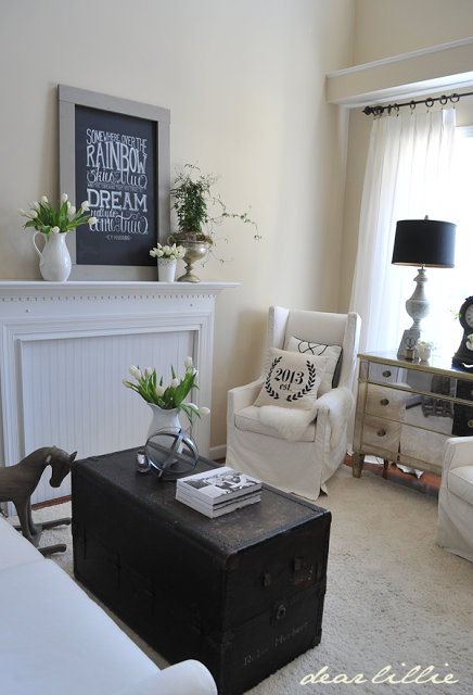
The above images are what I decided upon for option one, but here are a few other things I tried for this black and white look. I added a more graphic pillow and put the chalkboard up on the mantel.
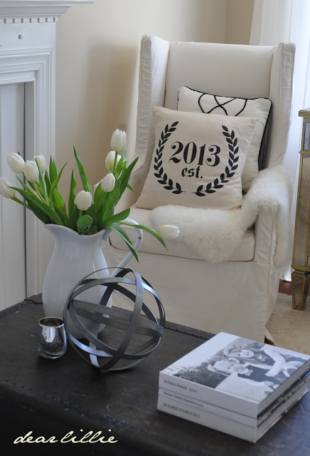
And I also tried switching out the chairs.
Now head on over and check out all of these other rooms for day one. I know I cannot wait to see them all!
I hope you all have a fabulous Tuesday! I’ll be back tomorrow morning with Look #2!





Your decorating style has always been one of my favorites. I love the changes and the first chairs though the second ones look more comfy. Can't wait to see more!
I love this concept for a series and have been having so much fun popping over to all the other blogs to see their first looks! You did a wonderful job… I love the texture and mix of neutrals with splashes of black for grounding! Just lovely!
It's fabulous! And how great that you can use things you bought when you were in college – we would have had fun shopping together instead of going to frat parties!!
So much fun being part of this challenge with you!
Kelly
Anything you do looks good.
I love how it looks! I love that black lamp shade against the window! Thanks so much for joining in!
Jennifer! I LOVE the new look….and I love the tufted chair….like I would marry it and elope to Vegas!
Hope your move is going well!
Happy moving day to you!
karianne
I love the look with the black, the slipcovered chairs, and the more graphic pillow! I loved the look that you had at the beginning, but wow, I love the change too. Love the trunk! This is fun looking at these ideas! I found you from The Lettered Cottage.
Going to go look at the others! Fun!
Blessings,
Heather
I have always luv touring your rooms Jennifer. But I must say, I luv the pops of black that you introduced in day 1 of the challenge. Looking forward to the next room 🙂
So very pretty- love all the neutral colors! And I like the second choice of the grey chairs best.
I've always admired the Pottery Barn "tree," and its place on the mantel looked grand. Best wishes to your family in your new home. I will enjoy seeing each room evolve in the coming months.
It is peaceful and beautiful! I hope your move is going well.
Anything that you create is so beautiful…as you have beautiful taste and creativity and great "bones" in the room!!!..
Love the mixed up look…Hope your move went well and the unpacking is almost over…a stressful time I know!…xv
http://vickiarcher.com
Beautiful room- design, arrangement, decorations, love it all!
I absolutely love your living room and how you are always changing things up! I never would have known you previously lived in a town home because everything is so spacious. I hope everything is going well in the process of moving 🙂
Jennifer,
So beautiful! What kind of flowers do you have in the vase next to the black clock? So gorgeous!! I must get some. :). Kim
Thanks, Kim! They are ranunculus. I got mine at Trader Joe's.
Wow, what a gorgeous room – it all looks so beautiful. I love the high contrast of the darks and lights. You have great style. Thanks for your lovely blog!
Jennifer I adore this room. The black/ dark tones really pop and give so much visual interest. Love it all! Bravo!
xoxo
Karena
Giveaway from The Enchanted Home
Loved this room the best, too.
Would you mind sharing where you got your slipcovered wing chairs from?
Can't wait to see more of your new house!
Thanks – Rachel 🙂
Thanks, Rachel! They are from Savvy in Williamsburg.