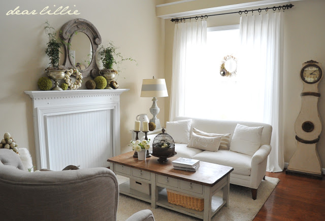
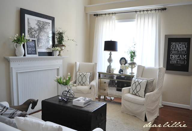
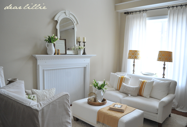
Well, today is Day Three, of the One Room, Three Ways Challenge. You can check out Tuesday’s post to see Day One and catch up on what this challenge was and the requirements.
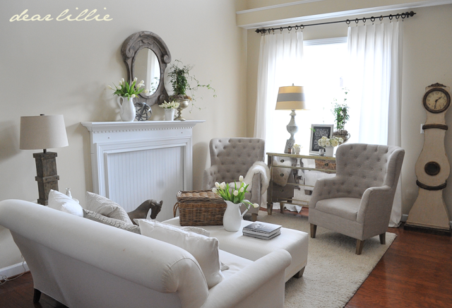
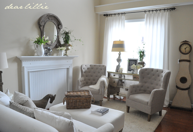
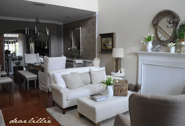
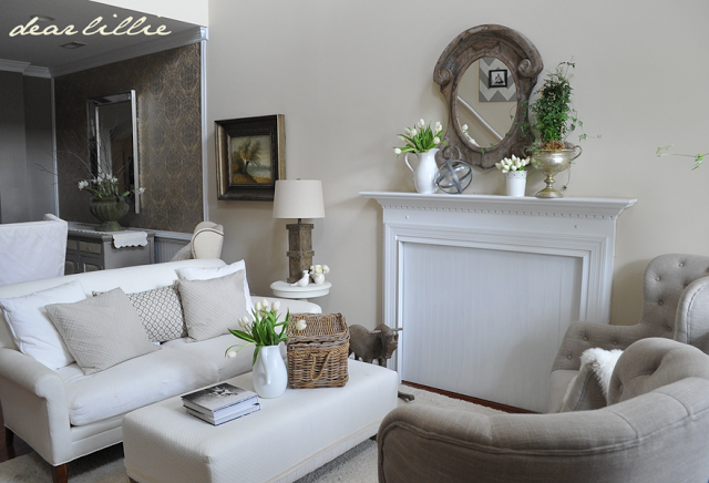
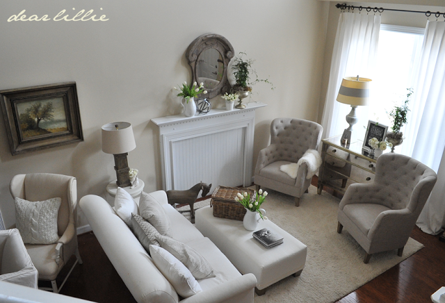
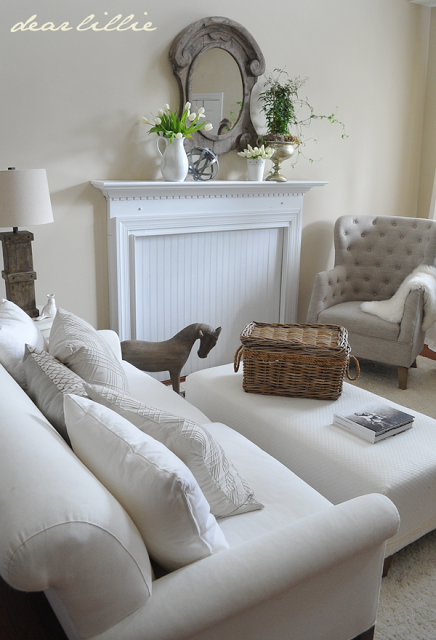
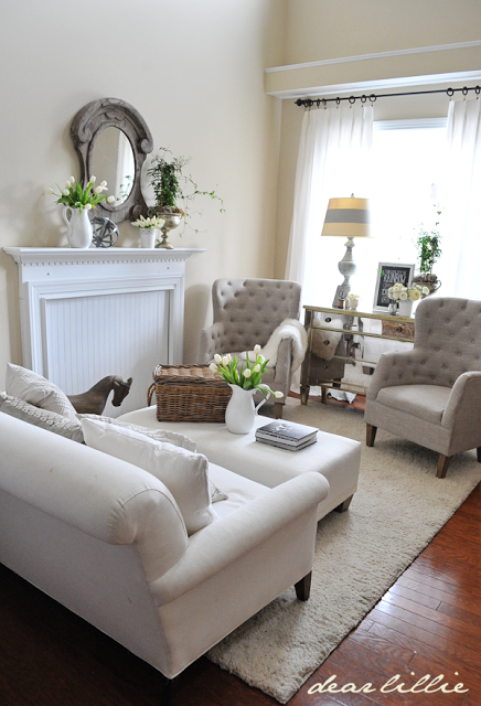
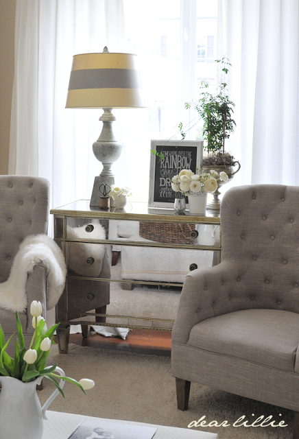
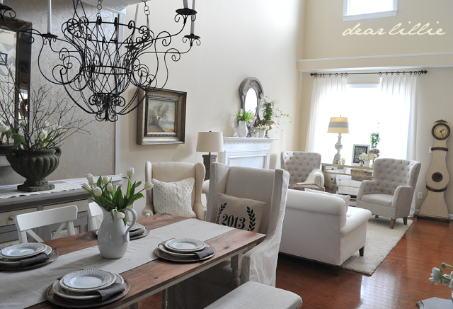
After I photographed this option, I ended up keeping the room this way so you if you have been on our site in the last month or two you have probably seen a few glimpses of this overall look. Originally I had planned on doing a pink themed room for my final option based on Lillie and Lola’s usual color suggestions =), and I even found a few things that I thought would help me do it in a grown up way. However, I used most of my budget on the second option and didn’t want to break the rules so ended up just using many of the same items I have had in here over the years but just rearranging them a bit. First, I switched the sofa back to help separate the living room from the dining room and then put the mirrored chest back in front of the window and then I used the two tufted chairs on either side of it. I put the mirror that we always have above the mantel back in it’s usual spot and then moved the ottoman back in here that had been in the family room for a couple of months.
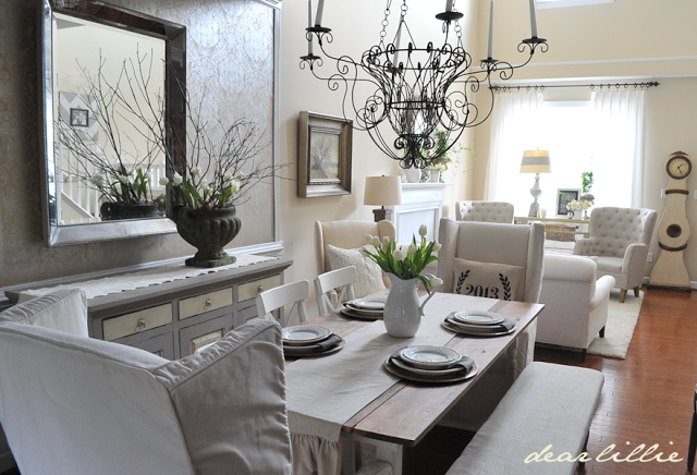
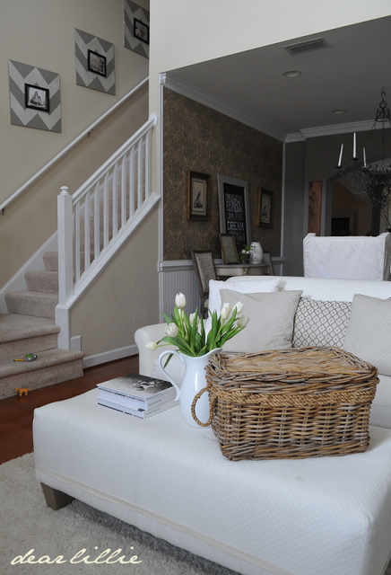
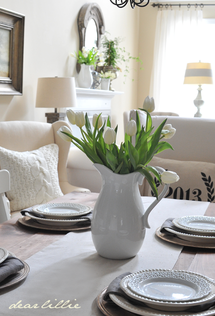
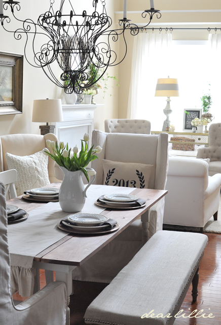
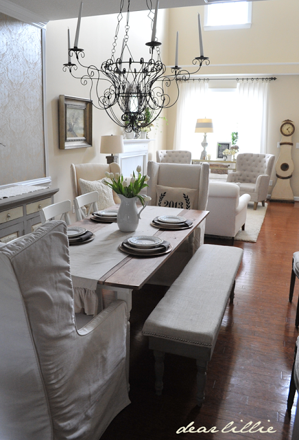
Because the living room didn’t change all that drastically I thought it would be fun to add these wingback chairs to the dining room table to help change that room up a bit too. I LOVE having wingback chairs used at the end of the table and even though day to day it would not have been practical in this space I am hoping I will be able to do something like this in our new home where we will have a formal dining room. (There are a few more photos of the dining room at the end of this post).





Adore your home and style. If I got to pick, day one is favorite. Love the touches of black as grounding for the room.
Your (former) space is so pretty, bright and cheerful! I love the chairs in front of the window with the mirrored chest, and the view from the dining room!
Jennifer you have so many superb pieces to begin with and I love the way the simply neutrality of this room shines! Gorgeous!
xoxo
Karena
Giveaway from The Enchanted Home
Jennifer, all three were beautiful. I love how you have some great chairs to switch out for a whole new look.
Where did you get the dining chandelier. It's gorgeous. And btw 😉 LOVE all 3 "rooms".
Thank you, Nancy! It was from a store called Savvy in Williamsuburg, VA. I purchased it about six years ago.
Hello Jennifer. I am torn. Day 1 and 3 are my faves. If I had to pick a look, I'd be hard pressed to do so. Another beautiful room! The best part… no monies spent! Luv that.
Thanks for allowing us in 3 days in a row. It has been a treat.
Hugs, Gee
I adore those chairs! I love this look too!
Jennifer, love this little project you guys did. I love day one and three the best! Especially, day three, Ps if this were a contest , you would win hands down😀
I don't know which one I like more – all of your styles are beautiful – and flows perfectly into your gorgeous dining room!
Kelly
Wow is just the simple word that may explain that how much I liked it. It was nicely stuffed with the material I was looking for. It’s great to be here though by chance Furniture stores mumbai
You have great taste Jennifer. I loved all three ways.
Stunning! I don't know which one is my favorite but I am so impressed with your talent! Love this series of 3 rooms!
-Shelley
I am thinking of you and hoping your move is going well:)
I love the lampshade with the gray stripe. Is that a DIY project? If not, where would one purchase? Thanks!
Thanks! Yes, it was a DIY project with just some basic painter's tape.
Where did you purchase the lampshade with te gray stripe? Or was it a DIY tutorial? Love it!
Thanks! Yes, it was a DIY project with just some basic painter's tape.
Jennifer, your design as always is so beautiful. I liked all three also. I hope all is going well with the move. Have you thought about doing something with the white boards on the fireplace? I was surprised when I did not see the fireplace there. It may be that you or someone else made a faux one. Just an idea….and nothing compared to your talented ones.
Thanks, Lin. It was just a huge bare wall when we moved in so we added a mantel that we found at a consignment shop to add some interest and a focal point for that wall. The home we just moved into has two real fireplaces though which I am really excited about!
What a fun series! I've enjoyed visiting all of the blogs! I definitely think this one is my favorite of your three – and I'd say it's the most "you" – don't you think?! I thought your first one was fun and really different – loved the pops of black! And I loved your accessories in day 2, but I have to agree with you – the mustard color isn't a fav of mine, especially with the rest of your house. I love the lattice print they carry & used it on some pillows but the color drives me nuts. I would love that same print in navy!
This is so inspiring! Love, Love, Love it!!!
Absolutely gorgeous! Would you be willing to tell where you found your wingbacks? They are perfect! Well done!
Thank you! They are from Savvy in Williamsburg.
Ohhhh I just love your style! May I ask if you would provide a resource for purchasing slipcovers for the wing chairs? Unlike yours, mine are old and ugly, a simple coverup would work wonders… Were they terribly expensive?
Thank you! 🙂
Dena
I am so sorry, Dena. My chairs were purchased with the slipcovers on and I don't have any slipcovers that I have bought individually so I don't have any recommendations for buying slipcovers for chairs you already own. Have you tried looking on Etsy?
Have a blessed week!
Warmly,
Jenni