As soon as I finished painting this hallway a year a half ago (which was pretty much one of my least favorite painting jobs in this whole house because it involved all those annoying spindles and me balancing on a ladder on top of scaffolding!) I knew I wanted to do a gallery wall going up the stairs. However, gallery walls on stairways always seemed a little daunting to me plus I couldn’t decide on what look I wanted to go with – a mix of different style frames, all black frames, all white frames, a mix of sizes or all the same size…you get the idea, so I kept putting it off.
I finally decided I just needed to pull the trigger though and do SOMETHING because even though we have photos sprinkled throughout the house I missed having some of my favorite memories out where we could see them every day. My parent’s had a gallery wall going up their staircase filled with all sorts of family photos in their last house and my grandmother had photos all over the walls in one of her rooms and I always loved being able to look at all the photographs and see so many different memories every time I climbed the stairs.
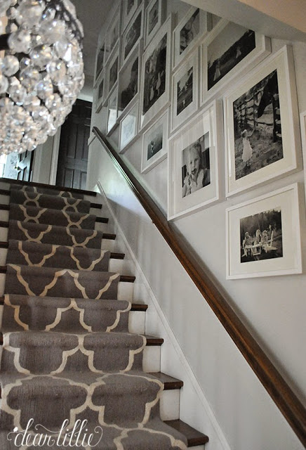
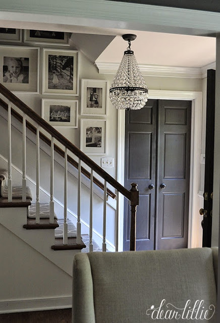
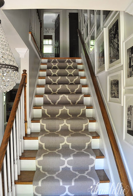
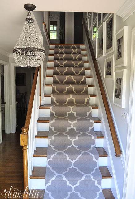
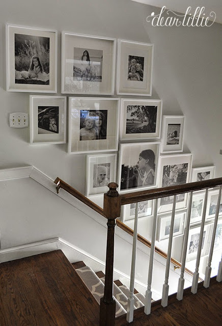
Because we went with a mix of frames in the den/study for the gallery wall we did in there, I ended up deciding to keep this more simple. Plus you can see this wall from the front door, the dining room, the upstairs and downstairs hallway, the upstairs bathroom and two bedrooms so it seemed to make the most sense to keep the frames as simple as possible so it flowed nicely with all of the rooms you could see it from. To keep the cost down I went with the Ribba frames from IKEA. All in all I was pretty happy with them. My only real complaint would be that the large 20″ by 20″ frames are more like shadow boxes and stick out further than the rest of them and that kind of drives me a little crazy but that’s probably just because I have a little OCD.
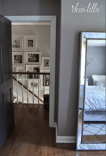
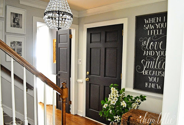
This angle looks the worst in photos – it actually doesn’t look as crooked in real life – ha! I mean it’s definitely NOT perfect, but it looks really crooked in these pictures because of the lens I had to use for this angle. It warps angles a bit which is especially frustrating when trying to photograph something like this – ha!
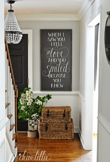
And as you can see in that last picture we have a new sign! It will be available in our shop later this month!
SOURCE LIST:
Wall Color – Moonshine in Matte Finish (BM)
Trim Color – Simply White in Semi-gloss Finish (BM)
Door Color – Mopboard Black in Semi-gloss Finish (BM)
Light Fixture – Small Sized Mia Pendant from Pottery Barn
Beadboard Wallpaper – Allen and Roth from Lowe’s
Sign – Dear Lillie
Baskets – HomeGoods
Vase filled with Branches from the Yard – HomeGoods
Runner – RugsUSA (can’t remember what pattern it was, but when I get a chance will try to look it up and add it in later)
Little Mirror – Antique Farmhouse
Frames – Ribba from Ikea in an array of sizes
I hope you all have a fabulous rest of the week!


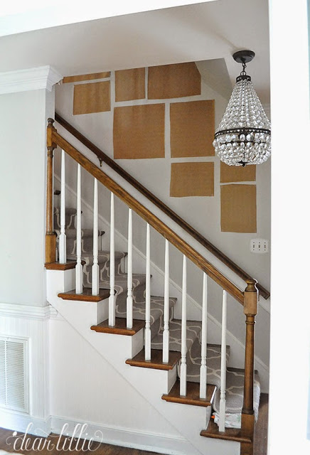
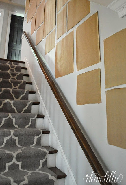
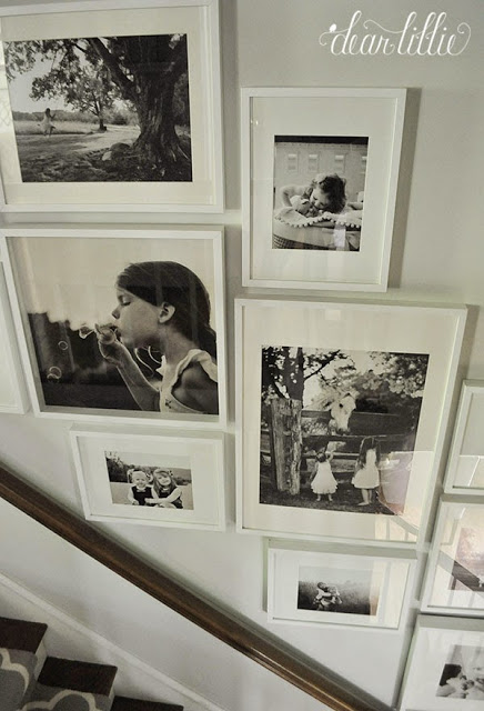
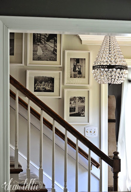
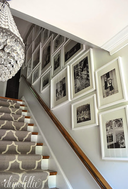
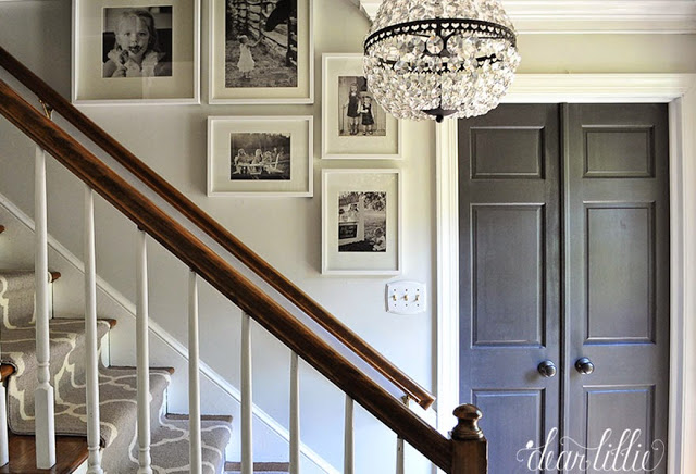


Hi Jenny ~ I LOVE your gallery wall! I have put ours off for the very same reasons you mentioned. I am making summer my goal for ours. 🙂 I love how you chose the white frames with b&w photos. I'm not sure if we'll use black or white frames because I have so much white in our home already. But what I love about your white frames is that they blend so well… and the focus is really on the pictures. Was it hard to narrow down which pictures to use? It looks like you used pictures of your sweet girls and maybe some of their cousins? Did you debate family photos too, or did you know you wanted just the kids on this wall? This is part of what is overwhelming to me… how to narrow down which photos to use for the stairway! Great job on your gallery wall and thanks for showing how you taped up the paper – great visual and reminder to do that! 🙂
Thanks so much! And I would agree–deciding which pictures to use was definitely the hardest part! We started with over 100 pictures that we wanted to use and eventually narrowed it down to 19.
I love this gallery wall. I think you made the absolute right decision to go with white frames and keep it simple. I did the same in our master bedroom and love it. Your new sign looks great!
I love me some gallery walls! Haha! And I really love that new print… So reminds me of my first glimpse of my husband:) ~Kim
Wow amazing job…looks really nice with the white frames..,it does focus more on the pics.. I bet it was time consuming…
Did you have a pro install your runner.. Looks beautiful.. I love the Dash and Albert runners also..
Thanks, Maggie! We installed it!
I don't see a single imperfection, it turned out wonderful! I've been putting off doing the same thing because of the same issues you had, I just can't make up my mind, but I do have to say I love the coordinating frames with the black and white picture.
I have held my opinion close on gallery walls going up the stairs. This has changed my mind ! Thank you – and the new sign is spot on to enhance these beautiful photos. Thank you ! (as always)
Wow Jennifer! This is one of the best stair Wall Galleries I have seen and believe you me I have seen a lot. I've researched them for the past couple of years as I have developed an iPad app to help the world hang Wall Galleries without using a tape measure or doing any math. We'll launch in June and we are so excited to start helping people. You can see a sneak peak on our website. walleries.com
Cheers!
Brian Oliver
The stair runner looks great too, how did you get it to stay put?
Wow, really love this! I also love love love your stair runner – where did you get it??
Thanks! It is from RugsUSA!
Love the gallery wall…I've been putting mine off too, for many of the same reasons! I now have renewed inspiration!
I LOVE your gallery wall! This looks amazing. As I was looking at that, I also noticed your light switch plates (things you notice one you need to replace them) – can you please tell me where they are from? Thanks!
Thank you! I think we got them all at Lowe's!
Can you post how many of each frame did you get? I know it depends on the size of space and the arranging but about how far apart are they?
Hi could you please share what frame sizes you used? Thank you!
Hi! We used a wide array of frames. The large squares are 20×20 as stated in the post, and then some 16×20's and 12×16's.
what size photos did you use for the 20x20s an where d id you buy the photos? hving trouble finding a place to print them
Hi! We used Mpix.com!
Thank you so much for your response! Did you have any trouble fitting prints in those size frames. For example, the 16×20 frame fits a picture about 11.5×15 with the mat correct? Also, did you use an 8×10 print in the 12×16 frame with the mat?
Im curious about what Kelly asked as well. I have our stairs all taped up with the sizing of Ribba frames that we will need, and Im currently looking on Mpix. They do 12×12 photos and 8×10 photos so those will fit in the 12×16 frames and the 20 x 20 frames. What sizes did you print to fit the 16×20 frames? I don't see an option for a 12 x 16 photo (which is what that size frame holds). Thanks for your help!
Hi, Charity! We just went to the next closest size up and then trimmed down.
Love the gallery wall, and paint colors. I know moonshine is in the white family, but looks like a soft grey in photos.
How did you hang the ribba frames? Did you use the wire that was included with them from IKEA or did you use hardware from the hardware store?
Hi, Nicole! Jenni just used the hangers that were included with the frames!
-Jason
How many of each size frames did you use? I tried to figure it out from your pictures but I couldn't quite tell. Did you just use 3 different size frames?
can you please find out the name of this runner!! is it still available at rugs usa?
Hi! Unfortunately I don't believe they still carry it–sorry!
-Jason
i love this!!! do you think it would work exactly as you did it but with color pictures instead of black and white??
I am a little late to the post, but found it on pinterest. I ant to do this use contemporary as well as vintage photos but I want them to all be similar tones of black and white. Some of my older photos are glossy. Do you think it would be best to have them professionally re-photographed (or I guess I could do it and use the same filter through out) but done know if it is necessary. Would love your thoughts. Plus the slightly more in depth frame would for sure drive me crazy too.
hello lilltle late but how many frames did u used for eachone thankl you I have the same stairway thank you