This is what our third bedroom has looked like since shortly after moving into our home. We have used it as a guest bedroom but now it is time to turn it into a nursery – yay! I am so excited to start working on a nursery again but am a little sad to see our guest bedroom go. While my parents were here a couple of weeks ago, we moved the twin beds into Lillie’s room. We have been busy working on her room since then and it is now finished except for one small corner – I plan on taking pictures of it tomorrow and posting them later this week. So, anyway, now that the twin beds are gone, this room has a full size bed in it (the one that was in Lillie’s room – we need to keep it so we can still have room for people to sleep when family comes), a chair and the mirror and dresser. We need to squish a crib in there too somehow – ahhh! I am torn on what direction to go in as far as color goes. I will show you the two things I am torn between at the end of this post. My sister, Jamie is here for the next few days, though so I want to get to work on it now and hopefully have it finished by the end of this month. That’s the goal, anyway!
So here is what it looked like until two weeks ago:
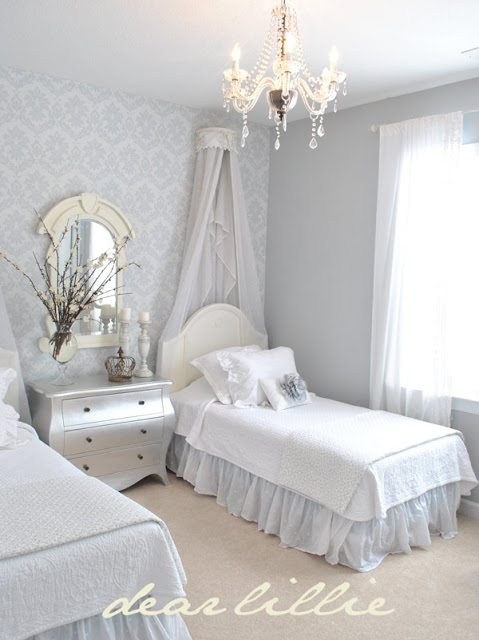
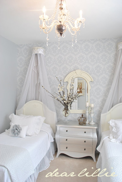
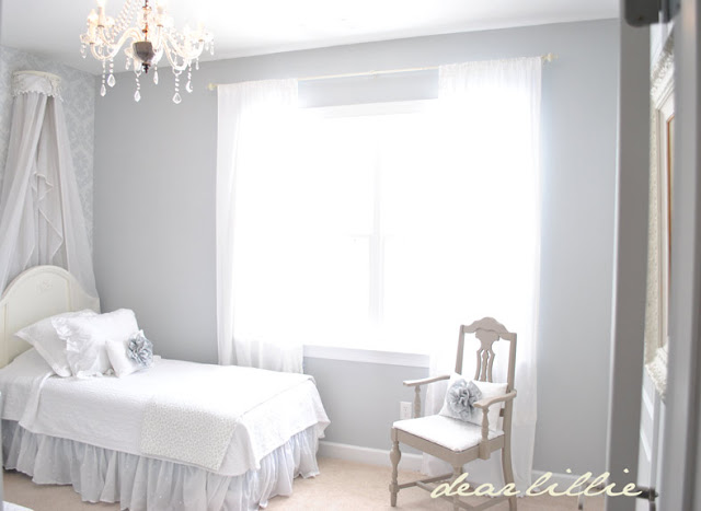
I was torn between quite a few different color-ways to start with. I have it narrowed down to two now though. We won’t be getting any new furniture. We will be using everything we already had from either Lillie’s nursery or things already in the guest bedroom. I do want to make all new bedding though and have some fun ideas for some decorative items. Believe it or not, I don’t want to have ANY pink in this room. We did Lillie’s nursery in all pinks, whites and creams and I want this one to look completely different. The main thing I have to decide though in the next day or so is which color scheme I do want to use – a very natural, earthy look with Alexandria Biege Walls (kind of a soft mocha brown) and then all of the bedding and accessories to be whites, creams and tans. I would use a lot of different textures to add some contrast. The second option is to leave the colors as is (I love that wallpaper and hate to get rid of it) and do the room in the same color scheme it already is – blues, grays, whites and creams but just add some more baby touches. I would still have to make a decent amount of bedding for both the crib and the full sized bed and need to put a lot of things on the walls. I am leaning toward option one, but not quite sure. What do you think?
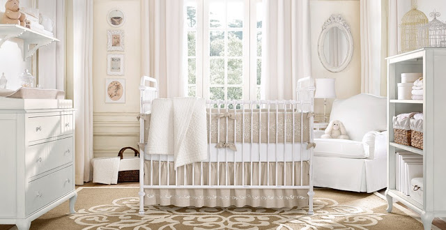
Inspiration for Option 1:
I LOVE the feeling of this nursery and it has the overall idea I want. I would just have the walls be a little darker using the Alexandria Beige color (it’s the on the same color swatch as the Davenport Tan my sister and her husband used in their
dining room, where we had Lillie’s birthday party, but is one shade lighter). We used Alexandria Beige in our last home and it has always been one of my favorite colors!
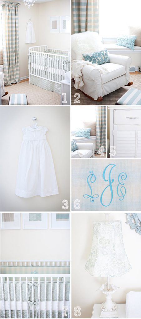
Inspiration for Option 2
I actually had decided on going with Option 1, because I didn’t want to do a girl’s nursery in all blue. Then I saw this link on
The Shabby Nest and saw this gorgeous nursery for
Baby Lunden and started having second thoughts. How beautiful is this? Even though our blue is more of a gray blue I could keep the wallpaper and wall color but could add a beautiful white baby dress and some frilly pillows.
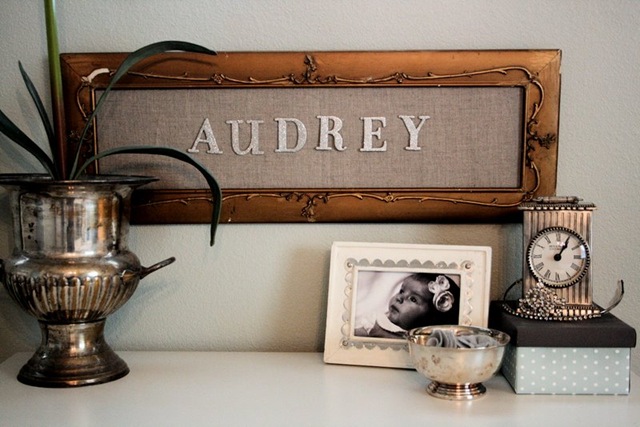
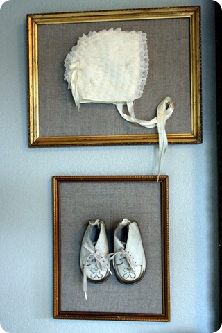
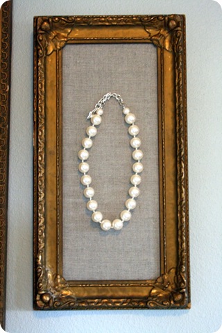
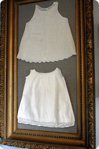
And regardless of whether I go with the first or second option I love these framed ideas from Audrey Ryan’s nursery over at Jones Design Company and would love to do something similar! I haven’t decided the layout yet of the room so I don’t know if I am going to have the wall space or not but I LOVE the vintage feel of this:
Any thoughts? I would love to know which you think would rather see – Option 1 or Option 2?
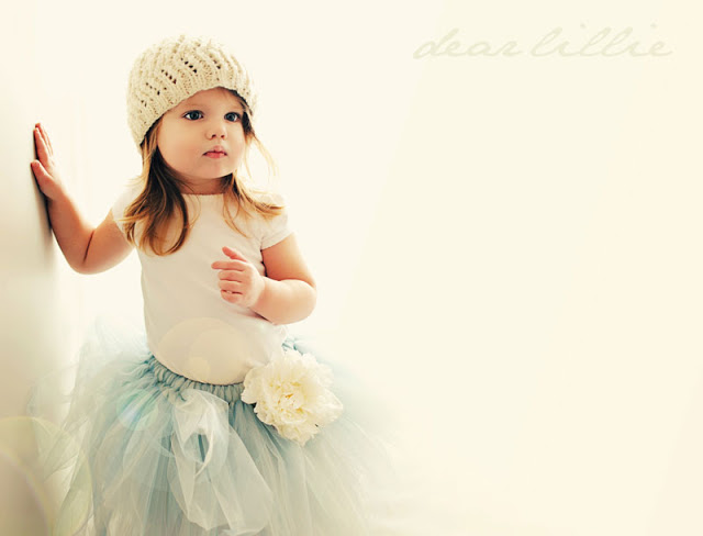
Also, we have had our shop closed for the past ten days or so but are back open. I still don’t have any of the new spring screenprinted items ready yet but am working on them and hope to have them ready to go by the first or second week of March. Also, I am planning on offering one script pillow each month as well and am working on those. I am going to do a similar one to the Je T’aime ones next and then plan on doing something completely different for March. Although I am behind on those things we do have two new tutus available in our shop! The Arabelle Faerie Tutu which we previewed here on the blog a couple of weeks ago and another new one called the Calla Tutu, which would be great for a spring or summer wedding! I hope to take photos of Lillie in that one today or tomorrow.
Lillie in the Arabelle Faerie Tutu
I hope you all have a wonderful week! I will be back later this week with pictures of Lillie’s room and we also have a giveaway coming up soon too!

PS – Oh my goodness! I almost forgot – Happy Valentine’s Day!!!!!






I've always loved the photo in Option 1 and can really see this one in your home. Can't wait to see Lillie's room and the progress of the new nursery!
Judy
They are both gorgeous options! There's something that's so happy about the second option but either one that you choose will be beautiful. Good luck!
While I love option one, I love the wallpaper you already have more! Keep it and go with option two! Happy Valentines Day! ♡
I love option two. I think it would make less work for you ( wallpaper removal ) and I LOVE the blues and whites. They both would be beautiful of course! 🙂
Option 2 🙂
I like option 1 — I can't wait to see you transform the room into her nursery!!
i love option number one!!!! so pretty!
Jennifer, either way you go will be beautiful. My master bedroom has davenport tan on the walls and the alexandria beige on the tray ceiling. One day I want to lighten up my room. I love the color you have in that room now and think it would be very girly by the time you get through with it.
Oh, boy…very tough! At first when I scrolled through, as soon as I saw option #1…I thought oooh, it's perfect. But then I scrolled down to the pretty blue and while I didn't think blue could really work (in my mind), I am blown away by the softness of the look, couple that with the fact that you could keep that lovely wall-paper and I'd say Option #2 is my choice.
I love those framed baby things…so novel! Can't wait to see which way you go! Good luck!
xoxo Beth
I just saw the nursery for baby Lundon the other day and fell in love with it. I think that you should go with number two, just to save you time and money on having to redo everything. The room's basics are already breathtaking! But I do love number one as well, so whichever you choose will be perfect. 🙂 Happy Valentines Day!
i love option one. i have the same photo as my inspiration, although i have ended up with a more grey/white/cream palette. 🙂
I love both options, but I really love option #2…but then again I love blue 🙂 I also like the option of no paint and more time to focus on the bedding and decor!
I love both but I guess it all depends on how much work you want to do, myself I think I'd go with option 2 and keep the gorgeous wallpaper! Either way though it will be pretty for baby # 2! BTW your daughter is so very beautiful!
I love option 1 and the vintage framed photos are gorgeous!! Cannot wait…. I have to admit, I did a quick scroll of the photos before reading, and for about 30 seconds, I thought baby #2 s name was going to be Audrey. LOL. It helps to read 1st right? Gorgeous inspiration Jenni. So excited to see what you come up with! xoxo
I have to say I love option 2! Its so fresh and clean but 1 is completely different from what you have going on in the room now. So maybe option 1, can't decide sorry I love them both. Blame it on baby brain! Happy Valentines Day! lulu
OPTION #2!!! As I started reading, I told my husband to come look that I loved this room. I told him it would make a cute little girl's room . . . even could transition into a teenager's room.
I'm sure that whichever one you choose, you will make it look divine!!! However, I am leaning towards Option One!
They are both so lovely, but I have to go with option one.
I also love the idea of re-claiming the color blue for a girls room, too!
Can't wait to see the end result!
Hugs,
Anne
I love love love option 1!! I want that rug for my nursery. What site are these pictures from?
Gorgeous guest bedroom. 🙂
LOVE option #2!! My little girl's room is actually painted a tiffany blue.
i'm no help bc i love them both!! i'm so excited to see the room come together! when we move into a house in june i really want to hire you! ha love how you decorate. happy valentines day!
Happy Valentines Jennifer~ I love option #1!:) and the inspiration photos are gorgeous~Cant wait to see what you do with the room! Hugs,Rachel
French Farmhouse 425
Your child will be one of the most luckiest in the world (other than Lillie) with either room. But I am leaning more towards option #2… Can't wait to see what you choose.
Happy Valentines Day!
Both are gorgeous but I'm swooning over #1.
I think if you did that with some of the pops of color in #2 it would be perfection. But who am I to say, whatever you do will be amazing and gorgeous!!!!
I can't wait!
XO and Happy Valentines!
Kristin
i've had the first photo from Option 1 saved in my "inspiration" file for quite some time. buuuuut, i love the color scheme in that room now, and happen to love using blues for a girl. have you seen Holly's little girls room over at Life In The Fun Lane? all blues. gorgeous. especially since your hues would be more grey blue which adds to the "nursery" feel in my opinion. so, they're both amazing, but the second one seems like less work (no painting, ripping down beautiful wallpaper, etc.) and it's awesome because it's unique.
either way, i cannot wait to see it!
xo-
amanda
Definately Option #2! That wallpaper is gorgeous. The colors are calming and dreamy. Perfect for a nursery.
I like option two! you can totally use blue and still make it a girl's room 🙂
Happy Valentine's Day!
Just Better Together
Either way will be beautiful and I love the wallpaper that's in there now, but…….
I just adore the taupe and white rooms so I vote for option one!
#2
Both are cute. But color is more fun. Babies like color. if you added a little tiny bit of pale creamy yellow that would be very cute.
Love both… the gold frames make me swoon…. but all I can say is that your guest room is dreamy… Your decorating skills makes me green with envy!!
That guest room is too pretty to paint over and that gorgeous wall paper!!! I vote for Option 2
Happy Valentine's Day!! I hope you had a fabulous one!
Good bye my inspiration room! I just love that guest room, but can't wait to see what you do. I love Option 1, but just love the pops of blue in #2. So… I am really no help. I know it will be gorgeous!
Both are just beautiful but I am partial to option two- blue is so unexpected and beautiful for a baby girl nursery. Have fun decorating!
First off, my pick was #1, but after I read what you thought of #2, about keeping the wall paper. I really like that idea and think it would be beautiful! I am sure either way, you will make it a beautiful baby girl's room!
Have a great week!
Jodi
I just love that wallpaper in your room now and think option two would go better with it. Have you thought about a silver, white and grey room? As long as the grey is a pearl grey I think it could be a really interesting nursery. Good luck and can't wait to see what you decide.
Looks like you've already had lots of input, but I'll weigh in anyway! I love the blue because it's unexpected for a girl's room. And I LOVE it when the crib is in the middle of the room (if you have enough space). Whatever you do, it will be fabulous–as usual!
Warmly, Michelle
Oh my goodness, it's going to be wonderful whatever you choose! That wallpaper is so beautiful though, I sure hope you can incorporate it! I love the idea of neutrals. I adore all your options and the vintage feel is so cute!
Happy Valentine's Day!
xo
Option 2 for me cause I love blue. The accessories will definitely define it as a girls room.
I love the idea for option 2. The wallpaper is beautiful and versatile. Have you thought about pairing the silver with periwinkle, which has blue undertones? I so enjoy your blog! You have great style. 🙂
love, love option #2!!!
Argh! I had decided to do our nursery in all bright colours……and now I want the blues and grays! I didnt think I could do it as neutral-since we dont know what the sex is, but those pics really pull it off either way….. Sigh…back to the drawing baord
Both are beautiful! I would go with option two because it would be a shame to get rid of the lovely walpaper that you already have in there. I think you could make it into a lovely babyroom by adding a few creative accents, like frilly pillows.
LOVE the blue! That is what we did for Cooper's nursery, latte walls, blue chandelier, blue floral bedding and drapes! Can't wait to see what you decide!!! Brandi
No preference.
I love them both! What a hard call. Although I'm really in love with the linen bedding in the second tan and white photo. I'm afraid I'm no help, but I can't wait to see what you do!
Oh! And THANKS for the shout out!
I love both these nurseries, maybe option 1 a bit more though. What site are these pics from? I would love to see more of Option #1.
Thanks for all of your opinions, everyone! We ended up going with option 1!
I don't know the orginal source for the first photo in Option 1 which is why I didn't link it. If anyone knows let me know and I will add it! The second photo is from Restoration Hardware Baby and Child, which I meant to link (like I did with Option 2 and the framed vintage baby items) but totally forgot – whoops! Sorry!
I hope you go with option two, I love the wall paper and colours in that room, and can totally see some beautiful baby touches. I think it would be gorgeous, and with your talent it can't fail!!
Ooops, never mind, I now see you already picked. It will be beautiful either way, can't wait to see the finished product.
I just stumbled upon your blog today. I LOVE it. It is now up there with my favorites. Your house is beautiful – almost as beautiful as that precious little girl. I love both options and have no doubt it would be amazing either way you go. Will be following along. Take care and be blessed 🙂
could you please tell me the color of paint you use in every room? im the worst at paint colors,and i love yours!!
Kitchen and Dining Room (back wall) – Ashley Gray
Master Bedroom – Kendall Charcoal
Master Bathroom – Stormy Monday
Guest Bedroom – Pebble Beach
Guest Bathroom – Pebble Beach
Nursery – Alexandria Beige
Lillie's Room – London Fog
I saw that you used Lunden's nursery as some of your nursery inspiration! How cool! Lunden is my baby and just an angel! I am sure that your angel with just love the room you created for her!
Absolutely love your blog. Lovely photos and decorating ideas!
I love the second photo in option 1! I have been obsessing over the carpet in that photo but can't seem to find anything even close to it online. Any idea where this carpet can be purchased?!?!?