Well, a lot of people are probably going to cringe but we went ahead and decided to paint the study. I’ve spent two years going back and forth and I kept changing my mind. For a while I was convinced I liked it better how it was but then once we finished painting the rest of the house I started pondering painting it more and more. Even though I liked how the wood looked, I felt like the room stuck out a bit from the rest of the house and didn’t feel as cohesive and still felt somewhat dated. It was definitely the design decision I have been most torn on in the house so far and once I did decide to go ahead having the woodwork painted I kept chickening out. We ended up hiring someone to do the woodwork (for several different reasons one of which was that after painting woodwork for two straight years I was getting quite sick of it – ha, but a few other reasons as well) and then I just went ahead and painted the walls and doors.
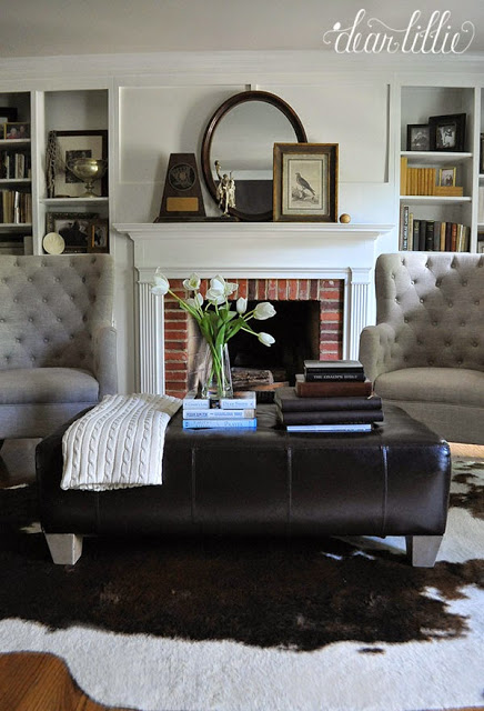
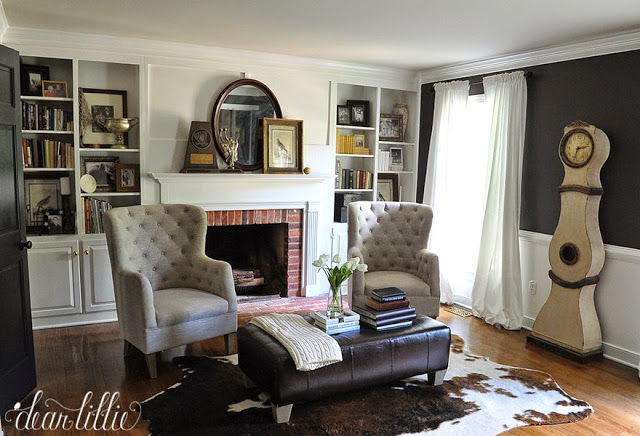
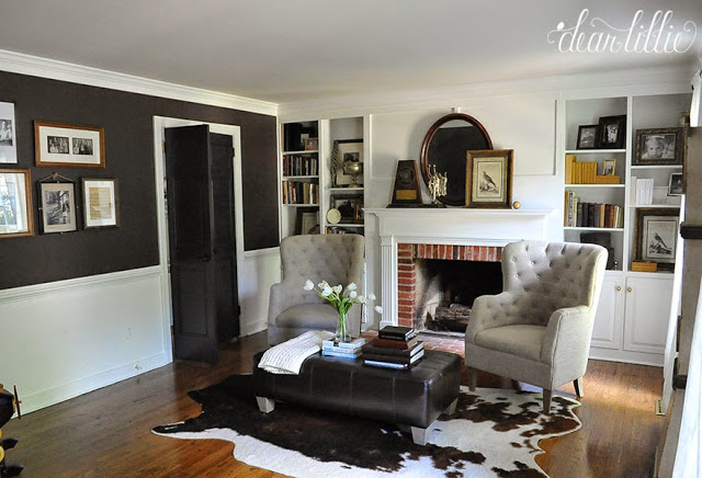
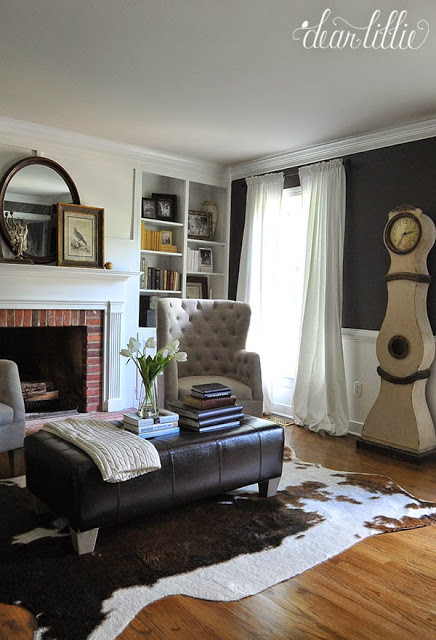
I have to say even though I was quite nervous about starting it I am so glad we did it now! I love how it still feels somewhat masculine and cozy but also updated and fresh too and more cohesive with the rest of the house. We kept the trim work and doors the same colors we have used in the rest of the house and then chose a really dark chocolate color called Midsummer Night.
Right after we began making this room over we started working with
Arhaus, one of my favorite furniture shops, and are teaming up with them to add a
fabulous new sofa into this room. It is due to arrive in about a week or so and I cannot wait! It’s HUGE so once it arrives we are going to be rearranging this room quite a bit so this room definitely isn’t done, but I am excited about the direction it’s going in and cannot wait to get it finished off. When the
new sofa arrives we will be moving it onto the wall with the windows and moving the chairs to the other side of it. I think it will open up nicely so you can see right in and see the fireplace. I can’t wait to share photos of it later this month!
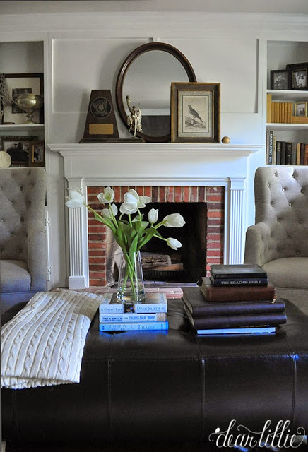
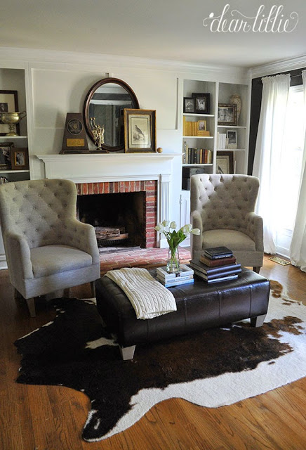
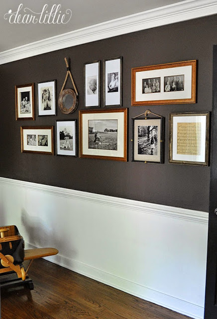
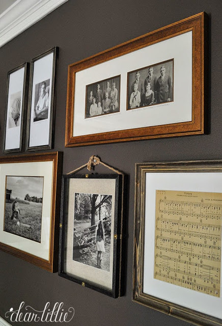
Until it arrives here is what the room looks like now. We took the slipcover off the ottoman and stole it from the playroom for now and added a faux cowhide rug from Joss and Main. We also added some frames for a gallery wall which has a bunch of old family photos as well as some of the girls and a vase full of faux tulips from HomeGoods for a little bit of elegance. Other than that thought pretty much everything else was already in here.
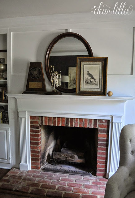
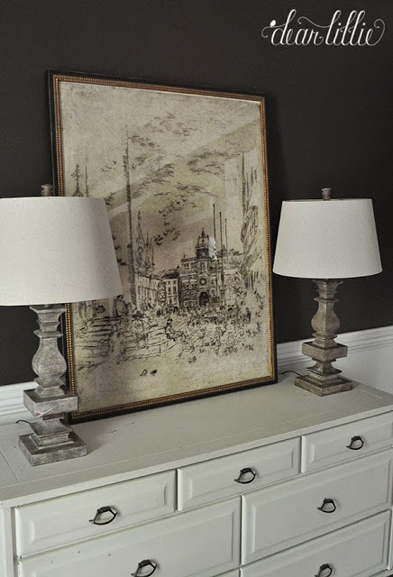
I’ve played around with this Grand Plaza Print in here. I love how it looks against the dark walls! I also love how it looks in our master bedroom though so I haven’t decided for sure which spot it’s going to end up. Once we finished getting this room put together it will be easier to decide.
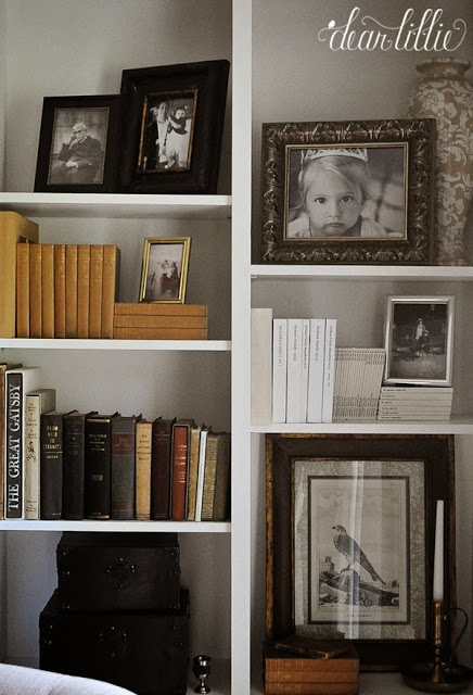
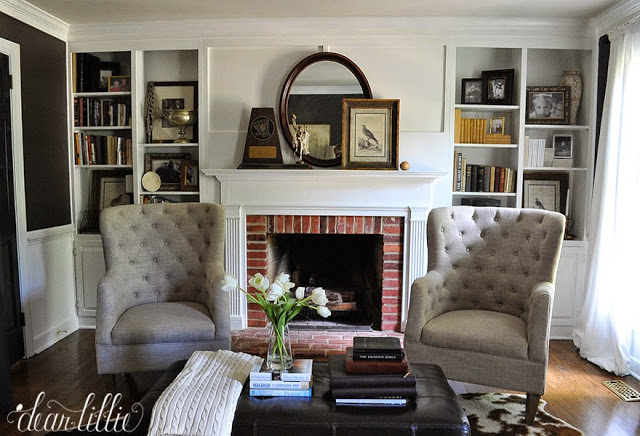
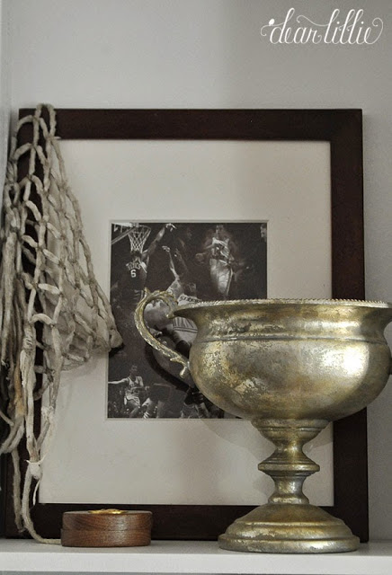
Although these aren’t the prettiest looking shelves I love that every single item on here has personal meaning to us.
Source List:
Wall Color – Midsummer Night in Matte by Benjamin Moore
Trim Color – Simply White in Semi-Gloss by Benjamin Moore
Door Color – Mopboard Black in Semi-Gloss by Benjamin Moore
Tufted Chairs – TJMaxx
Ottoman – Target about 8 1/2 years ago (only in here temporarily)
Clock – Savvy Home and Garden in WilliamsburgMirror above Fireplace – family antique
Rug – Joss and Main
Drapery Panels – Ritva Panels from IKEA
Print on the mantel – Gift – purchased at Savvy years about 7 years ago
Plaid Pillows – Target
Blanket – Ralph Lauren about 7 years ago
Frames on Gallery Wall – Michael’s
Vase of Tulips – HomeGoodsIn Everything Give Thanks Chalkboard Print – Dear Lillie
Trophy-like Urn – Purchase on 75% clearance at a store called Seasons about 6 years ago
Books on Shelves – Passed on down or gifted from family members
Large White Book – Blurb photo albums
Small White Books – Chatbook photo albums
White dresser – years and years ago at a consignment shop
Lamps – HomeGoods
Grand Plaza Print – Arhaus
I hope you all have a wonderful week!




Oh I love it so much better now. You should have shared a "before" shot, took me a while to find how it looked before……..I def like it better lighter like this.
Glad it all worked out for you.
It looks beautiful! Bright and fresh, just like the rest of your house. Are you keeping the red brick in the fireplace?
Thank you! We may do something in the future, but we like the way it looks now so we haven't decided yet!
Stunning transformation…I surely can understand your trepidation on the matter of " to paint or not to paint"…however although the cozy warmth of the wood was undeniable, I believe the painted wood work was the right choice… I hope y'all feel the same!
Wow-what a difference! It looks just as beautiful as the rest of your house-can't wait to see the new sofa!
It's a beautiful room but I really miss the warmth of the wood in the study.
I'm glad you painted it! It was fine before, but now it looks like it belongs in a house designed by you!
Jennifer – It took us over five years to decide to paint the old woodwork in our former home. All of our friends (who had painted trim) told us not to paint. When we finally painted, the rooms became fresher, brighter and happier. Your study looks divine!!
Cheers
Loi
Looks FABULOUS! You should have no regrets! Its a beautiful room with tons of character!
I loved the warmth of the room before but I agree with you about the room being cohesive with the rest of the house. It is your style and you are happy with it. That is all that matters. Everyone has different tastes. I love your style and what you have done in your entire house!!
I figured you would paint this room eventually; that's your style! It definitely goes with the rest of the house more. What's most important is that YOU like it–it's your house, where you live. I'm glad you're happy with it!
I like the family photo wall.
I love your bookshelf arrangement! I think it looks wonderful! What is the story of that particular basketball hoop?
Thank you! The net was something that Jon won!
I think it had a beautiful Ralph Lauren look to it before you painted it. Now it just looks blank. I love, love the chocolate brown paint however, and the darling gallery wall was very nicely put together.
I'm debating on painting the original 1920's untouched woodwork in my dining room. I goes up 3/4s of the wall….it's so dark and imposing. It's such a tough decision, but I just hate how dark the room is and it's doesn't fit the rest of the house. I admire your bravery not just in painting the room, but in posting it for all to see! 🙂
Gorgeous…as with everything you touch!
Looks blank????? It looks beautiful! I think you definitely made the right choice! The paint is gorgeous and I love the hide in there. Can't wait to see the sofa!!
It looks fantastic! I like it so much better even though it was great before. It looks updated and bright and goes better with the rest of the house. The paint choice looks perfect.
Oh, also I love the way the ottoman looks with the rug.
Oh, also I love the way the ottoman looks with the rug.
I love your room. I am considering painting a lot of woodwork also and this gives me a lot of great inspiration. I am also very curious, how do you like your rug? I have been considering an IKEA cowhide, but the thought of faux seems much more to my liking.
Thank you! We really like ours, but we've only had it a for a couple weeks!
I think it looks wonderful. The contrast between the white and chocolate gives it elegance. I love the leather ottoman on the hide. It suits your beautiful home.
Love the woodwork painted! I am waiting for my Club Sofa in natural linen to be delivered from Arhaus for our living room. I'm currently on the hunt for a sofa for our family room. I've looked at Outerbanks and the Baldwin at Arhaus. Curious… if you were to choose a new sofa for your family room … which style would you choose?
Thank you! We actually originally chose the outerbanks sofa but ended up switching to the one thats linked, the Emory. It's like a bed its so deep and comfortable and Jon fell in love with that one when we tried it out in the store!
What size sofa and unholsetery are you getting? Would you eventually move it to the family room? Please post when it arrives!
We went with 94" in Deso Sand!
It looks great! I've been wanting you to paint the wood for awhile now. It just wasn't your style!
I do think the mantle should be painted a darker shade for contrast and I would whitewash the brick too.
I agree painting the fireplace a warmer color would make the room feel cozier..beautiful job..
You definitely made the right choice to paint. The room is beautiful and really does tie in with the rest of your home. Great job!!
Loved the "old world" feel of the room before paint, but it's now defintely more cohesive with your style. The brick kind of throws the whole look. It will look awesome whitewashed, to rid the red tones that jump out amid the neutrals.
I think the room is lovely. You have done a beautiful job of mixing old with new. And I happen to love the red brick. I think whitewashing would just make it disappear. The red helps "pop" the neutral colors. Every room needs a pop of red or yellow. Great job.
Absolutely beautiful and calming as always! Love how you incorporated personal family items and photos to draw a wealth of love and memories each time you sit in this room!
It is elegant, fresh, and matches your style throughout the house. I liked the cozy feel of the darker woodwork for a study/library, but I can see how it makes sense to match your style, which is lovely and creative, and also, the room does look updated and fresh! I enjoy your blog so much.
it looks fabulous!
Oh My Goodness at the Negativity! Dear Lillie, Pay no attention to the negative comments! Your Den looks absoutly gorgeous! It's looks so fresh, bright, and flows with the rest of your home! I can't wait to see your new sofa:)
A home should be made to feel like your own and what you are happy and and comfortable with. I feel sorry for people who just don't get that and have nothing better to do than to criticize. We've always been taught that if you have nothing good to say, then don't say anything at all. You have created such an elegant, warm, and peaceful home for your family; and I want to thank you for the graciousness you reveal to all of us who read your blog. Kate
Excellent idea to paint! Beautiful!
I'm shocked at the negative comments as well! Your room is beautiful and you've made it yours and that's all that matters. I'm all for painting anything and everything.
I like it better:)
It looks gorgeous. It also looks so much bigger. It was pretty before but it is beautiful now. I can see why it was a touch choice. I can't wait to see the sofa.