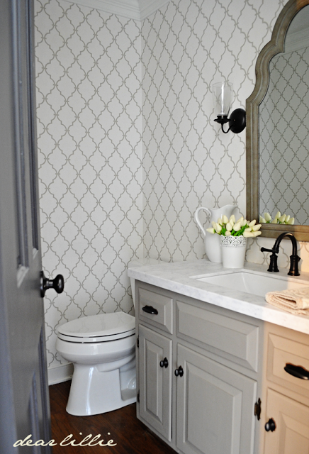
I can’t tell you how excited I am to have this room finished! Technically it’s not quite finished. I still need to add some artwork to the walls but other than that it’s pretty much done! We replaced the toilet shortly after moving in and I took down the chair rail and then I kind of got stuck for a while trying to make a decision. I didn’t want to chose a new countertop or paint the vanity until I picked out a wallpaper and I couldn’t for the life of me find what I had pictured in my head at an affordable price.
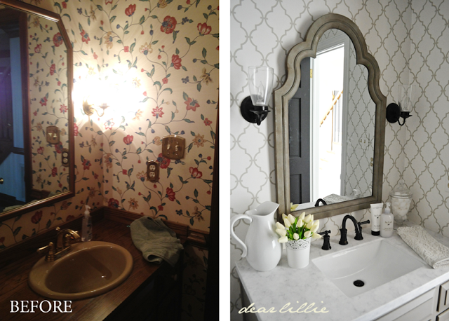
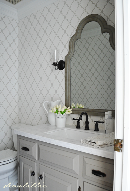
I eventually got sick of waiting on myself to make a decision on wallpaper and went ahead and ordered the countertop/sink and faucet last month from Lowe’s because I figured it would be safe and go with most anything I ended up picking out for wallpaper. I wanted a marble countertop but after the initial quote on that ended up choosing a product called Evercor which ended up close to half the cost of the marble quote. We chose it in the color Aspen. It came with a free sink and I chose the rectangular undermounted style. That was one thing I didn’t have any trouble deciding on. I knew I wanted a square or rectangular sink. I love the way it looks. And then I chose the most inexpensive oil rubbed bronze faucet in 8″ widespread style that Lowe’s carried.
Then it was back to the wallpaper. I wanted something fun but not too crazy. Something with an interesting pattern (like in Lillie and Lola’s room) but in relatively neutral colors. Well, I spent close to
four months looking and didn’t find anything that had that feel I was
imagining. Or I should say not anything that was reasonably priced. I ended up
choosing the gray trellis pattern by York (I ordered it from American
Blinds and Wallpaper because that was the cheapest place I found it). I
wasn’t all that thrilled about it when I ordered it but figured at
least it would be safe and I was just so sick of staring at the bathroom
being stuck looking like it was in mid-renovation so I pulled the
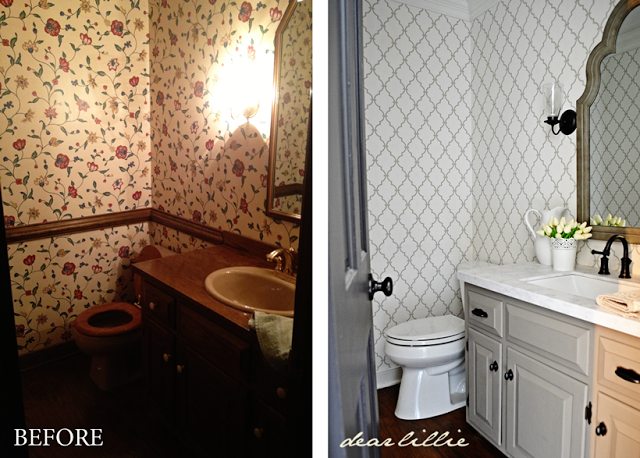
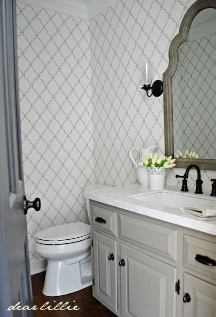
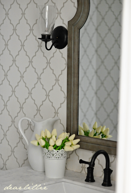
trigger. This ended up being the opposite of my stair runner situation (where I loved the pattern until I actually put it on my stairs). Once this went up I ended up being really happy with it. It feels so much more clean and fresh in here! It was nearly impossible to photograph because there is no natural light in this powder room so I don’t think it really portrays well here on the computer. It felt really dark and kind of dirty in here before and now I am so much happier with how it looks! So, in the end I m actually really excited about it.
Once I chose the paper I painted the vanity. I used Shenandoah Taupe because I still had plenty of it left over from last year and then added new hardware from Home Depot. I had planned on hunting for something unique but got impatient once the rest of the bathroom came together and just ended up running to Lowe’s and Home Depot and those were the ones I liked best.
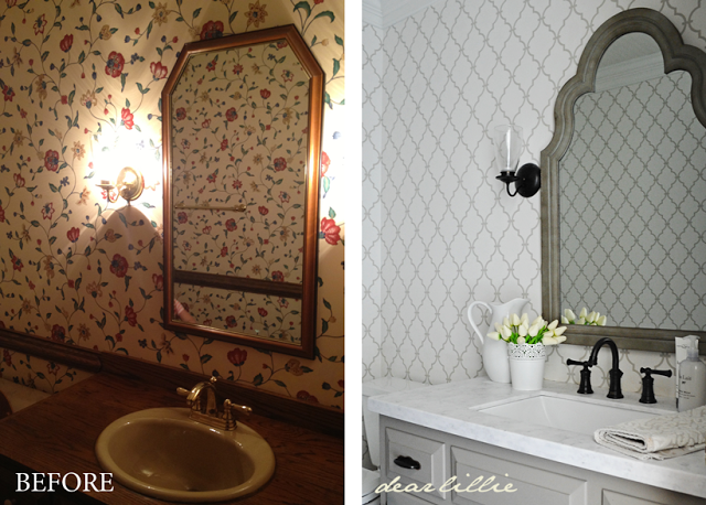
I just removed the sconces and spray painted them oil rubbed bronze for now. I would like to replace them with something a little more interesting someday but they are fine at this point.
Here you can see side by side the before and what it looks like now (I still need to add artwork but haven’t decided what I’m going to put up yet):
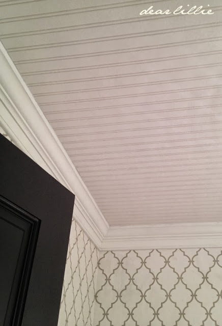
This is a cellphone shot so it’s really grainy and off color but we had some of the leftover beadboard wallpaper from the dining room and entryway installed on the ceiling in here. It’s a fun little detail that’s a bit unexpected.
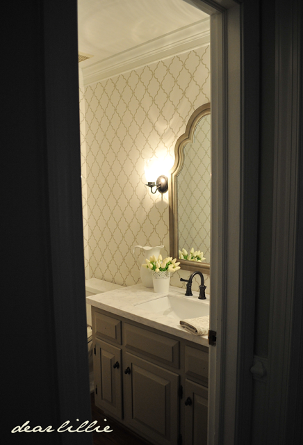
And here’s what it looks like with the lights on:
Sources:
Trim Color – Simply White in Semi-gloss Finish
Wallpaper – Graphic Trellis Wallpaper (can be found here)
Beadboard Wallpaper – Allen and Roth from Lowe’s
Vanity Color – Shenandoah Taupe (think it was in a matte finish because that was what I had on hand, if I were purchasing it new would have gone with semi-gloss for this)
Beadboard Wallpaper – Allen and Roth from Lowe’s
Vanity Color – Shenandoah Taupe (think it was in a matte finish because that was what I had on hand, if I were purchasing it new would have gone with semi-gloss for this)
Hardware for Vanity – Home Depot
Vanity top and sink – Evercor in Aspen from Lowe’s
Faucet – American Standard from Lowe’s
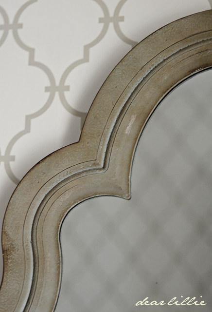
Mirror – HomeGoods
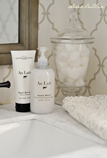
Soap, Lotion, Towel and Jar – HomeGoods
Sconces – spray painted with oil rubbed bronze
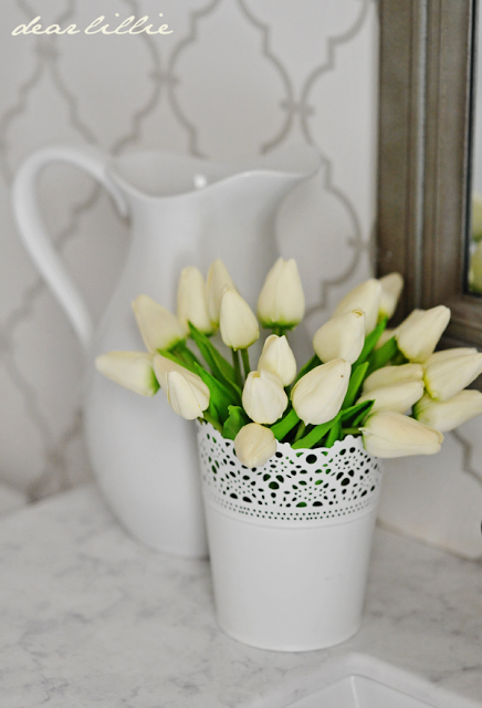
Pitcher – Target
Vase – IKEA
I hope you all are having a wonderful week!




looks fantastic!!
WOW Jennifer what a beautiful transformation!! Love it!
What a beautiful transformation!!
Just beautiful…as always!!
Suzyq
So beautiful! My husband and I are renovating an eerily similar colonial in North Carolina and I love when I see new blog posts from you pop up in my reader! Our home was built in '79 and the original owners were like grandparents to me. However once they sold it, it was ver unloved for many years. We've gotten it clean and livable in the last six months (we worked on it for three months prior to moving in just to get it sanitized!). Once we finish some structural repairs in the spring (foundation issues), we will get back to work on the aesthetics. Your blog is such an inspiration!
I get the honor of commenting first! Yeah! It's beautiful! I love how the mirror is shapely like the pattern on the wall ;). Beautiful!
Gorgeous! I just can't get over all you've done with your new place already. My favorite is the mirror, though that countertop/sink is a close second.
That is gorgeous! Seriously though, I do not know how you are getting so much done! We have lived in our house for over a year and haven't a fraction done of what you have done. You must be a machine!
It looks fantastic!!
It looks amazing!, What a big difference you made in brightening up the space and bringing it up to date. Love your determination, creativity, and color choices. You always inspire me!! Can't wait to see your next room!!! Emily Young
You've done it again-fabulous! I especially love that mirror-great find!
So beautiful!
Beautiful. Love the sink/countertop!
Very pretty, Jennifer.
I am amazed at how fast your new/old home is transforming. So beautiful!
Beautiful and so inspiring! Love to see a blog post from you!! Can you give a link to the counter top? I tried to find it on the Lowes website and couldn't. Thanks!!
Thanks, Angie! I didn't order it online. I purchased it in the store. I am not sure if they sell it online or not.
So lovely. Your color choices and finishes are spot on. I love your signature white tulips in the sweet bucket. I think once you decide on artwork it will be complete.
Still cheering you on over here. Hope Lillie is feeling much better.
Thank you, Cheryl!
Small room, but so lovely. You really lightened up the space and gave it some sophistication. Your artwork will complete the room. I especially love you signature bucket of white tulips.
Hope Lillie is feeling much better.
So beautiful and crisp looking. I love the mirror with that wallpaper!! Bet your going to be washing lots of little dirty hands and faces in that sink!! Can't wait to see your next project!! follower in Md. Shawn
Haha, yes indeed! =)
I love all your choices – they work together beautifully. It turned out so great and I can not believe how much you are getting done so quickly. I really love the countertops and rectangular sink. I noticed you do not have a backsplash – is that out of style to have that little 3 inch backsplash of the same material? It looks great, I am just curious.
Thank you so much, Elizabeth! I am not a huge fan of how bathroom backsplashes look and was hoping it would look more like a piece of furniture with a vanity top added by doing it this way. I figured if it doesn't end up working out so great I can always add a backsplash by just ordering a piece of the Evercor in the size needed.
That mirror is fabulous. The whole room is just gorg. Pinning for inspiration!
Absolutely gorgeous Jennifer!
Wow! The transformation looks amazing! I can't wait to see the artwork you choose!
Jennifer: Everything about this room is beautiful and so you! Cindy
I've been stalking the blog all week waiting for the powder room reveal! Love it! You are such an inspiration:)
Just curious………was the mirror your inspiration? I love how the wallpaper echos the shape of the mirror. It's all in the details;)
The mirror was actually a lucky find! I had found a few similar mirrors on places like Wisteria but they were quite expensive. Once the wallpaper was up I decided to see if I could find anything that would work at Target and HomeGoods and didn't really think I would find anything. I was shocked when I turned the corner and saw that mirror in HomeGoods! It was the exact style I had been looking at online but 1/3 the price. I snatched it up so fast and forgot to even measure it. Fortunately when I got it home it just barely fit between the sconces. Haha!
It was meant to be, don't you love it when those things happen?:)
Amazing transformation…. Your decision to remove the chair railing really makes the powder room look bigger as well. Is it me or does the wallpaper in your powder room have a similar trellis design to the new runner on your stairs. Both are beautiful!!
What a transformation! Beautiful job!
Holy cow, Jennifer, this is fabulous! I'm pinning this baby for future copying 😉
That transformation is incredible. When I see these comparisons I always question what people were thinking when they were designing in the first place. Of course, styles and materials were limited but still… even some white paint would have at least brightened it up.
Jennifer, did you prime your vanity? I am loving all painted woodwork, etc. Looks so much brighter and happier in the new home.
Thanks, Lisa! I actually didn't. I was planning on priming it just like all the trim and kitchen cabinets but when I painted a swatch of it on just to test the color I discovered the cabinet was kind of rough and porous, almost like it had been sanded already, so I just kept on painting – haha! We'll see if it comes back to haunt me. I think if I painted it a lighter color I might have to worry about some bleeding through from the stain but I am hoping that won't be the case because the color I chose is darker.
Have a blessed week!
Warmly,
Jenni
This turned out beautiful! I love the wallpaper. At first I thought you stenciled it, lol. That would have been a job! That mirror is great. I wish our Homegoods carried mirrors like that!
Haha! I definitely don't have the patience to stencil! Haha!
What a gorgeous little bathroom! I am going to have to research the Evercor. I have never heard of that before and we/I want new counter tops in the vanities upstairs and maybe our master bath. I am over black granite.
I really like how it turned out. It looks crisp and clean without being to stale. It will be interesting to see what you decide on for the art.
Gorg!! 🙂 is the vanity top Solid surface?? Would you consider it in a Kitchen?? I love the way this turned out!!! Very classy & neutral…
Thanks, Stephanie! Yes, it is a solid surface product. I wouldn't use it in a kitchen because I think the repeat of the marble pattern would be more obvious on such a large surface although I do think the actual quality of the product would still be nice in a kitchen. The vanity surface is small enough that you don't really notice the repeat. I am hoping to use quartz in our kitchen when we replace those counters – still saving up for that, though. =)
Thanks,You & I both!! ; ) I contacted my local lowes and they don't sell or recommend the evercor in anything other than bath vanity's. They did however let me know about a new solid surface by Formica called gray striato that is similar look to Carrara marble. which I would love to use in our kitchen (one day)!! I looked into it as well seems just as pricey! Keep saving… 🙂
It's hard to believe that's the same room!
I love it and your classic sensibilty that always comes out looking splendid, no matter what the price point! Great job!
I love it – it looks gorgeous and timeless!
xo,
S.
Its so simple, yet fun and stylish. I don't even think I would add art in there just leave it as it. The pattern is modern and classic at the same time and I like it.
You give me so much inspiration/hope that many changes can be done to my home. Your home face lift is a beautiful one. Just amazing the old brown…and now crisp clean white!!!
Jennifer,
The room is so light and pretty now! It looks great!
Wow… what a difference. Everything looks so bright and fresh and pretty. I love the wallpaper, and i really liked the rug on the stairs too. I think the color of the rug is really nice, and i liked the pattern too…
Cindy
Ideas your "almost finished" but kind of ignored it as I got lost in how finished this powder room is!!! Yes, you will find art and we will be amazed but in the meantime, I will just gaze at the wallpaper, the square sink, ( LOVE it–in Lowes with Hubby and we walked by a SQUARE toilet! In my dreams I'd get square sink and toilet as it was only I think $100). But back to you. I am blown away on how much you have done. Painting. Finishing. Space after space. No complaining. You did not get your marble and you told us about a new product ( please say it is not like the fake marble of the '70's that my first old home owner had redone years before and oh! It just did not hold up–how are these better–sturdier??). Back to the beauty of the room, I love it just as it is for now. So pretty, elegant!!! And done with the hard part!!! Congratulations!!!
This seems like it should last a long time! I don't think I would use it on a huge surface like a kitchen counter but I am happy with how it looks in our powder room.
You should definitely go into the remodeling business…you have done a great job in all of your rooms…and the bathroom is no exception. It's stunning! Love every single detail. simply gorgeous.
Very pretty! Light and elegant.
The bathroom looks amazing… I really love your choices!! You have a wonderful talent for decorating.
It's gorgeous… wow. Every detail is just so beautiful! I need to look into Evercor – I have some old marble that I'd like to replace but the cost has had me nervous to even look!
OH MY GOD, what a transformation!!!! Just love the wallpaper.
Very inpirastional.
Love Elisabeth
The big changes are all outstanding, but the little things really tie the room together. I love the flowers and the water pitcher.
There was really a big difference in the before and after images. The before images look quite gloomy and the after images look very bright. They give the impression that the room is very bright and classic too. Agreed! The wallpaper is fantastic.
So far so great Jeni…but what's new? It's always like that around Dear Lillie 😉 xo
The bathroom looks great. I can't tell, did you do anything to the floor? (I apologize if you explained this in the post. I like pictures)
Thanks. No, we left them as is. Part of what we fell in love with when we first looked at the house was that the wood floors pretty much were throughout the whole house.
Jennifer, you spectacular style has followed you to your new home!
Jennifer, I love the powder room update – the mirror complements the wallpaper perfectly, and the colors look fab. I could sit on my couch all day and read every post – love, love, love your style!
Beautiful job!!! Love it all!
I love it! Such a beautiful paper. I can't wait to see more.
Jennifer,
Do you hang your own paper or should I hire someone? Nightmare or not as scary as it looks?
I hired someone. I was originally planning on doing it myself but the painting is taking me so long I decided it was worth it to hire someone for the wallpaper because I found a lady that was so reasonably priced.
Juat gorgeous! My husband and I just moved into a 1972 split level home. Fell in love with the wood floors, but oh my goodness…the hall bath and a couple of bedrooms are wallpapered that is not so great, maybe 20 years ago. I can live with it for now, but it's going to have to change eventually. I thought about painting over it, or adding new wallpaper (would probably hire someone for that). Did the woman who wallpapered for you remove the old wallpaper first? Have you ever painted over wallpaper and if so, what kind of paint would you recommend? The wallpaper here in my home seems to be very smooth, no peeling or loose areas. Love the blog. Thanks for the inspiration!
Thank you! And yes, I have painted over wallpaper before. I did it in our first home and plan on doing it again in one of the guest bedrooms in our new house. I just primed it really well first and then painted! For the bathroom though the lady did remove the wallpaper first and she also removed it in our hallway and the second extra bedroom because that paper was peeling in places (I originally tried painting over it in a few spots and it didn't work well – whereas my test spots in the first guest bedroom have turned out how I had hoped and therefore based on how well it worked in our first home I am pretty confident it will be okay in this room as well). Good luck! It's a lot of work but sure is fun to see the transformation!
Warmly,
Jenni
Lillie,
I love your new wallpaper.
Hi Jeni, Are you still happy with the Evercor product? I am trying to correct a design mistake (something I chose and have never liked) on our kitchen island. It is only 36 x32, so I'm hoping the repeat in the pattern wouldn't be an issue. I love marble too, have it in a powder room that isn't used much, but am looking for something with that "look" that won't etch, stain. Your home is lovely, BTW! Thanks, Jill
Hi Jill! Yes, I love it for the bathroom, but I wouldn't necessarily recommend it for a kitchen.
Hi got a quote from lowes for evercor and it was 1600 with two double sinks and for 71 inch length. does that sound right?
Hi! I'm not sure if you saw our response on the other post, but ours was fairly expensive. I think $600 or so, but the quote they gave us for marble was $1200 so it was a much better alternative for us that still gave us the look we were going for!
Are you still pleased with the Aspen countertop? Considering the purchase, but I'm concerned since the sample at Lowes did not have the usual glossy look that most quartz and granite countertops have.
Yes, we have been happy with it! I think it looks similar to a honed marble (like in our kitchen) and therefore does not have a glossy look to it.