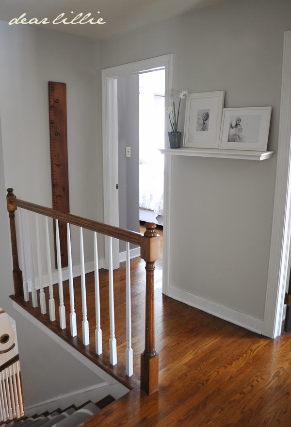
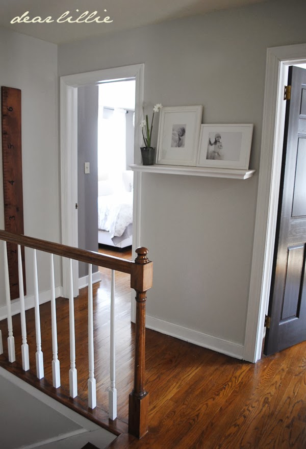
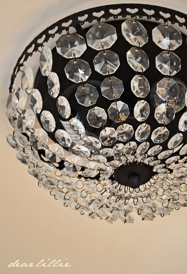
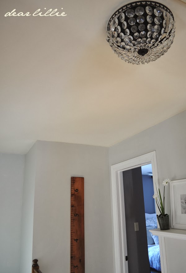
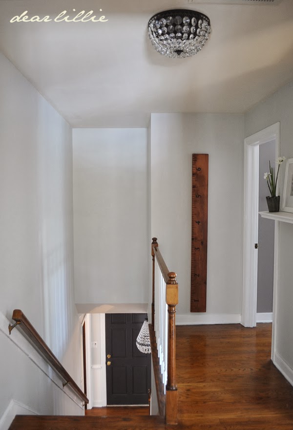
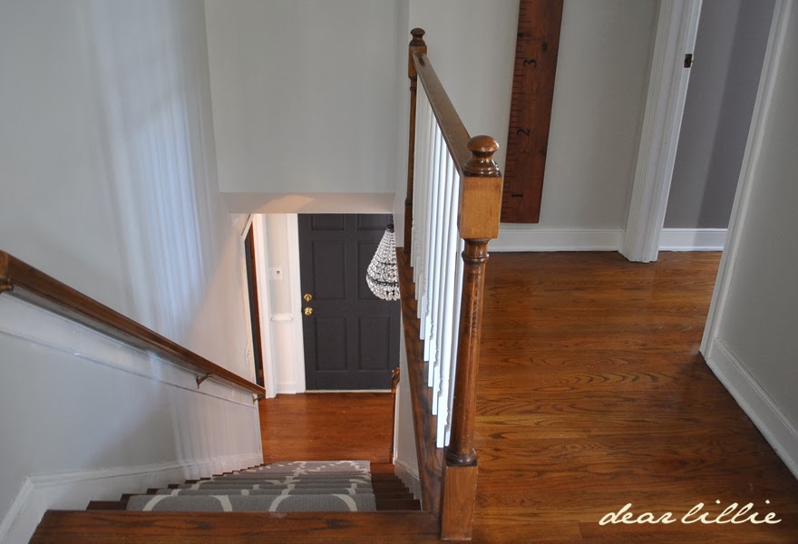
I finally took photos of the hallway upstairs. We finished painting it back in the fall (maybe late October?) and I just sadly took pictures last week. I was kind of holding off because I was waiting to find a bookshelf type piece for the top of the stairs but at this point am giving up on waiting on that. I did finally get the coordinating light fixture for up here though last week!
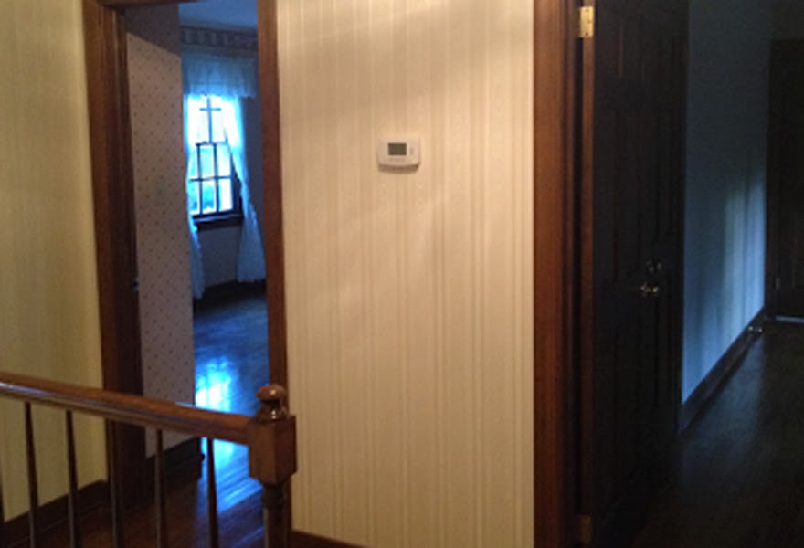
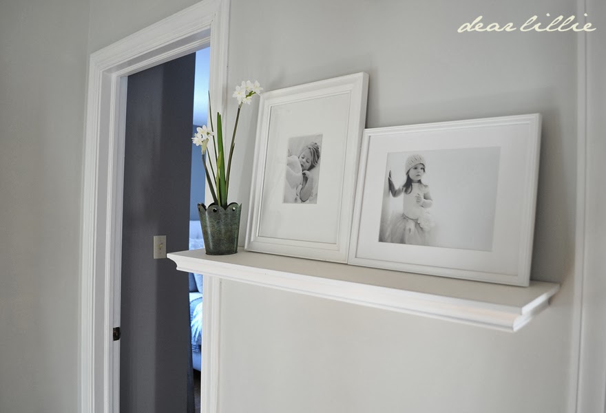
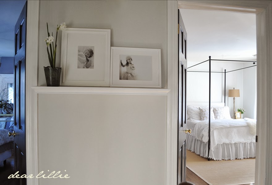
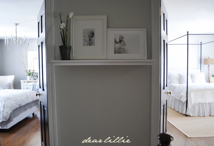
I know I took before photos of the hall but I cannot for the life of me find them. Here is one random shot where you can at least see the wallpaper that was here. We had it removed and then I got to work priming and painting the trim. Jamie was here visiting back in the fall when I was working on this and helped with the walls. Because the thermostat was hung annoyingly in the middle of this wall I just added a basic shelf (one of the ones that I had removed a couple months ago from our kitchen walls) and leaned two photos against it so we still have easy access to changing the thermostat if necessary but it helps hide it most of the time.
There is no natural light up in this hallway unless I open the doors so it makes it quite difficult to photograph especially seeing how I need to purchase a new tripod and still haven’t gotten around to getting it yet .
I will try to take some better angled shots once we get the bathroom finished that you also see from this hall. I still plan on adding a gallery type wall going down the stairs and would maybe like to add some type of wall treatment for added interest up here but at least it’s a lot brighter feeling up here and not so dark and gloomy.
SOURCE LIST:
Wall Color – Moonshine in Matte Finish (BM)
Trim Color – Simply White in Semi-gloss Finish (BM)
Door Color – Mopboard Black in Semi-gloss Finish (BM)
Light Fixture – Mia Flushmount from Pottery Barn
Shelf – Target (I’m not the biggest fan of it and would not buy it again)
Frames – One on the left is from Target and the on one the right is from IKEA
Growth Chart – Dear Lillie
I hope you all have a wonderful rest of your week!




Looks lovely – so clean and fresh! Can't wait to see the second guest room.
Absolute perfection as always! Is that your master and guest bedrooms in that last shot?
Thanks, Lauren! They're both guest rooms.
Just lovely. 🙂 I really enjoy reading/following your blog and always look forward to hearing about your progress on your new home. You've done such a nice job with everything. I glean fresh ideas every time I read a new post–thanks for sharing!!
Gail
I really love your fresh clean look. I need new carpet for my stairs and was thinking Berber but I really love the patterned rug you have.
Perfect as always!:-) I love your house my "Goddess of interiors":-) Rgrds, Kasia
Jennifer la transformación es increible, es muy muy bonita. felicidades.
besos
Again, quite the transformation! So much brighter and cleaner looking. I'm wondering also if that is the master bedroom on the left? The shelf and frame to hide the thermostat is a great one, might use that myself! Thanks for sharing your beautiful home with us, Jennifer;)
Thanks, Kelly! The room on the left also a guest room.
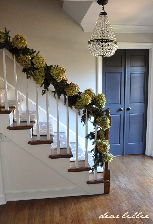
Those light fixtures are gorgeous, and your thermostat camouflage is really smart! I wouldn't have thought of that. Seriously, though, that hydrangea garland…to die for!! 🙂
I love your black doors. I have my outside doors painted black. On both sides but I have been afraid to do the interior doors. Thinking it would make things too dark, but you have inspired me 🙂 I go back and forth on a runner for my stairs and again your photos work and I might go ahead. My hallway and foyer are Ben Moore greige. I love that color, works for any room!
That's an excellent idea for camouflaging the thermostat! It's easy to move the pictures and then put them right back again. Also love the crystal ceiling flush mount light!
Hello Jennifer I am a advid follower. I have a couple of questions, I am a person that tends to really not favor winter and the gray, no sunshine skies that it usually brings, (makes me kind of depressed and long for spring and summer) but I am really leaning towards lighter colors in my home right now especially the grays and I already have painted all my trim white to brighten things up. question 1. Do you ever get the feeling of lacking color or any sadness by using grays and lighter colors thru out your home? I have a very cozy feeling now of mustards, sage greens. But I am really wanting to go lighter. If nothing else thinging of going very pale, pale blues and greens with very neutral linen furniture and accent with the blues and greens in pillows and such. I think its called ballet slipper for the blue. What colors would you recommend from Benjamin moore? And my second question is Does your house ever feel to stark and sterile like to you? I say this as my hubby said he thought ours might look like that but he has not seen yours. And I thinking of showing him pics of your home. We both like a VERY nice organized clean home but he says he doesn't want it to appear to stark and look like the hospital that I have spent a lot of time in since dealing with my multiple sclerosis. Any Advice? I would diffently appreciate it. Thanks, Shawn
Hi Shawn! I find grays very calming and soothing. I love all of the colors we've used so far in the house, but if you're looking for more options you can find a list of great light BM colors of at "For the Love Of a House" (they are all beautiful!). Our house is a bit stark at times, but that is because it is nowhere near close to being done (we just move in this summer). Once we get it lightened and brightened I will be adding all sorts of textures and items to help cozy up the rooms. The reason we are going so light and bright for the backdrop is because there is very little natural light in the house and the ceilings are very low–we didn't want it feeling dark and gloomy.
Jenni, thanks so much for responding back! I appreciate you helping me with working on a color scheme for all the adjoining rooms that I have to paint in my home.. And I am going to go and check out the blog "For the Love of a House" as you have suggested. I will have to let you know how things turn out! Keep showing us all your improvements. I just love looking at other peoples homes so much! It gets me so inspired!!
Is that the master bedroom on the left?
Can't wait for the reveal!
Such a lovely transformation
Thanks, Seraphina! The room on the left is also a guest room.
Looks fantastic as usual…I was wondering what height did you put the shelf at?
Thanks…
Thanks! I would guess it is roughly 4' 6".
javascript:void((function(d){var%20e=d.createElement('script');e.setAttribute('type','text/javascript');e.setAttribute('charset','UTF-8');e.setAttribute('src','//assets.pinterest.com/js/pinmarklet.js?r='+Math.random()*99999999);d.body.appendChild(e)})(document));
Beautiful, as always!! Have the same pottery barn chandeliers. Got my flush mount a few weeks ago and have patiently been waiting for the hanging mia chandelier. So pretty. Love the look of the two rooms and the hall together. You have made a beautiful home for your family. You have come so far!! You are such an inspiration to so many!! Xx Emily young
I love the thermostat solution!
THAT is beautiful! What a difference paint makes. Love the lighting fixtures too and the shelf to cover the thermostat is ingenious. I have a thermostat exactly like that. Now I know what to do with it 🙂
It looks so clean and fresh up there! I am swooning over that 2nd guest bedroom. I can't wait for you to share some more about that. I really love the fresh. clean and neutral decorating style you have. It looks fantastic!
I cannot fathom that amount of trim & wall painting…….with 2 kids and a business. you are amazing. there is A LOT of trim in that house!!!! bravo!
Jennifer you are a tremendously hard worker- did you remove all that wallpaper? Have you shared your secret how to get so much off so quickly? You also must be extremely determined. Another beautiful transformation. I realize the amount of work since we too do all our home renovations. I wonder when you tackle a room what drives it other than wanting to make it your own taste; meaning do you have the design inspiration first and make the budget fit or focus more on the budget? I question as we are trying to update two upper level bathrooms (a master and our girls bathroom) in a small amount of time. Budget is for sure a large play in our efforts, but we also want it to look classy and nice. Any suggestions on how you go about tackling a space is most appreciated. Thank you for sharing your beautiful work and home.
Thanks! Removing the wallpaper is actually one of the few things that we've paid someone to help with. It only cost $20 a roll, so it has been well worth it!
So beautiful! You have been busy!!
That looks so clean and crisp! I love it! I also want to see that other guest bedroom! Looks gorgeous!
So beautiful as usual.Love the colors! Think I will use the Moonstone for my bedroom. Everything you do always is perfection.
so pretty.Think I think I will use Moonstone for my bedroom.Everything you do is perfection.
I love the fixture in the guest room featured on the left, where did you find it?
Thanks! Its from Restoration Hardware Baby and Child. We will be doing a full post on that room soon!
Absolutely gorgeous Jennifer. The new light fixtures are beautiful. I bet the girls love those with the sparkly crystals. Always fun to see what you're up to. Such a transformation since you moved in. You need to bottle and sell your energy!!
Just beautiful!! Thanks for sharing!
The wall color with the wood floors looks so pretty and brightens up the hall! Also love the contrast of the door color!
E+J
Thank you so much, Eddie!
Oh my goodness, all your colors and shades of gray and white are just beautiful together. The whole house, every room completely flows into the other. It gives your house this visual dimension that is so pretty. I still really like the stairwell rug with it all too… and love the simple little trick for covering the thermostat…
Cindy
I adore the colour you've used on the walls here. It works perfectly with the light fittings!…xv
http://vickiarcher.com
Such a remarkable change! The lights are gorgeous. This is a wonderful example of what lots of hard work and paint can accomplish in both beauty and resale value. Lovely colours and so updated now.