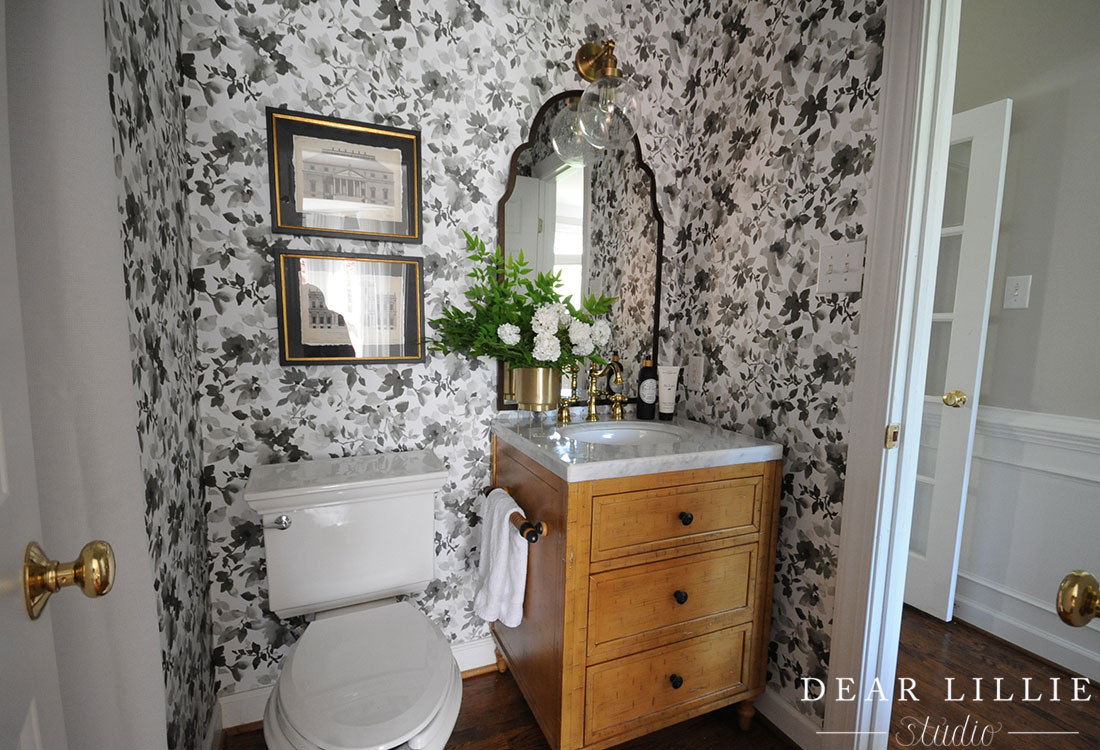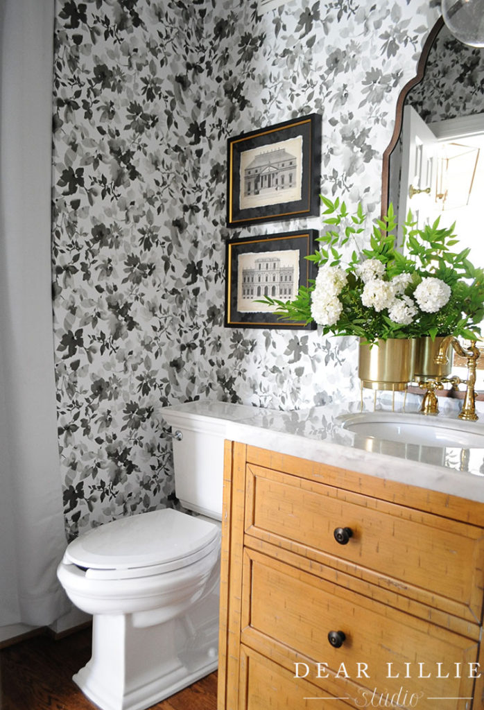
Today we are excited to share our the finished photos of our downstairs bathroom makeover! We partnered with Wayfair for their One Room Renovation Challenge! We partnered with them two years ago in this same challenge and it was so much fun (you can see that post here) so we were excited to do it again!
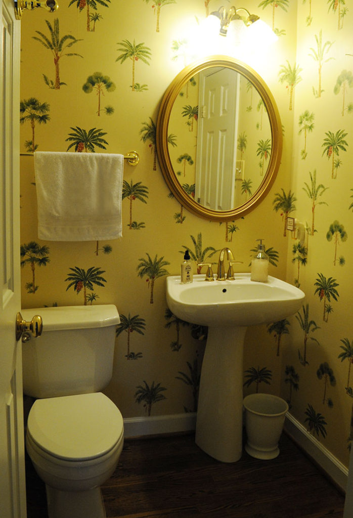
Here is a before shot:
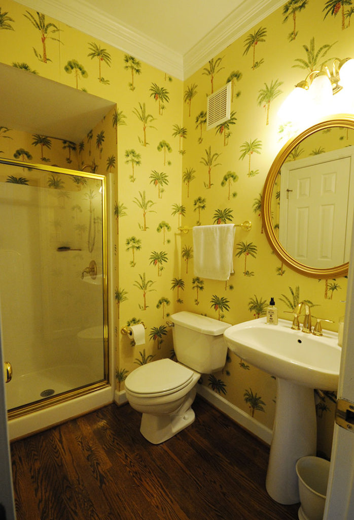
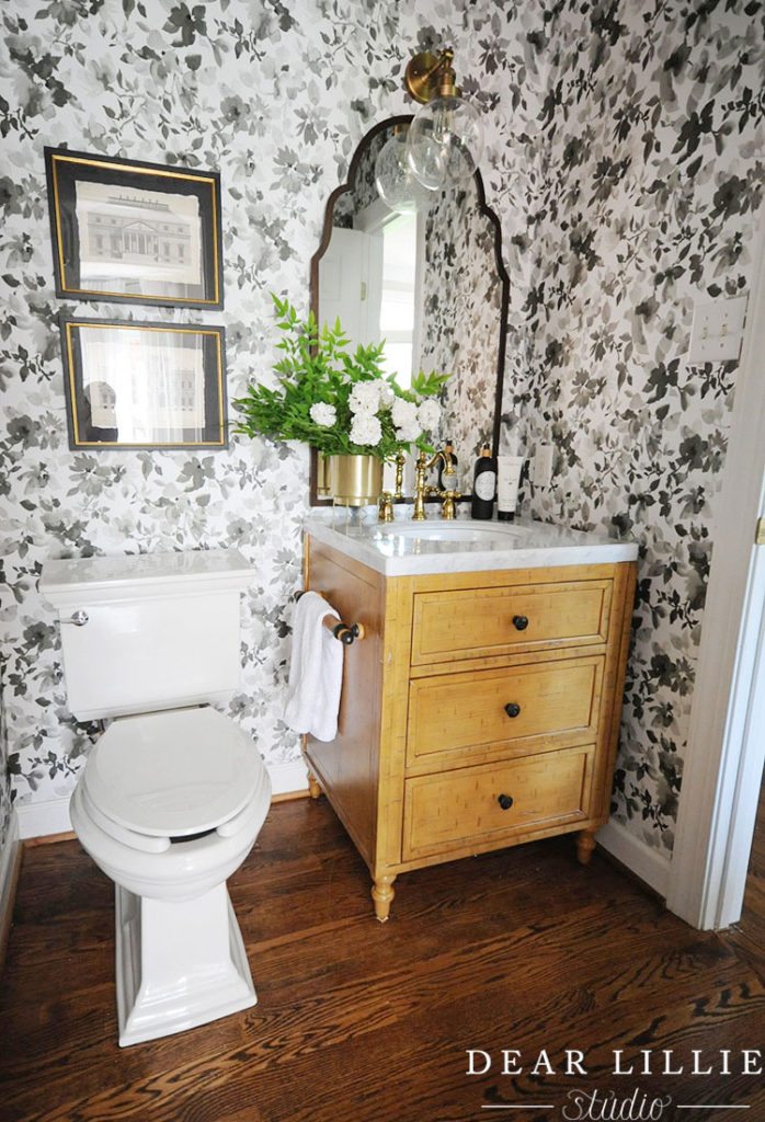
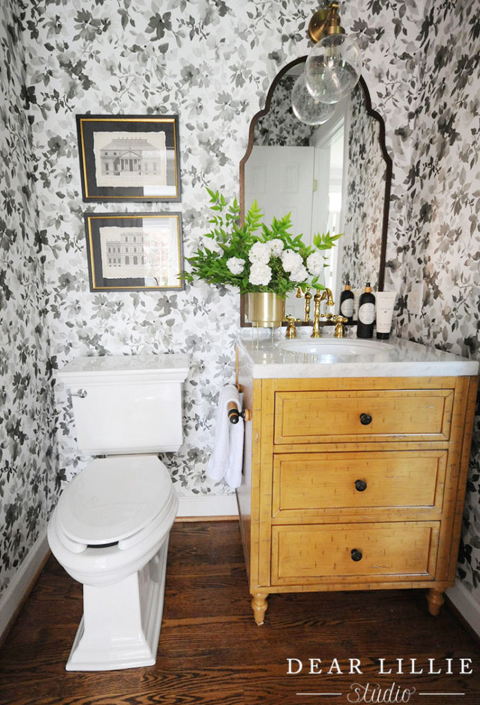
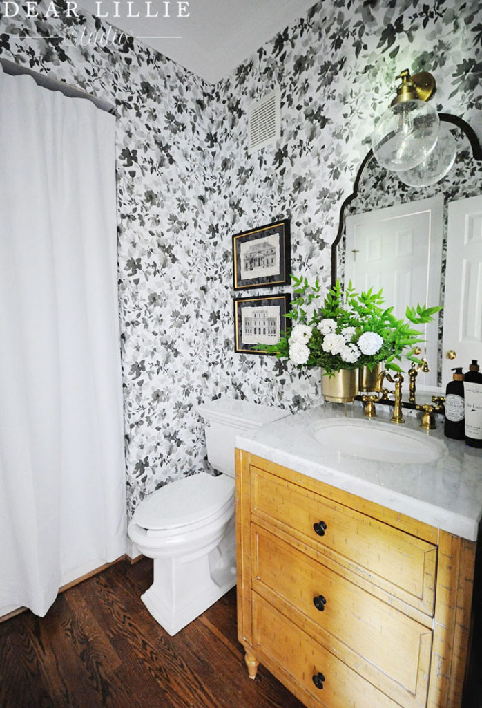
The wallpaper was dated and coming down in spots so we knew for sure that was going to be one of the main things we were going to change. We also wanted to add some storage to keep toilet paper and other toiletries so we knew we wanted to switch the pedestal sink out for a vanity. With the vanity and wallpaper being the main focal points I focused on choosing those first. I initially was going to use this wallpaper but then decided because we were renting and about to move out that it would probably be wiser to go with a peel and stick option that way if the next people weren’t a fan of this paper it would be very easy for them to take down! So after deciding that I chose this wallpaper. It was by the same company that I used in Lillie’s room and it was so easy to hang that I figured I would stick with that brand. And sure enough it was just as easy to hang in here…well minus the fact that hanging wallpaper in a bathroom isn’t the most fun project – ha! But it went on really easy and the pattern was not hard to line up at all. I would definitely recommend it! I am not sure long-term how peel and stick would hold up in a bathroom with a shower but this shower isn’t ever used and it seemed like going with an easy to remove paper would be the best choice overall for the new owners.
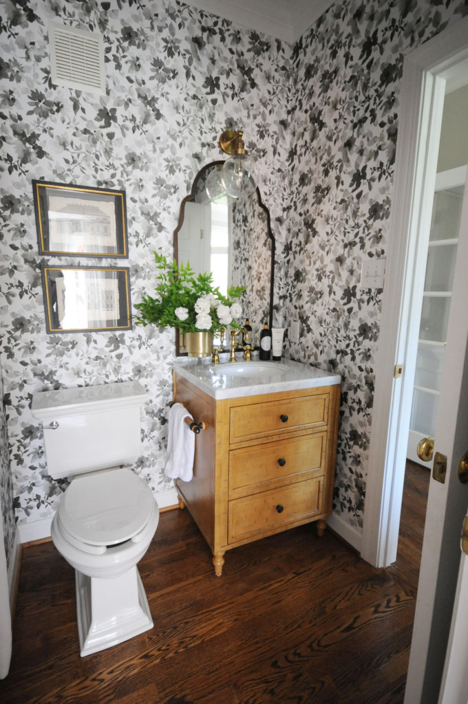
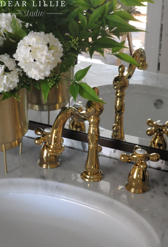
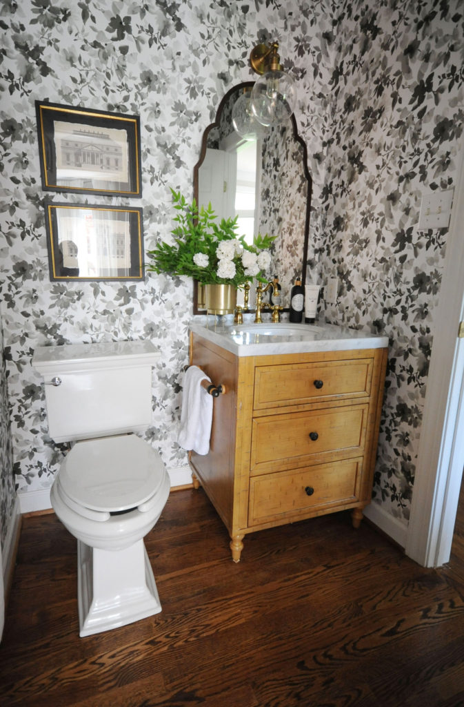
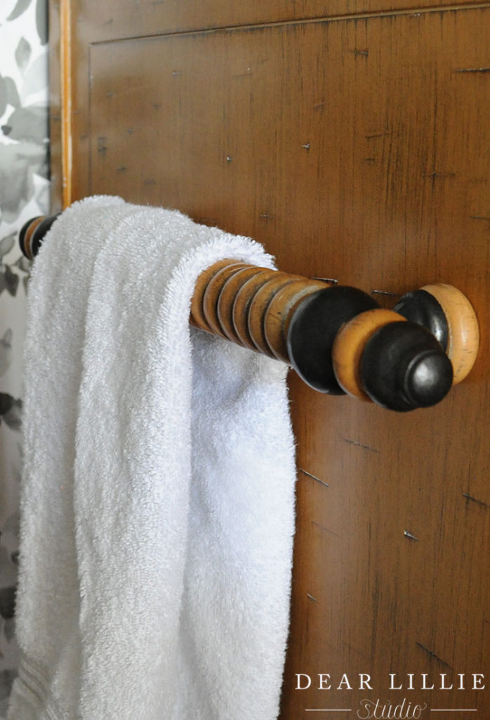
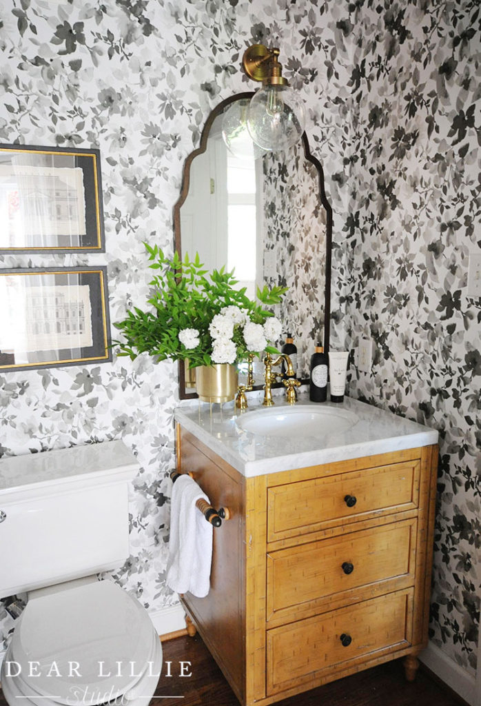
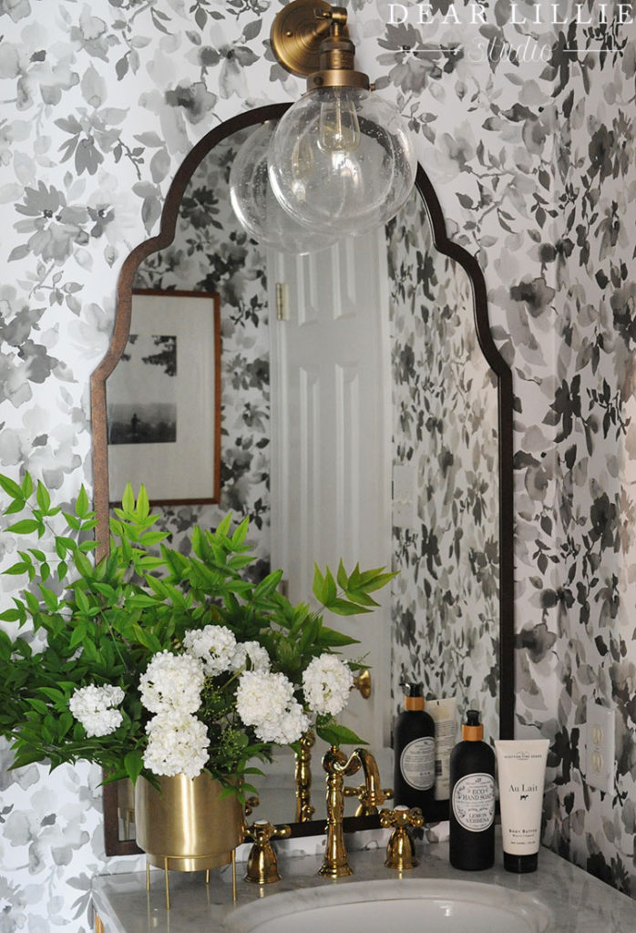
The other main focal point was going to be the vanity and I immediately fell in love with this one. It was the biggest splurge in the space but being a small bathroom it was worth it! The wood is beautiful and the marble top is gorgeous! I then chose this faucet as the finishing touch for the vanity and it adds the perfect amount of shine to the space – like a piece of jewelry for a room!
Here’s a before from another angle (bathrooms are so hard to photograph!):
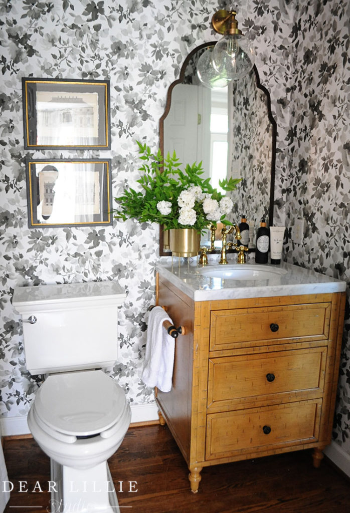
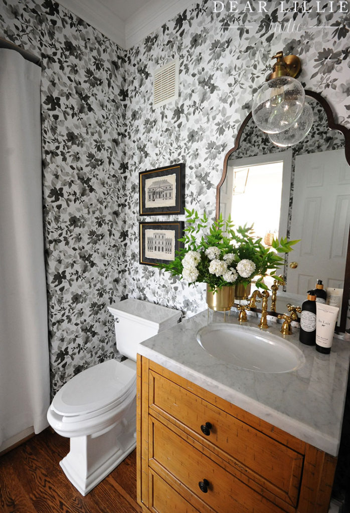
To finish off the space we added a new toilet (I am planning on switching the seat to the one we used in our last bathroom makeover) and I swapped the existing mirror with one I already owned from our Soft Surroundings line. Then I replaced the light fixture with this one that gives it a much more updated look. To finish that wall off I added two of our framed architectural prints (which are no longer available).
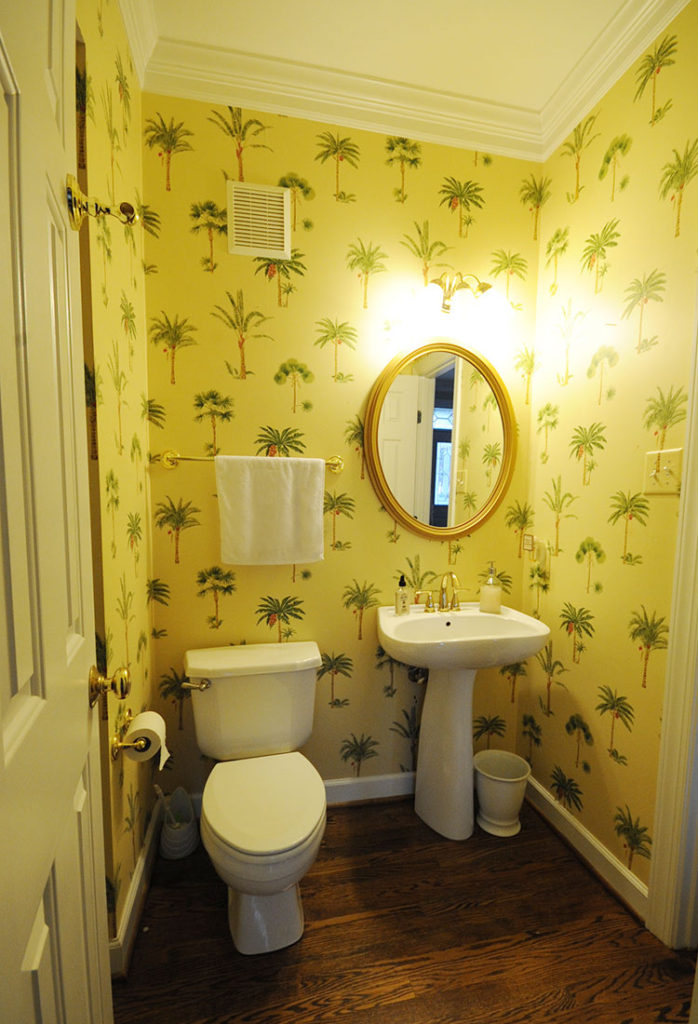
And another before:
And now:
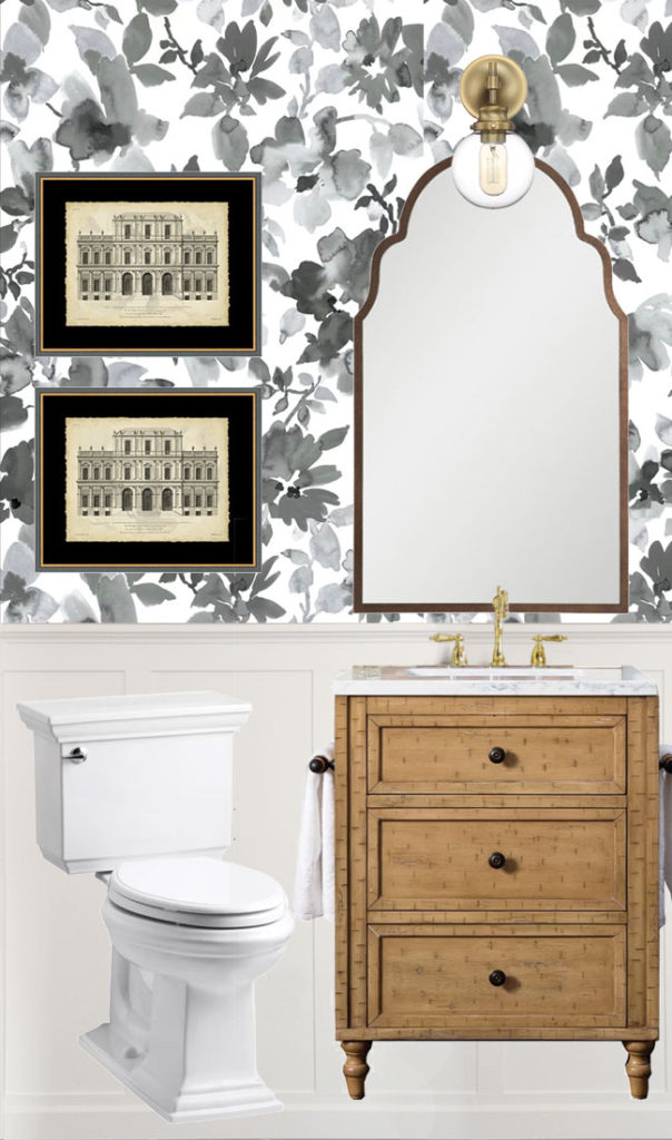
Here’s the mood board I did for the space back in March:
I just love the details on the faucet!
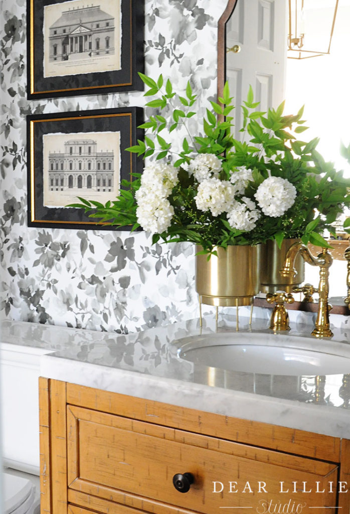
And the seeded glass on the sconce it so pretty!
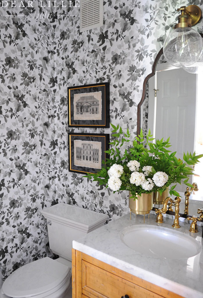
Here’s a little look in from the hallway:
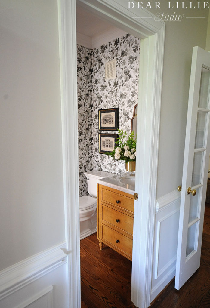

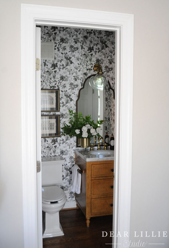
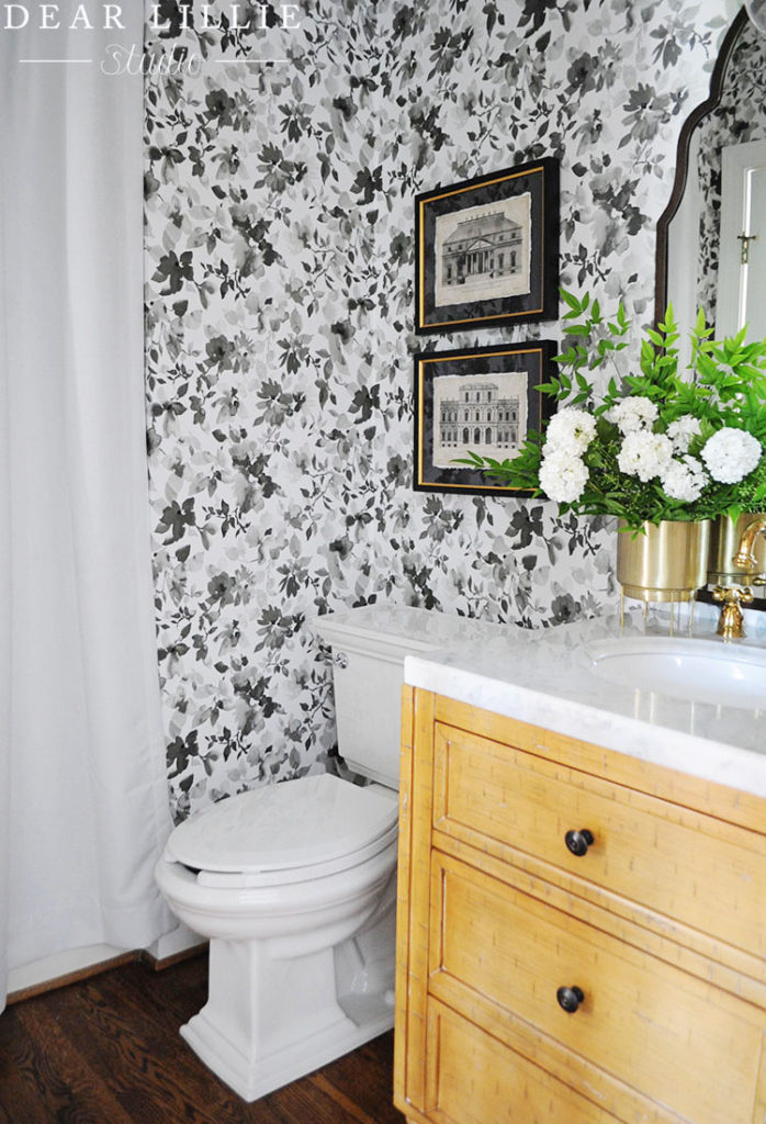
To help conceal the shower we just added a tension rod and this curtain panel. It makes the room feel so much nicer!
It was such a fun and easy transformation! Here are all of the sources:
Source Information:
VANITY – WAYFAIR
TOILET – WAYFAIR
MIRROR – WAYFAIR
SCONCE – WAYFAIR
FAUCET – WAYFAIR
WALLPAPER – WAYFAIR
ARTWORK – WAYFAIR
SHOWER CURTAIN – WAYFAIR
VASE – WORLD MARKET
And be sure to check out all of the other blogger’s and
their amazing transformations this week:
Sunday – Beneath My Heart
Monday – The Charming Olive
Tuesday – Dear Lillie
Wednesday – Lombard and Fifth
Thursday – B Vintage Style
Warmly, Jenni
Items were provided by Wayfair in exchange for this post. All thoughts and opinions are my own.
