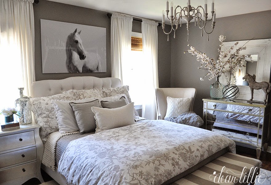
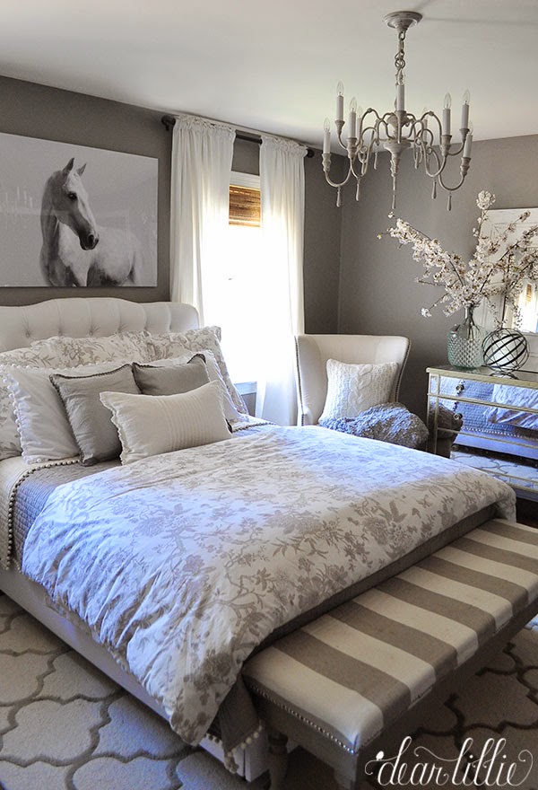
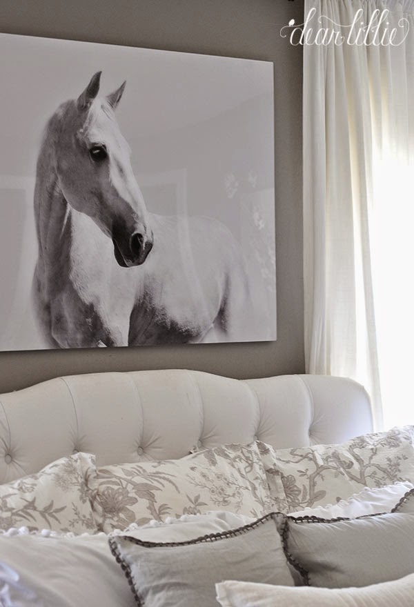
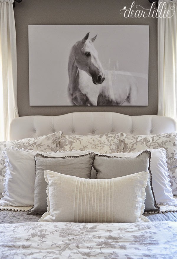
I’ve been looking for some artwork for above the bed in this room for a while and I have to say this horse picture was not at all what I was planning on or what I was looking for but every time we went into HomeGoods this winter Lola would want to go to the back and check and see if it was still there. She fell in love with it the first time we saw it and kept begging for us to get it. I have to admit it’s pretty rare for my girls to fall in love with something that isn’t pink or Elsa-related so I kept pondering it but didn’t really think we had a good spot for it. Lola and I measured one of the walls in her room a few times but didn’t think it would work right. Finally after a couple of months it was on clearance and marked WAY down so I figured we would at least bring it home and try finding somewhere for it. She was sooooo excited! After trying it in a couple of spots that didn’t work we tried it in here. I loved how it looked against the dark gray walls and size worked nicely but I have to admit it throws me a little bit being above the bed and is a little bit bold for me. I think I would like it a little better above a sofa or dresser or something. However, Lola’s excitement made it worth it.
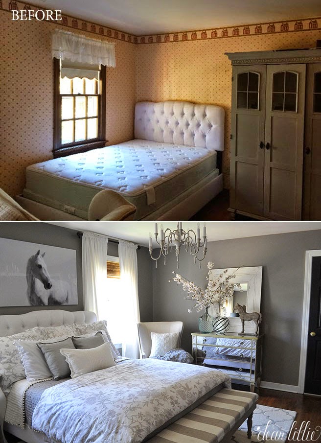
For anyone that is new here I thought I would share a quick before shot of the room:
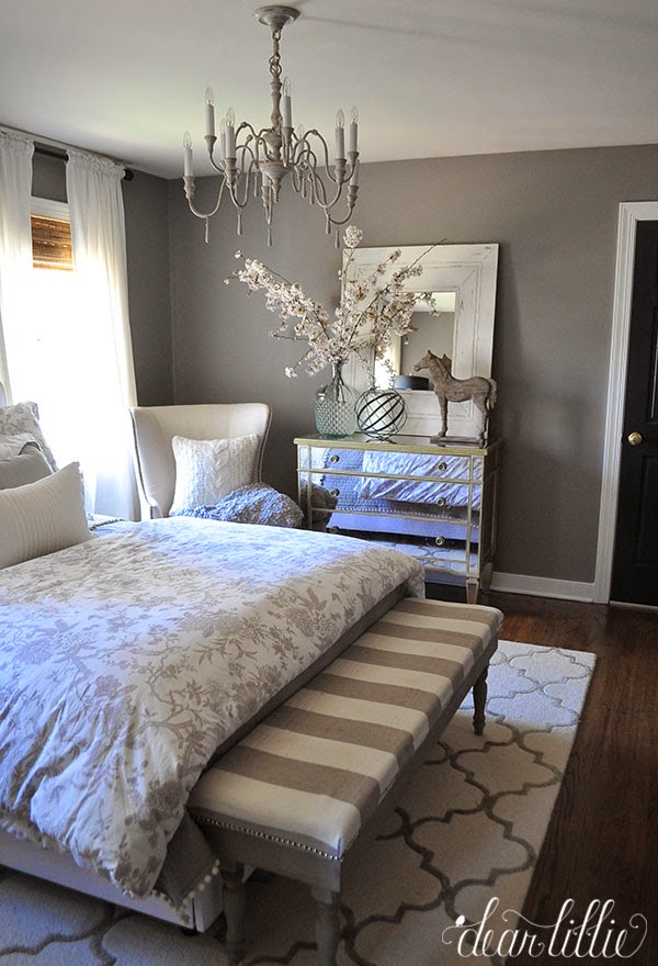
Wall Color – Graystone by Benjamin Moore in Matte Finish
Trim Color – Simply White by Benjamin Moore in Semi-Gloss
Door Color – Mopboard Black by Benjamin Moore in Semi-Gloss
Bed – Skyline Furniture about six or seven years ago
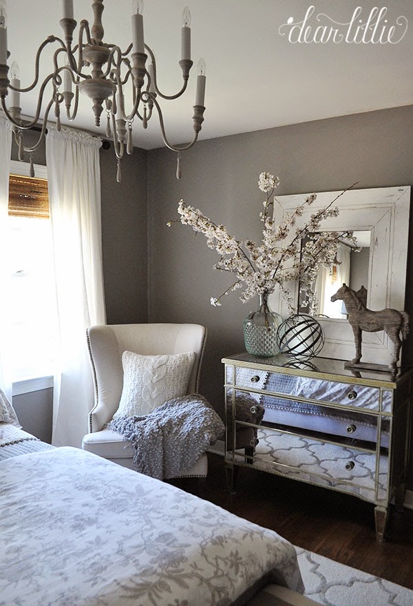
Horse Picture – HomeGoodsMirrored Dresser – Haynes Furniture about six years ago
Silver Chest – TJMaxx about six years ago
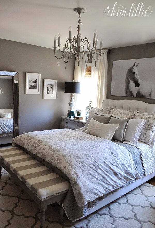
Lamp – Aiden Gray on clearance about eight years ago
Duvet Cover and Euro Shams – Jardin Toile from Ballard Designs
Quilt and Standard Shams – Audree Pom Pom from Ballard Designs
White Pom Pom Shams – Country Curtains
Two Square Pillows – Birch Lane Armelle Linen Pillow Cover in Stone
White Linen Center Bed Pillow – IKEA
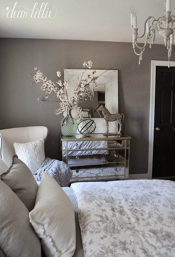
White Framed Mirror – Savvy in Williamsburg, VA
Bench – We made it, tutorial can be found here
Tall Mirror – Home Goods
Large Glass Jar – Decor Steals
Metal Sphere – Home Goods
Wooden Horse – Joss and Main
Chair – on clearance at The Loft Outlet in Williamsburg
Knit Pillow – Joss and Main
Gray Throw – HomeGoods
Drapery Panels – Ritva Panels from IKEA
Curtain Rods – Home Depot
Chandelier – Restoration Hardware Baby and Child
Rug – Rugs USA – Edison in Nickel
Shades – Lowe’s
White Frames with Lillie and Lola photos – IKEA
I hope you all have a fabulous week ahead!




Olá, bom dia! Ficou muito bonito a decoração do quarto!
Dora.
Is there a cabinet in front of the door in the before picture? Your after is so much better for so many reasons, not the least of which is that one!
Thanks! There used to be a cabinet in the room, but it wasn't blocking any doors 🙂
It fits in well with the size and color scheme. I also like that it ties in with the horse on the dresser.
Best,
Michelle from simplysantabarbara.blogspot.com
I love the horse artwork! So cute that Lola's excitement made it worth it. That room is so beautiful Jen.
Oh my goodness what a beautiful room. I would never want to leave! I am loving the use of grey in my house as well, and black doors and white trim. Simply stunning. At Homesense (Canadian equivalent to Home Goods, same parent company) the "good stuff" seems to sell before it gets marked down. the picture you have – what a find!
I think it looks kinda beautiful in there with those gorgeous calming gray walls. What a great guest room!
Cindy
The horse art is so unexpected which is the great part in such a modern room. I love it!!!
Paige.Rose
From
http://www.TheQuaintSanctuary.blogspot.com
Looks perfect there…love the entire room, well done!
I wish that was my bedroom! Perfection.
I think it's kinda perfect there.
Love horse artwork ! Looks nice!
I've had more than one horse canvas over the years, and everybody stops to look at them, are always surprised, and loves them!
This room is so peaceful and serene. Beautiful!
Jacqueline
I think Lola has a great eye- it's a beautiful picture and I love the contrast it adds to the room!
Love the horse picture. As you say it's a bit bold but it's also calming in a way with such a beautiful animal to bring a touch of real life into the monochromatic setting. I like the unexpectedness of it. A picture of flowers or other more usual picture would probably look nice but this is much more unique and fitting with your gorgeous creation of a room. Sounds like you have a decorator in the making in the family.
What if you put a gray barn wood frame around it?
That would be pretty!
This room looks amazing now, the transformation is unbelievable! What I love most is that it is all grey & white, it makes the room look so serene.
I have had my eye on the Edison rug for a while but was hesitant to order such a light color rug for our main living area. We have two kids and live on a farm! Do you think it would be durable enough? We don't usually wear shoes in the house. Does it shed terribly? (probably not in your low-traffic room?) I love your serene guest room. I'd never want to leave!
Thanks, Jamie! Ours definitely did shed a lot in the beginning! I'm not sure I would recommend it for a main living space on a farm though, as ours does tend to show dirt.
Darn! Thanks for your quick reply. I'm new to your blog and am loving it : )
So pretty! I love it! The cabinet in the before picture is kinda cool. Any plans on refinishing it?
Hey, the bedroom is beautiful!! How is the rug holding up? And is the gray pattern a true gray or gerige? Thanks!!
Hi–the rug has held up great! Jenni says it's gray with a taupe undertone.
-Jason
Thank you!
This room is absolutely beautiful! What size is the rug under the bed? Is this a queen size bed. I love the way its positioned perfectly under the bed.
Thanks
L
Thanks, Lisa! The bed is a queen, but unfortunately Jenni doesn't know the size of the rug–sorry!
-Jason
I did most of what's in the picture including the print of a horse (except in black) above the bed and it's as perfect as I was hoping for.