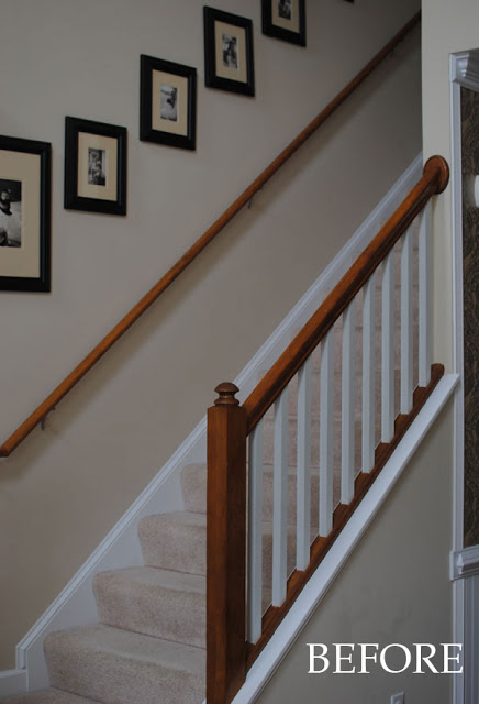
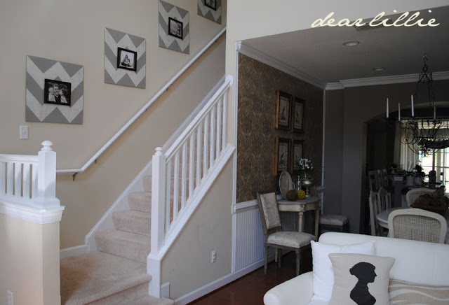
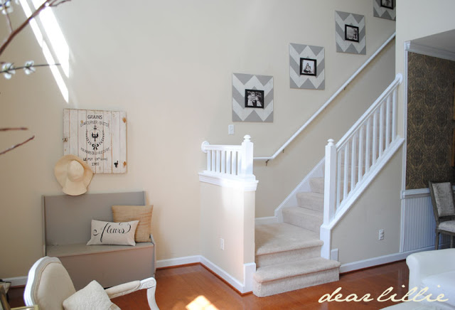
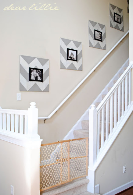
So, I have pretty much hated our staircase since the day we moved in. I didn’t like the mix of orangey wood with the white and I just hung frames we had from our last home going up the stairs. They looked nice in our teeny tiny hallway in our last place but looked so tiny and dull here but I figured I would change them as soon as I could afford the large frames I had in mind for the space. I finally painted the banister and railing last fall and it helped but I still needed to update the frames.
Here it is from a while ago:
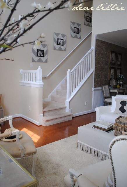
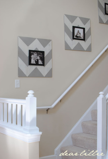
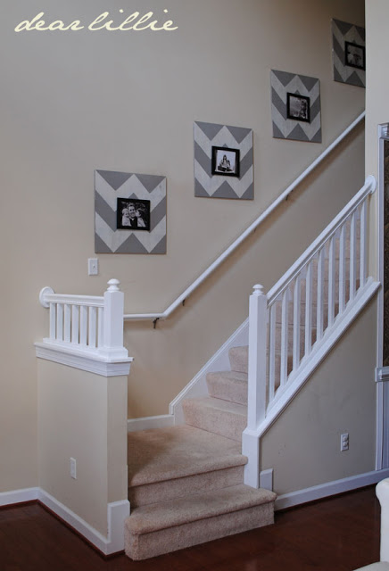
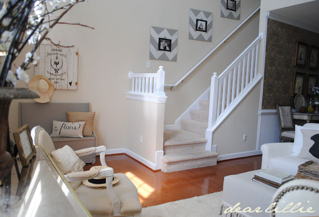
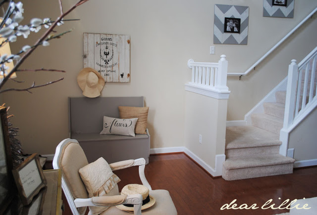
And here it is now:
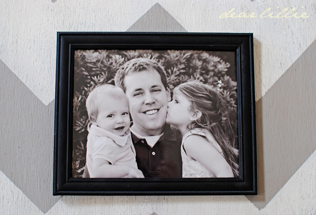
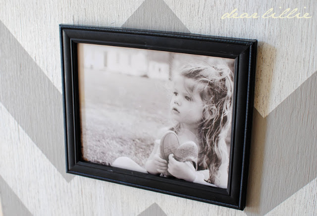
I have to admit I don’t really love how they turned out. They are too bold for my taste so I am planning on painting over the boards at some point but for now I think they are at least better than what was there before! And I can’t complain because I made all five for less than cost of one of the large frames I had been wanting to purchase.
I removed the “Lola’s Fence” as Lillie calls it for the pictures but this is what the bottom of our staircase actually looks like! I have to admit, baby gates are one of my least favorite items. Not just because they are so unattractive but because they are such a paint to climb over… (I have to admit I feel like it is quite an athletic accomplishment when I successfully make it over with one girl on each hip – haha!)
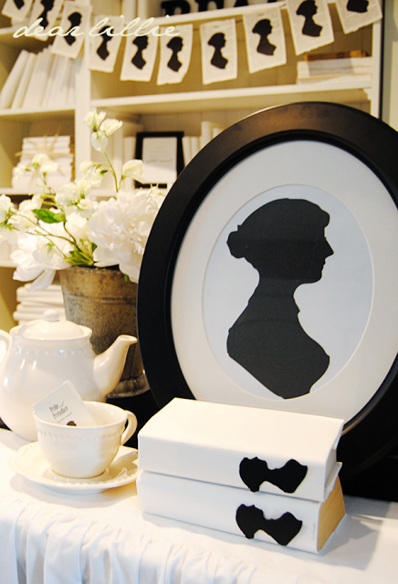
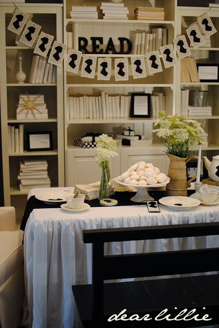
Also, we finally have our Jane Austen cutouts for sale!
If you are new to our blog you can find our whole Jane Austen inspired party here:
I hope you all have a wonderful Tuesday!




That looks fantastic!! I love it painted white,and the pictures look beautiful.
Kathy
Love the frames and I LOVE LOVE the white railings Jennifer! What a difference they make.
Ok first let me say how impressed I am you're able to make it over the gate with TWO of them!!! I'd definitely consider it an athletic accomplishment! Love the updated stairway, looks so much more open with the white paint, and your frames look awesome!
Jennifer your home is exquisite. You can feel the warmth and love in it, and that is just from pictures. I can only imagine in person. I do like the all white banister. Looking forward to more ideas & projects.
The gate in our home we called it "Baby Jail!" 😉 LoL!
Happy Day! Enjoy!!
I know what you been about them being too bold for your taste. However I have to say that from an 'outsiders' perspective, they do not look to bold at all, they look fantastic.
XO
I love how they look on the stairs. Just enough color and contrast. Of course, the photos being so adorable makes it even better.
Your updated staircase is lovely! The white railings and new frames give the entire area such a fresh look.
Makes everything look so much larger! Great improvement!
Blessings, Lorraine
We have the same orangey railing in our house. (Does anyone actually like it?). I was planning on staining it darker but I like the way it looks painted white in your home. The frames are a little bolder than your normal decor but I think they look fantastic. They add an unexpected element to the room.
LOVE!!!!!!!!!!!
Love the make over and the larger frames. What a great idea. I have a similar staircase and hope to add some photos soon.
Love it! It turned out great, and painting the railings made a huge difference. I like the frames as well, very pretty! I understand about the stair gates, I hated mine so much, and I also had to climb over them all the time.
Your frames look wonderful, Jenni! The grey paint makes them not too bold–what an awesome way to give a small frame more bang for the buck!
Baby gates are just a necessary evil, aren't they? We still have a couple, but ours are for doggies now rather than for babies. 🙂
You are such an inspiration. I have moved painting my stair rails to the top of my project list. Love the frames!
I think they look GREAT!!! I know what you mean about them being a little bold for your taste but live with them for while….they inject some modern whimsy. I think they are fun and youthful!!!!
Hugs,
Kim
Hi~~ I think they look fantastic….but I know how you feel, YOU have to love them just as much. I think you did a great job and it's a beautiful transformation.
Hope you are enjoying your week
~Cheryl
I find staircases challenging to decorate! I love the changes you've made to yours. Our staircase also has a lovely baby gate, but I'm having to make friends with it as it will be there for many years to come =) I think beadboard wainscotting (like in your dining room) carried up the staircase would look great!
Maybe you could turn them into more of an ikat feel with a dry brush effect. Still very current, but more classic then the chevron. I do think they look good, just more modern than I am used to seeing in your style.
The painted stairs and rail look amazing!
Liz
I love the jane austen theme cut-outs! -I just started following your blog & can't wait to go back and read your past post!:)
Love the white trim and railing!! 🙂
Great update! Definitely much improved. 🙂 I actually really adore the chevron frames you got going as well.
xoxo,
Melissa
I love how the railings look so nice painted. Thanks for showing us, as that is a project I've been thinking about for a long time!
I think your staircase looks great! Love the white paint! I love the chevron but if you don't that is so easy to change!!
It all looks beautiful! I love the chevron frames and the white railings make it all look so fresh. Great transformation!! Hope you have had a great Thursday as well!!
The stair wall looks great..
You did good..LOL
I like the little punch of modern, it works. You are very creative.
I LOVE the painted rails on your staircase! I am also not a fan of the orangey stained wood, & the white looks fantastic! What type of paint did you use? I also think the frames look fabulous in your home. As another reader said – an unexpected element – yet the colurs blend perfectly!
I used paint from Lowe's for the railing and I DO NOT recommend it. It was AWFUL! My brother and I put three coats on it last fall and to be honest it still needs at least one more, maybe even two. I always use Benjamin Moore's Aura line and have always been completely in love with it. I was at Lowe's picking up something else last fall and figured it couldn't hurt to try something else. Well, I was wrong – never again will I buy paint there. =) I highly recommend going to BM if you choose to paint yours.
I think it looks fabulous! Beautiful job, Jennifer.
Ok I love it all, do u think u'll share the tutorial for the frames?
And I'm looking for a great grey paint! Would u share your grey frame color and your wall color!?? All of your house I have seen is beautiful ! Thanks for the share
Thanks Natasha – we posted the tutorial yesterday. The gray for these frames I made by mixing other colors I had however it is similar to Ashley Gray by Benjamin Moore. The wall color was here when we moved in so I do not know what it is exactly but it is similar to a color we used in our last house called Cream Fleece by Benjamin Moore.
Oh and love the little bench to the left, did u paint that too its great grey color also, could u share that color to! Lol
The bench is Ashely Gray by BM.
I love the look of your painted rails on your staircase! The frames look fabulous! They turned out great! But I think the problem that you are feeling and I see also is there very modern and its just not the style that we usually see from you. But give yourself sometime with them they may grow on you. If not just go back to what your heart was really set on. Those larger frames!! LOVE YOUR BLOG!! AND HEARING ABOUT YOUR SWEET FAIMLY!
Your staircase looks so pretty painted white! I want to paint my staircase so bad but it seems to go on forever and there is so much orange wood. I think if I started I would be painting forever! I think the frames look great!
Angie 🙂
nice transformation! @nne
Jennifer, love how your staircase turned out – hate mine aswell, I think I'll paint it all aswell, much cleaner when it's all the same colour. Agree the frames are a bit bold but the colours are perfect and they do add a great punch to the wall. Mine has nothing, it's soooo boring! Anyway think its good to mix it up every now and then. I have a modern piece of art over my fireplace which is a temporary fix until I put up a large mirror, that I wasn't really mad about but now I love it!
Sharon
I'm with you, the chevron is a little to bold and ziggy zaggy for my tastes too, but i like the color gray in the zig or is it the zag… and your staircase is so beautiful painted white… it's neat to get a view of that side of the room… Your house is just gorgeous from every angle, all the colors totally flow together…
Cindy
Your staircase is stunning! I love the contrast of white, gray, and black. It's beautiful as always!
-Cathy
I LOVE the frames! Painting the railing and the banister also made a huge difference!