
Today we are excited to share with you our upstairs bathroom makeover which we generally refer to as “the girls’ bathroom”. Along with five other bloggers, we partnered up with Wayfair for this transformation and it was so much fun! Wayfair has super fast shipping on the majority of their items and from the time we started planning this makeover to the time we photographed it was only about 60 days. And the actual remodel part was less than ten days! So here we go:
Except for the wallpaper, which we got from DecoratorsBest, we got pretty much everything for this remodel from Wayfair – from the floor tile, shower tile, the toilet, mirrors, sconce and all of the fixtures – even the cabinet pulls and toilet paper holder! They have such a huge selection to choose from and they have amazing customer service and are so wonderful to work with!
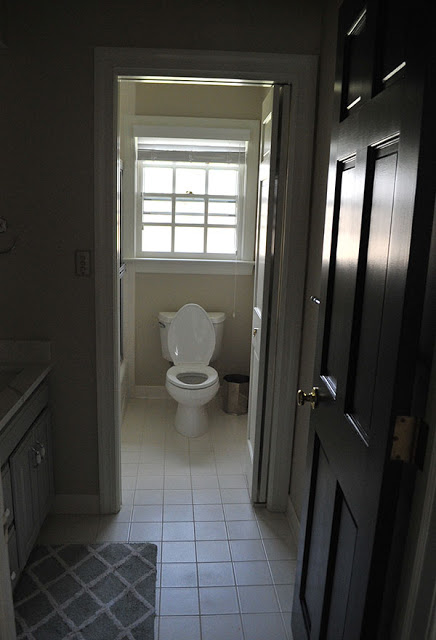
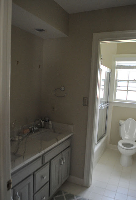
Here’s a before shot from when we moved in. It was completely fine but we wanted to give it a little more personality.
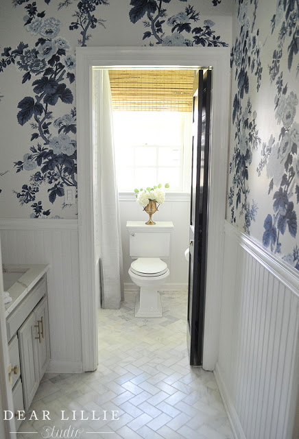
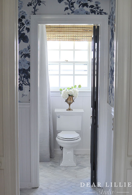
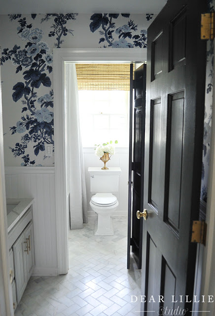
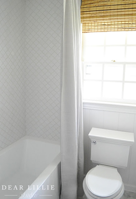
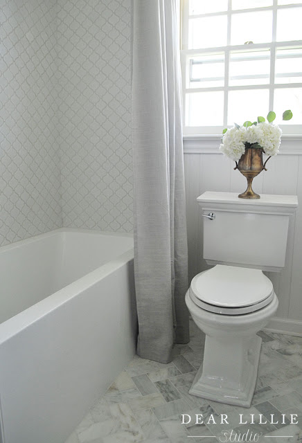
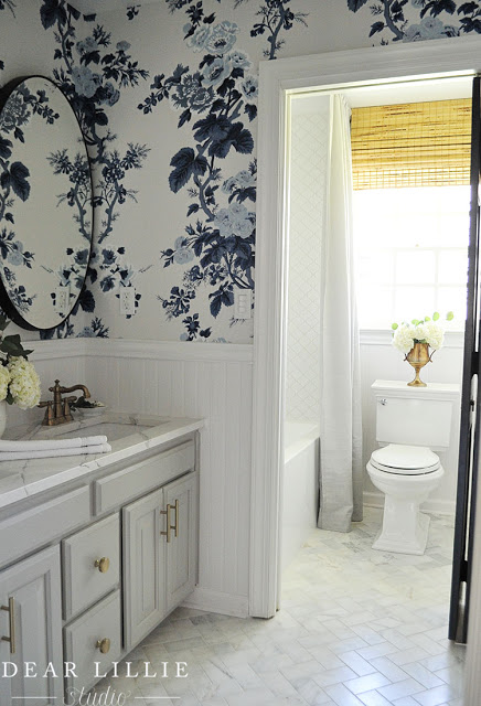
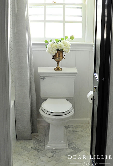
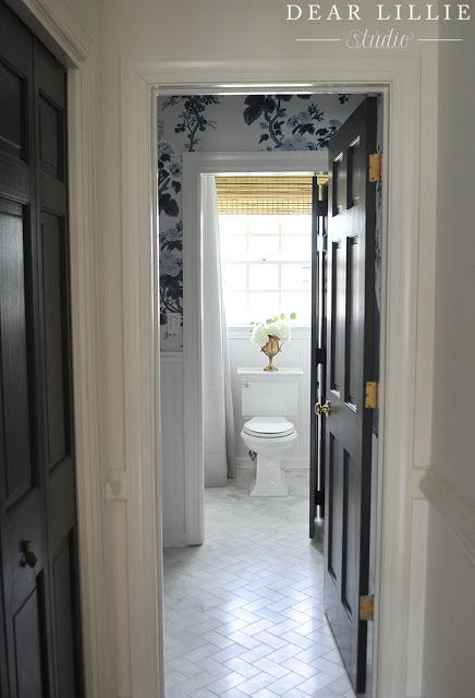
And here it is now! We originally thought about playing around with the layout a bit so that the toilet wasn’t the focus when you looked in from the hallway but after talking with the contractor and realizing that would double our labor costs we decided to keep it where it was and choose a toilet that we loved the look of. We actually chose this exact toilet in our last house and LOVED the clean lines of it so we went with it again and I am so glad we did. As silly as it may sound, I think it is a really pretty toilet – ha! And then by adding lots of visual interest with the bold wallpaper, the beadboard and the herringbone pattern on the floor it helps distract your eye from staring at the toilet too long.
Another before angle:
And now:
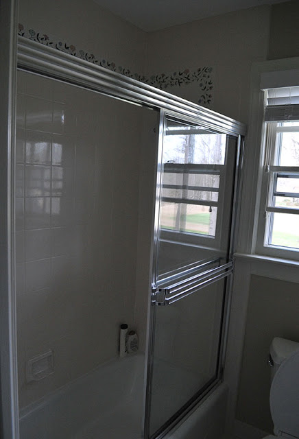
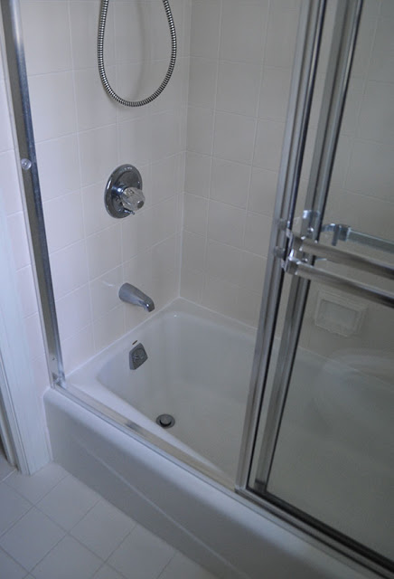
And here was the shower – it felt cramped before:
but now by sticking with a white color scheme and removing the doors it feel so much larger:
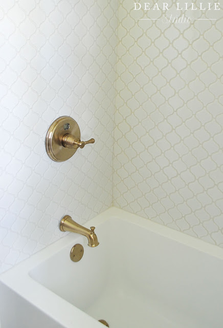
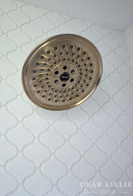
I love the large soaking tub we chose and the interest that the pattern the tile above it has. By keeping it all white it helps keep the space feeling larger and more open but the pattern keeps it from being boring!
and another before shot:
and now:
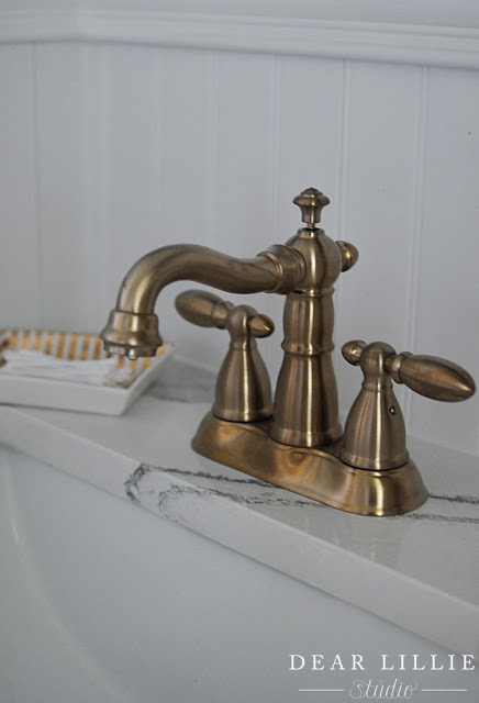
We went with Delta’s Brilliance Champagne Bronze color for the tub and shower fixtures as well as the ones for the sink. It is such a pretty color and I love the subtle touch of glamour it adds to the space.
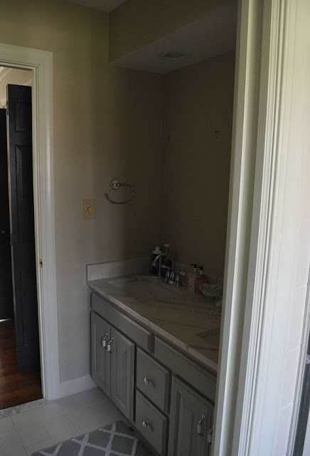
Here’s another before shot. Getting rid of the soffit made such a difference.
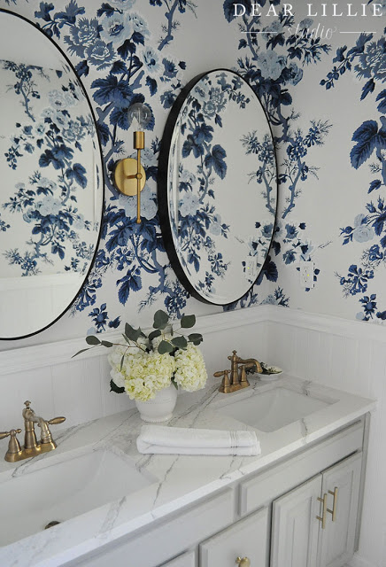
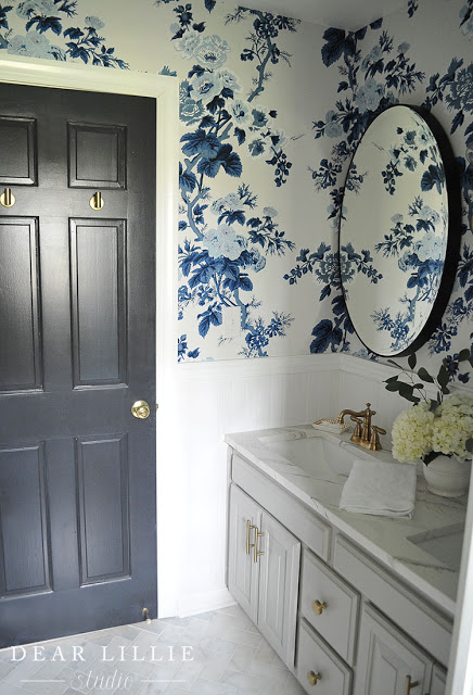
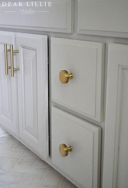
The vanity had recently been painted and a new counter added by the previous owner so we kept those things as is and then just updated the faucets and handles to go with the rest of the space. We also had the back and side splashes removed which I really think helps make the whole vanity feel so much more updated.
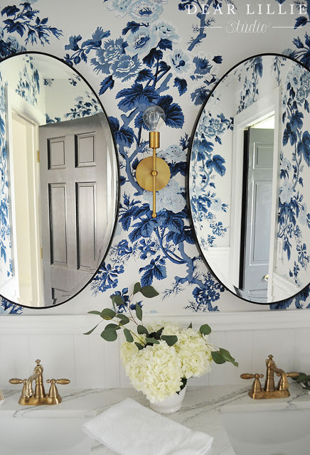
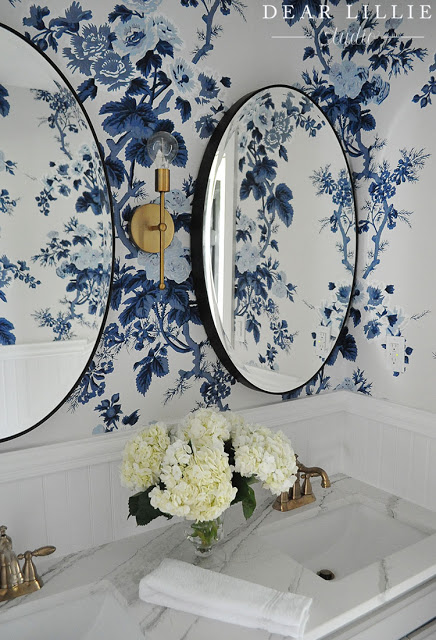
To really add interest we went with a bold wallpaper. My girls have very very different taste (as you can tell from each of their bedrooms – Lillie’s can be found here and Lola’s here) so the fact that they BOTH chose this wallpaper as their favorite was quite shocking! Haha! I had picked out ten or so that I thought they might like and never thought they would both end up liking the same one! I had them each list their top three and then was hoping there would be one that would be on both of their lists so was thrilled when they both listed this as their number one option! We got it from our sponsor, DecoratorsBest and it is absolutely beautiful! I have been eyeing it for several years now and was so excited to have a space where it worked so well! I love how bright and cheery it is and that the pattern is traditional but the bright color makes it feel more modern. I also love that when we are at the top of the stairs you can see both this wallpaper and Lola’s and they coordinate really well together!
I not only love the oval shape of the mirrors, I love their unexpected thickness too.
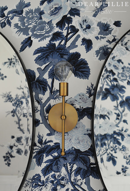
I had a hard time deciding on a sconce. I originally had chosen something more traditional but the color I wanted was on backorder so I had a few other similar ones I was deciding on and then decided to go with something a little bit more modern for a fun twist. I really like how it turned out but also know that if I decide I was something a little more traditional I can always add a basic shade to it.
I enjoy mixing some modern touches with some more vintage ones. This faucet has a vintage feel to it and I love how it looks against the beadboard.
We added these pulls and knobs to the vanity for another modern touch:
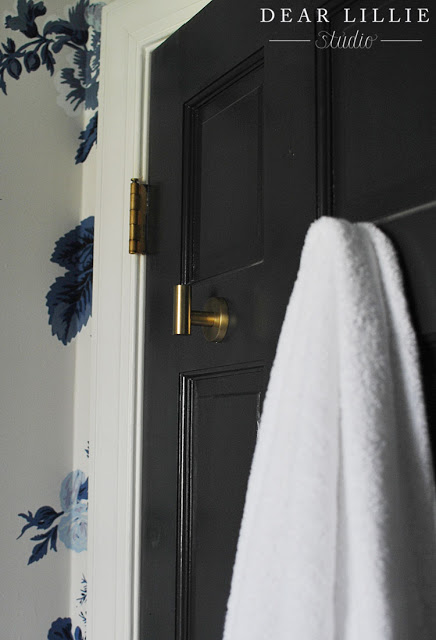
We also added some hooks to the back of the door for the girls to hang their towels on:
The marble floor is probably one of my favorite parts. I love that it feel classic and clean but also has a bit of a modern touch with the herringbone pattern.Along with being able to do this makeover quickly we also were able to keep our budget for materials under $3000! I am so happy that we did this project and love seeing it as I go up and down the stairs each day!
SOURCE LIST:
Trim Color – Simply White in Semi-Gloss by Benjamin Moore
Back Wall Color – Simply White in Eggshell by Benjamin Moore
Doors – Mopboard Black in Semi-gloss by Benjamin Moore
Tub and Shower Faucet – Wayfair – Brilliance Champagne Bronze
Vanity Pulls – Wayfair – Golden Champagne
Vanity Knobs – Wayfair – Golden Champagne
Vanity and Counter – Existing (and don’t know paint color – sorry)
Hooks for Towels – Wayfair – Brushed Bronze
Toilet Paper Holder – Wayfair – Brushed Bronze
Shower Curtain – HomeGoods (A Set of Draperies)
Trophy Urn – The Arrows Nest
Contractor – Bathrooms Made Easy by Ryan
Vanity – existing so don’t know paint color
Countertop – existing so don’t know any details but it appears to be quartz
Items in this post were provided by Wayfair in exchange for this feature. All items were chosen by me and all thoughts and opinions are my own. Decorator’s Best provided the wallpaper in exchange for this feature. All thoughts and opinions are my own. Affiliate links are used at no cost to the viewer.
SaveSave
SaveSave
SaveSave


 JavaScript is currently disabled in this browser. Reactivate it to view this content.


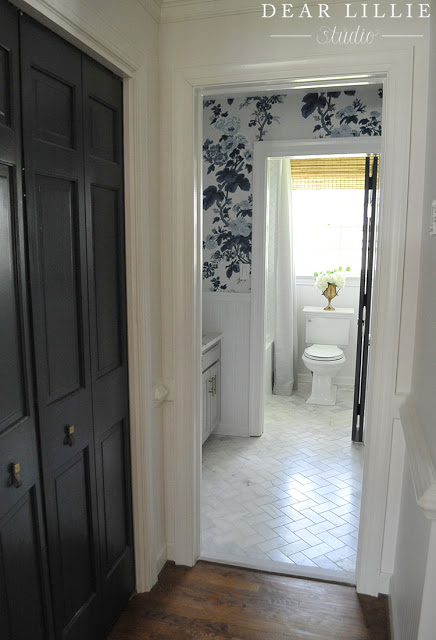


Really love this new look. Great how modern the marble counter now looks with that wallpaper.
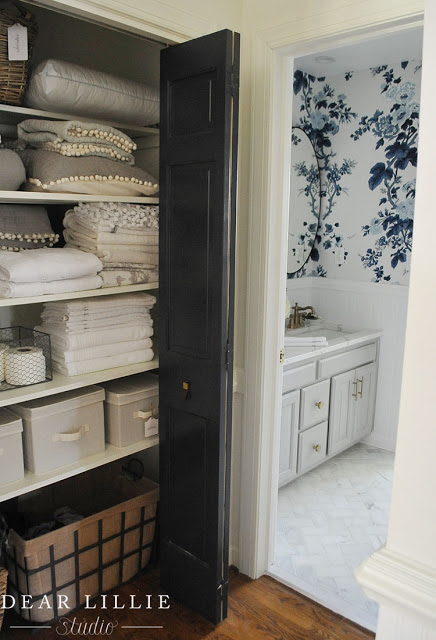
could you tell where you got the big wire baskets in the linen closet. thanks
Hi! You can find a complete source list for that closet here: http://dearlillieblog.blogspot.com/2017/02/some-progress-in-our-upstairs-hallway.html
-Jason
The girls' bathroom is BEAUTIFUL! I love it — so fresh and pretty. May I offer one suggestion to keep it that way? After every use of the sink, have them wipe up the water off the marble and away from the bead board. I have a pool bath marble vanity that has been discolored from water splashing from hand washing and then left there. (Boys, you know!) And my kitchen bead board is showing signs of chipped paint and rot from kids not wiping up. The only solution I know is to be proactive.
Incredible. I love the change. I'm sure the girls enjoy sharing this beautiful space. I adore Wayfair and all the products they offer. Your linen closet is just the best. Lynne
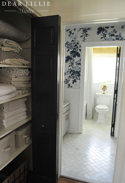
Are the doors a dark navy or black? What is the paint color? Thanks! Absolutely love!
Thanks, Kelsey! They're Mopboard Black by Benjamin Moore!
-Jason
Beautiful room with that blue floral wallpaper and white/black theme. I wouldn't have imagined it, but wow.
This is above and beyond stunning! Seriously!!! 💙
When you took out the soffit, did you add other lighting, besides the sconce? We have soffits with fluorescent lights in all of our bathrooms and are looking into ideas when we remove them.
Hi, Andrea! Yes, Jenni added two simple recessed lights in the ceiling in the same spots where they were in the soffit (so essentially they just moved up a foot or so).
-Jason
What color curtain rod did you use? We're you able to find one to match the shower hardware?
Hi, Meredith! Jenni used a solid white shower curtain rod to help blend in with the white tile and ceiling.
-Jason
Jennifer, The bathroom is stunning! Great job. I'd love a few more details as to how you hung the curtains for the shower? I love the look of a floor to ceiling to ceiling shower curtain, but am unsure of how to pull it off (and incorporate a liner, etc.). Thanks!
Thanks, Denise! Jenni added the liner a few days after the photos were taken (she took all these just a few hours after the renovation was completed). She ended up going with an extra long clear liner from HomeGoods, and it just hides behind the curtain.
-Jason
I love it. I love the gold accents. It looks completely updated. So pretty.
Beautiful room- as always! 🙂 Do you have any guesses on the color of the vanity? I am looking for a color like this for our guest bathroom.
Thank you, Quinn! Unfortunately it was existing when Jenni moved in, so she doesn’t have that info. We tried to come up with a Benjamin Moore color that was similar, but couldn’t really find one that was close enough to safely recommend. Sorry we can’t offer much help! 🙁
-Jason
This room is beautiful! I’ve wondered how well it works to have the bead board wallpaper as a backsplash- especially in a room used by young children. How has your experience been, and did you use any type of product to make it extra waterproof?
Thank you, Becky! The beadboard has worked really well (although it isn’t wallpaper)! it is actual beadboard that is designed for bathrooms, so we didn’t have to do anything extra to it.
-Jason