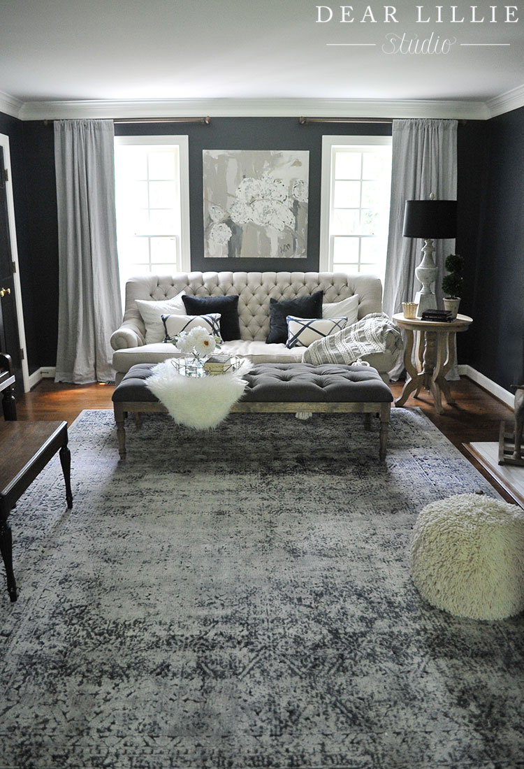
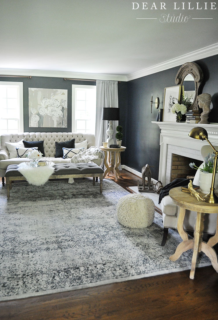
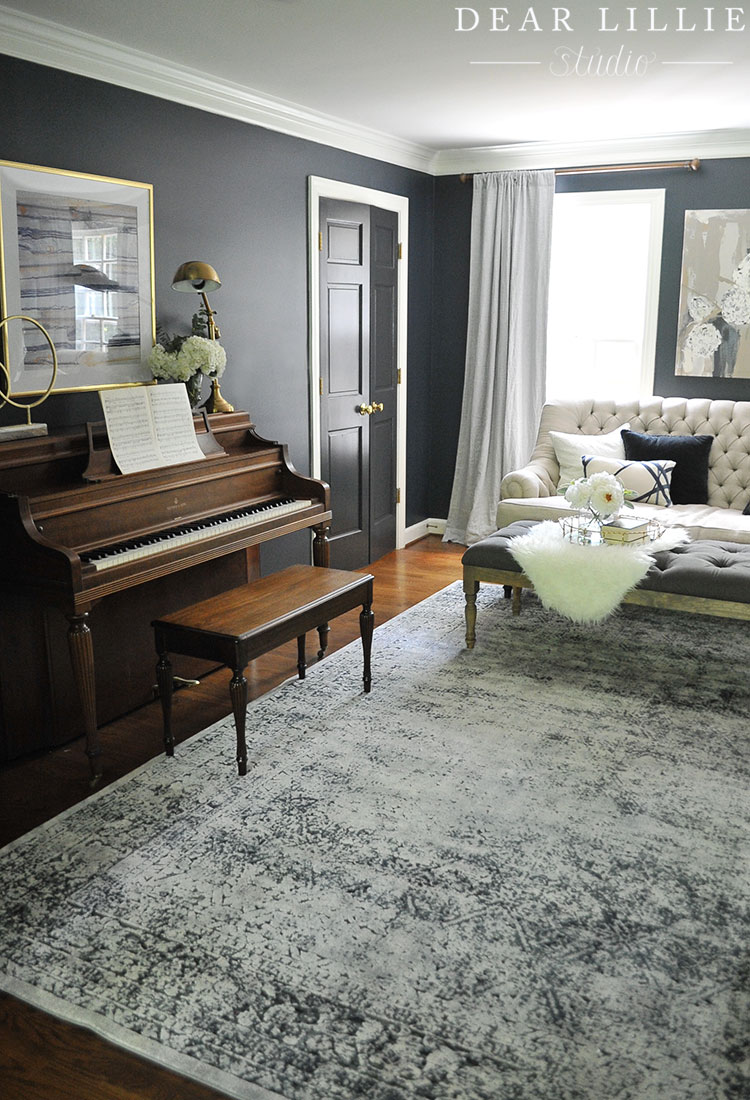
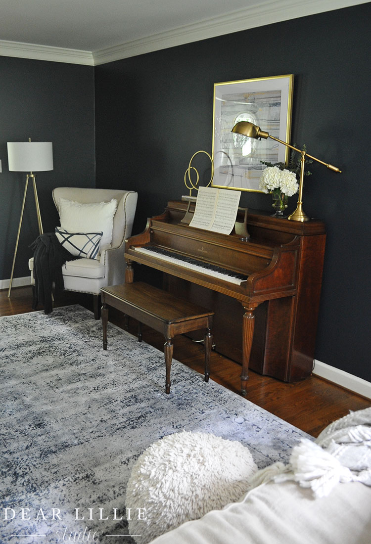
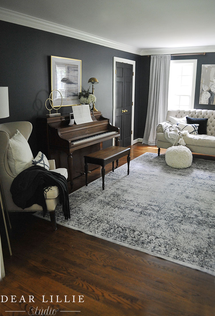
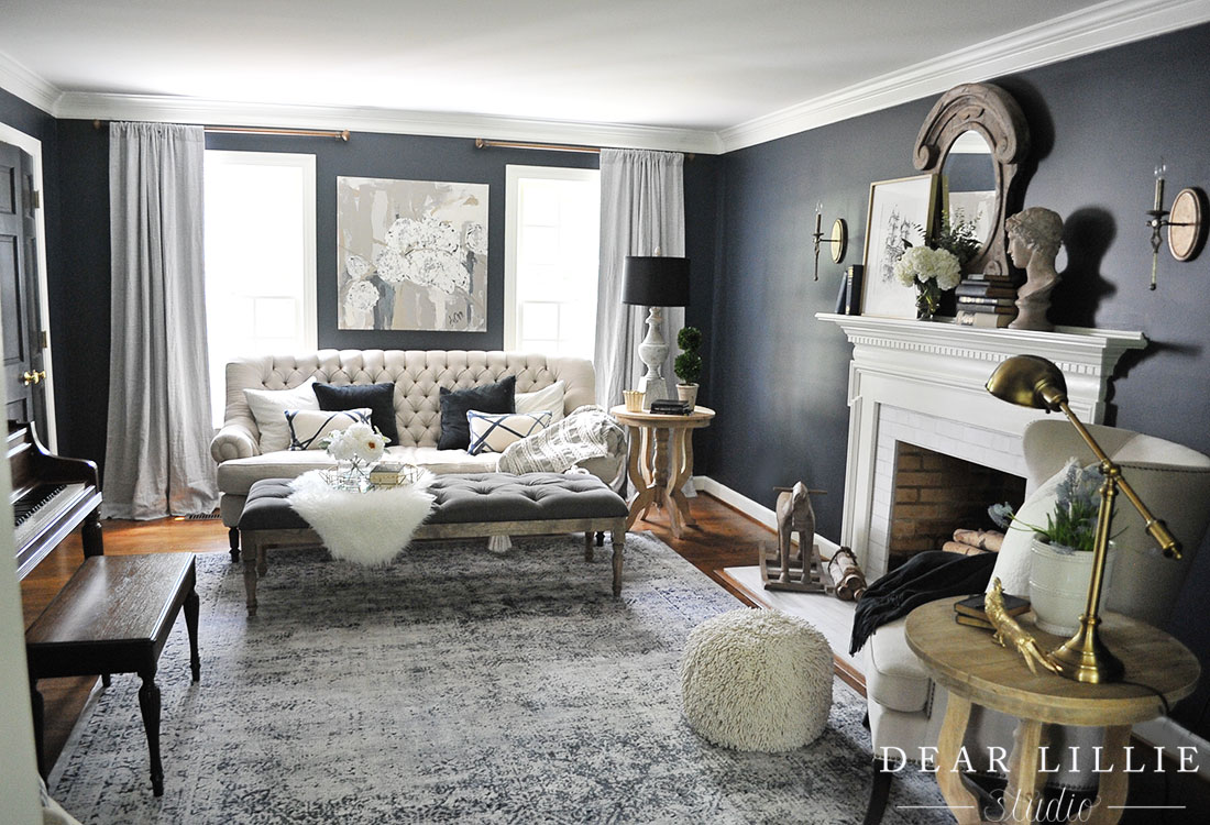
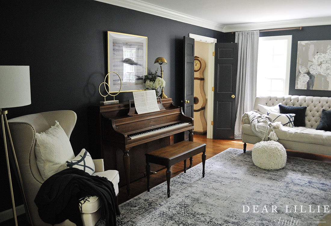
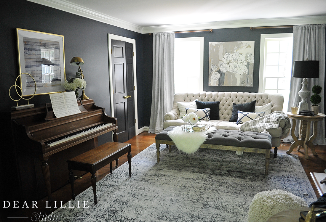
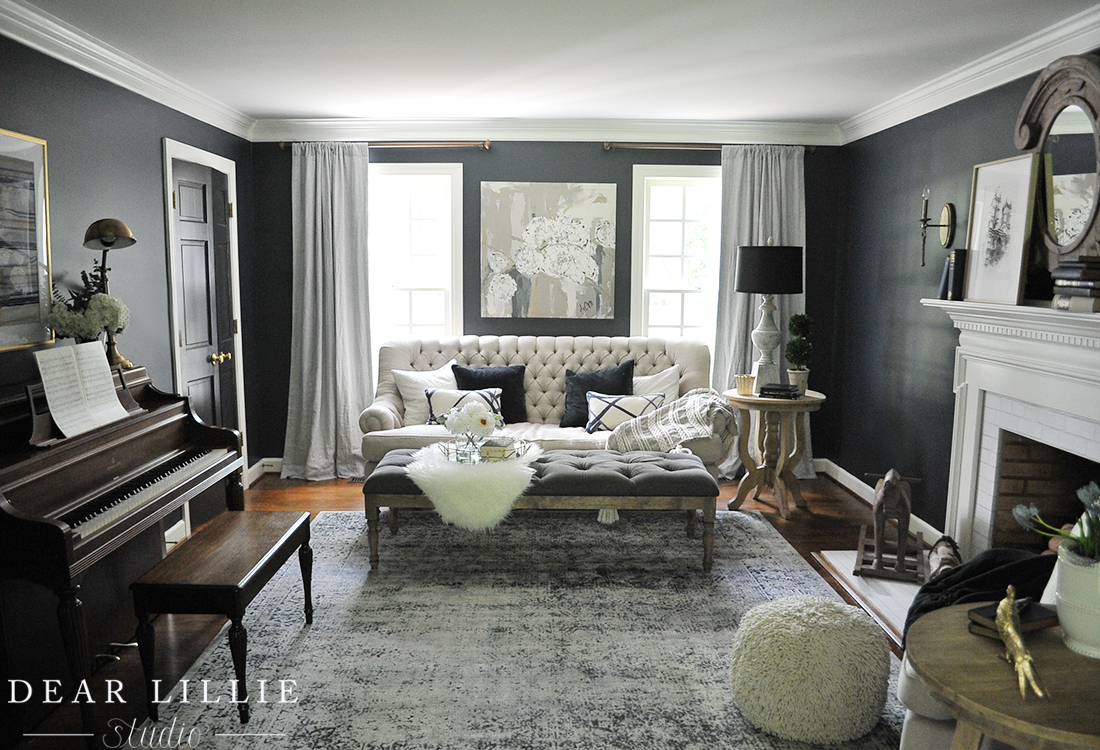
Although it definitely isn’t finished, we’ve made some more progress in our living room. We added a new larger rug from our sponsor, eSale Rugs and it is beautiful! I love how it looks against the dark walls and light colored sofa. It’s similar to the one in our family room that we love but a little bit darker. They have so many different style rugs that I just love the colors of, so it was hard to decide but I am glad we ultimately went with this one! We moved the rug that we had in here (that was a bit smaller) to the dining room and they really complement each other. I pulled the ottoman from our family room in here for a few days to help me decide what size and shape I was going to go with for a coffee table and I think I’ve found one so hopefully the next time I photograph this room I will have that in here and won’t have to keep stealing the ottoman – ha!
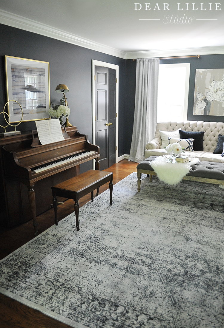
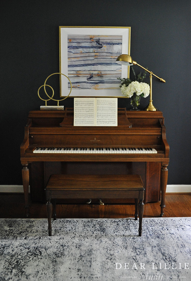
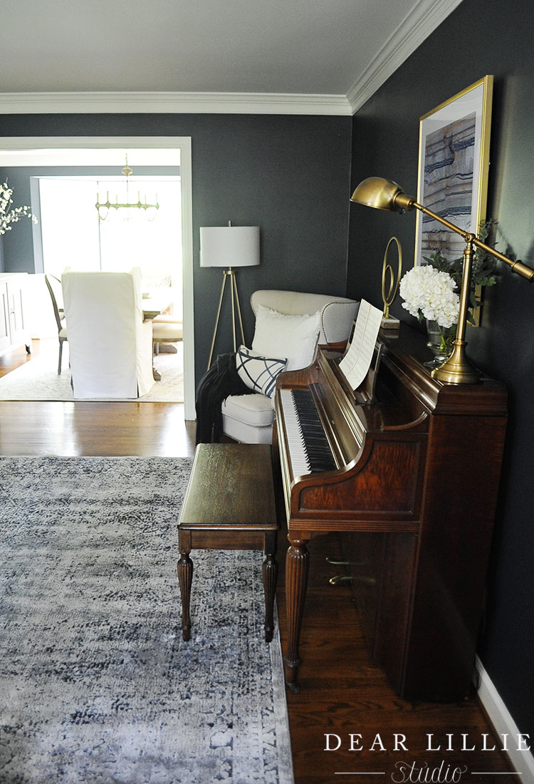
The other big addition to our living room was this piano! Lillie has started taking lessons and after hunting for months and months on Craigslist for an inexpensive one with no luck, a friend told us about an estate sale and sure enough we were able to get this one for a steal! Of course it ended up needing quite a bit of work, ha, but Lillie is absolutely in love with it and I am woken up just about every morning to the sound of her playing. I love how the vintage feel of the rug looks with the piano and the the contrast that the modern art above it adds to the space.
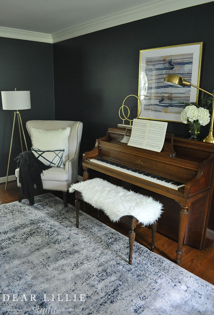
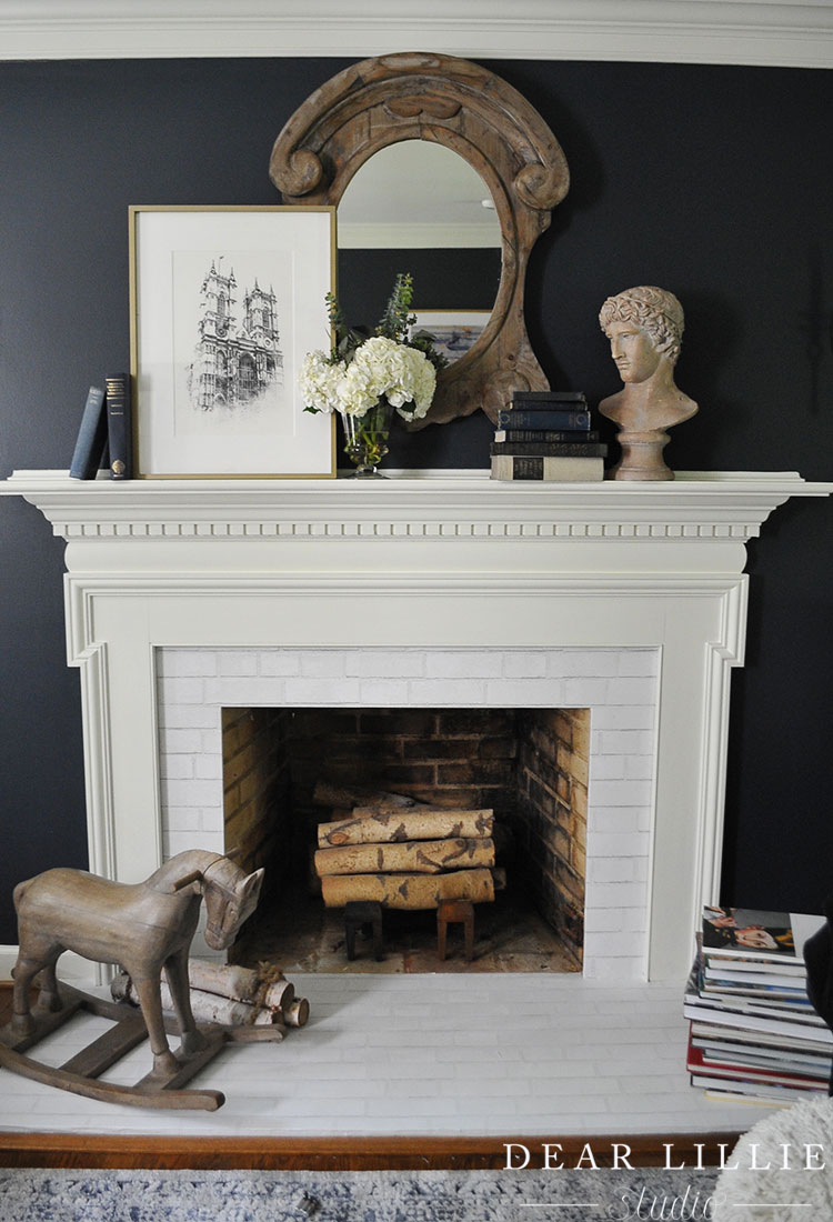
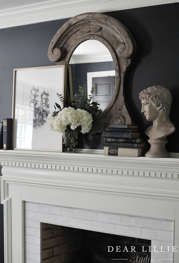
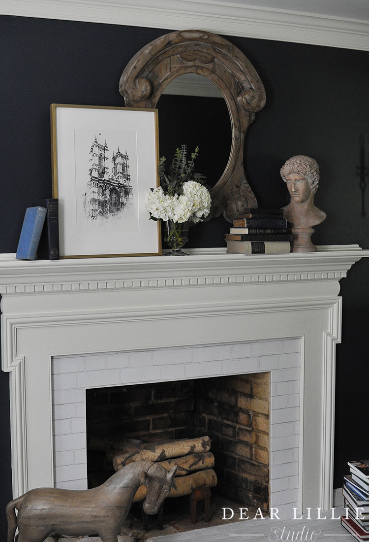
This mirror is just in here temporarily. I found a gold one that hangs horizontally that is supposed to arrive tomorrow and then this will go back into our powder room.
If you haven’t had a chance we definitely recommend heading over to eSale Rugs to check out their beautiful selection of rugs!



Your new website is beautiful! One complaint though there is not an easy way to navigate between current and previous posts, maybe it’s my computer Apple Air? You either need to scroll all the way to the bottom and click on the previous post through archives or you need to scroll back to home. It’s a true time sucker! I truly love seeing everything you post!
Thank you, Jackie! And thank you for the feedback!
Is there somewhere would you like to see navigation buttons within the blog post page that would be more helpful than the options currently available? Right now I would say the best way to navigate through our blog posts would be to use the Archives widget on the right sidebar (sorted by year and month), but we are always open to suggestions for improvement!
-Jason
Jason, thank you for responding. Truthfully, this is one of the things I appreciate most about the “Dear Lillie” blog, you are truly humble, kind people! The archives widget does not show up on the sidebar of the apple tablet, it shows up under your “our spaces” pictures. Making for extra scrolling. It was really nice having the old way of posts just rolling one right after the other and having the ability to click on previous post, etc. like I mentioned before it just may be my apple tablet. It may just be something I will have to navigate through. I do appreciate your willingness to find a possible solution.
Thank you for the kind words, Jackie! We now finally have navigation buttons at the beginning and end of all post!
-Jason
Looks gorgeous! And the new website looks wonderful too! So clean and fresh. And I’m glad you kept all the archives up too – I’ve been reading along for years now and sometimes I will look back through older posts to be inspired too. Thanks for all you do!
Thanks, Sarah! And thank you for checking out the new site! We still have lots of content to add to some “non-essential” pages (like the source list pages for Jenni’s home) and a few things here and there that should help you find specific content a little easier!
-Jason