Happy Saturday! I hope you all have had a fabulous week! I can’t believe another week has gone by and it’s the weekend again! Today we are excited to share with you another client space. This one is the dining room that is next to the sitting room of the Classic Yorktown home we shared last week.
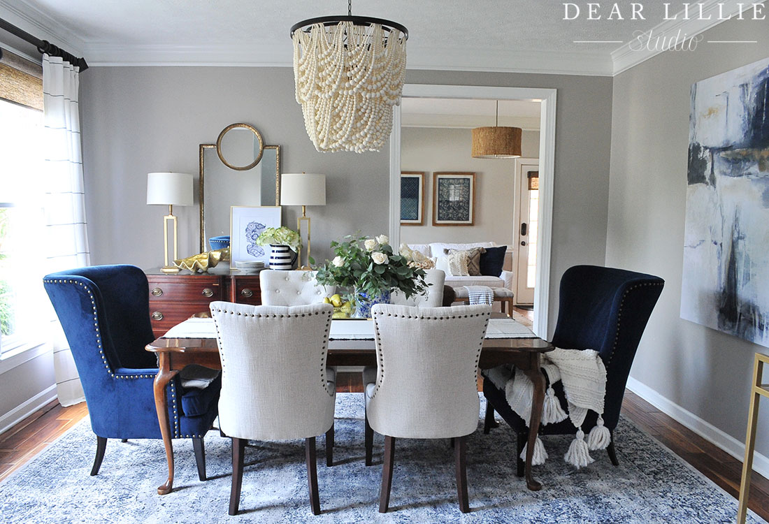
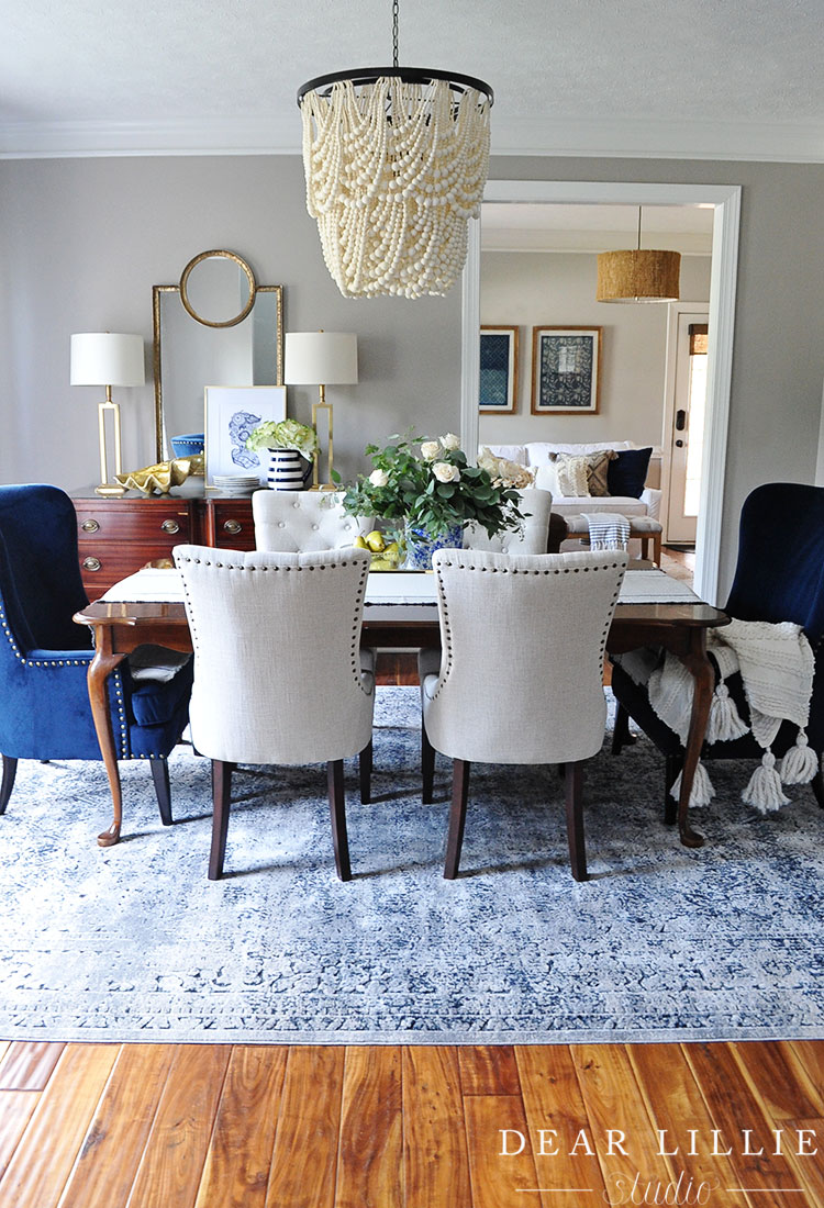
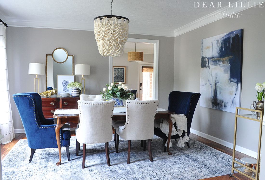
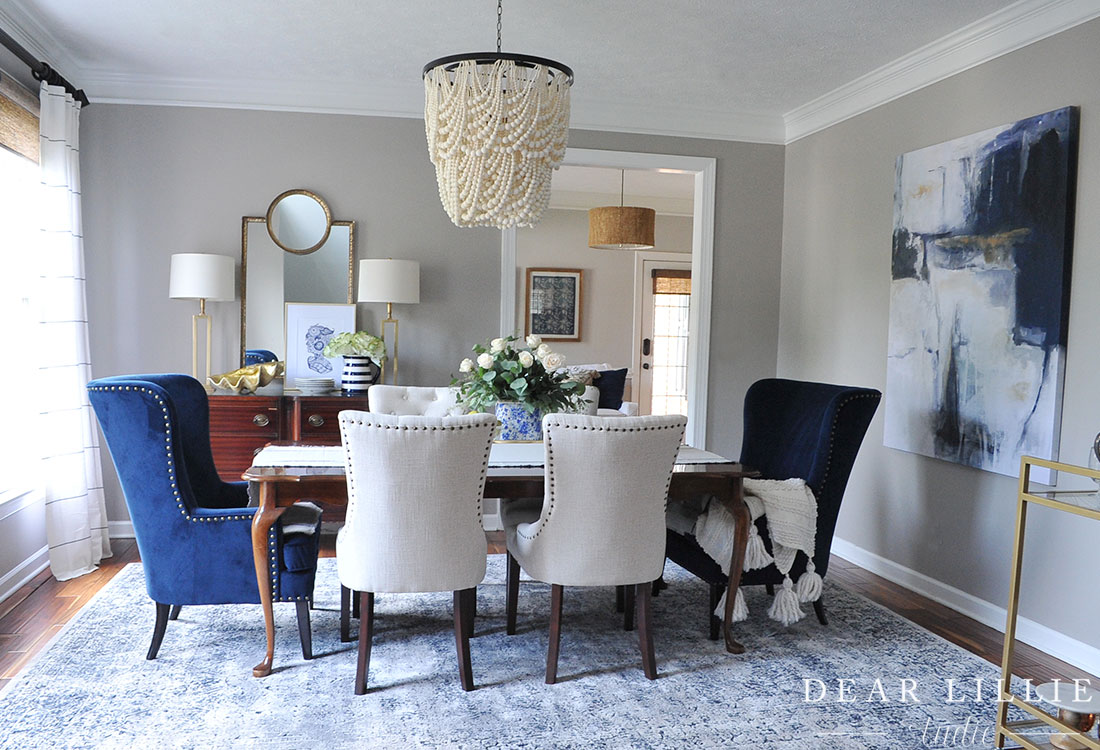
Just like the sitting room, this space already had a great start. The walls had been recently painted a soft neutral gray color and the home owner had a beautiful dining room table and buffet that had been passed down from family. We wanted to keep those elements but really add some updated touches to the space and give it both a sophisticated, yet also bright and fun feel!
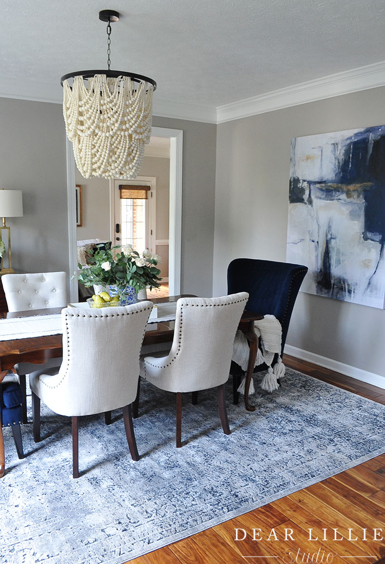
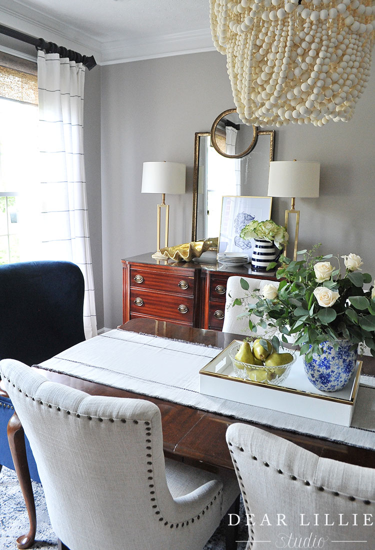
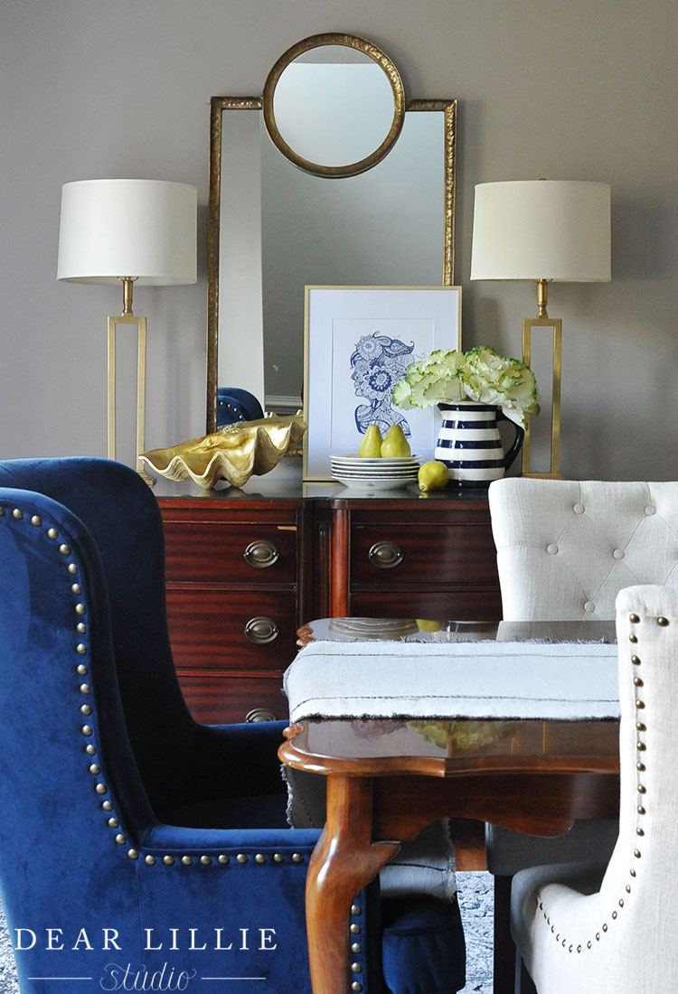
The chandelier is really the showstopper in this space! It has an elegant look to it, yet still feels kind of quirky and fun too! Then after coming up with several different directions we could go in this room we decided to go with a navy and gold color scheme (and then we pulled that on through to the sitting room). The end chairs really anchor the space and pull out the beautiful blues in the artwork while the lighter side chairs pull out the softer more neutral tones in the room.
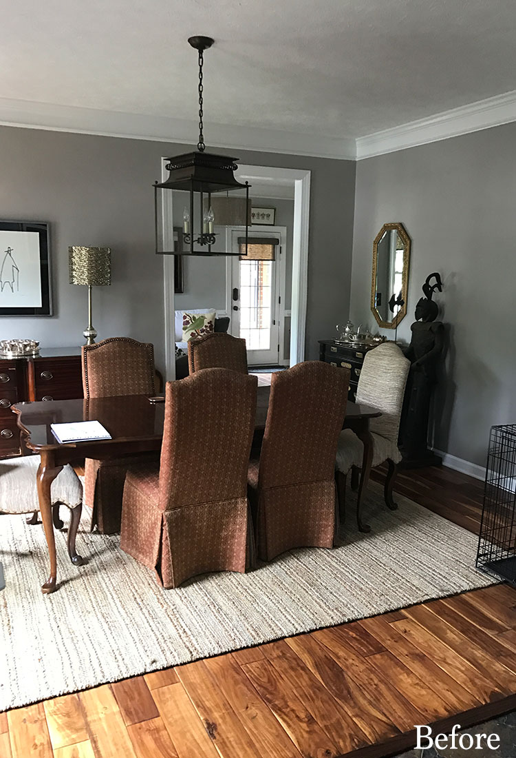
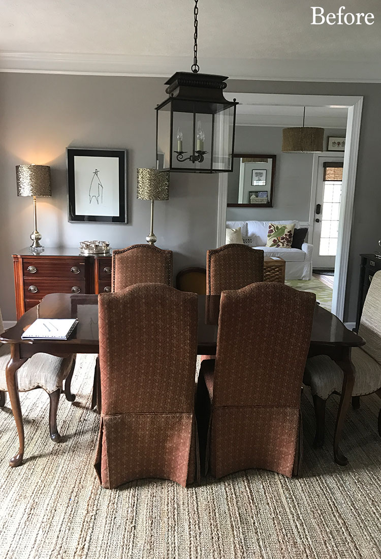
Here’s another shot of our starting off point (don’t worry, we didn’t get rid of the lantern – we love it and it is now hanging in the client’s kitchen! We just wanted something that made a bit more of a statement in here).
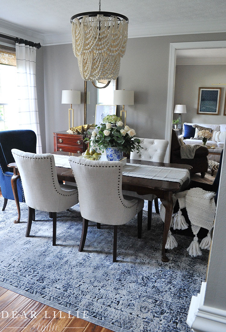
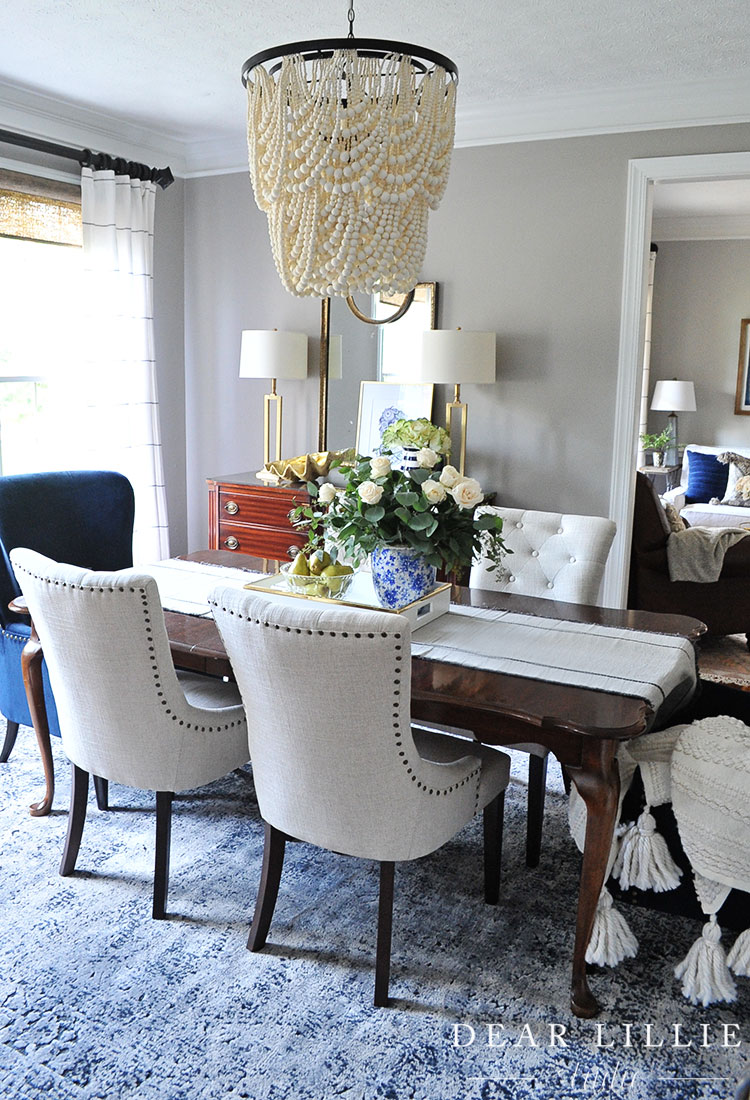
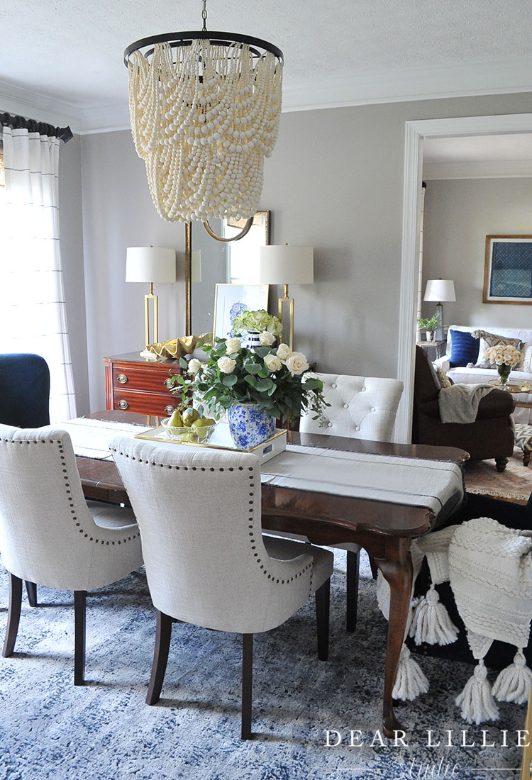
I love this view from the dining room into the sitting room and how the colors all work so well together and I love the mix of traditional pieces passed down from family tied together with newer more modern pieces. This room has pieces from the homeowner’s mother, grandmother and artwork drawn by her daughter! I feel like that makes the room feel particularly special!
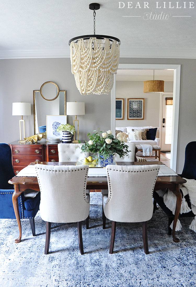
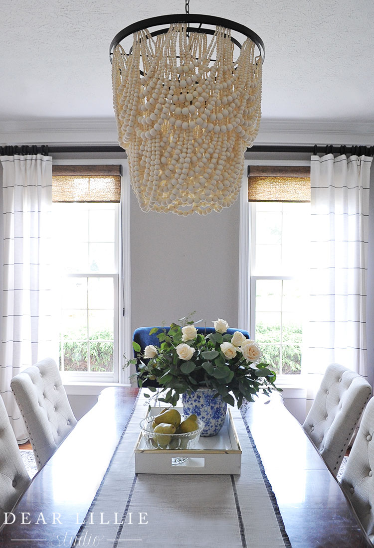
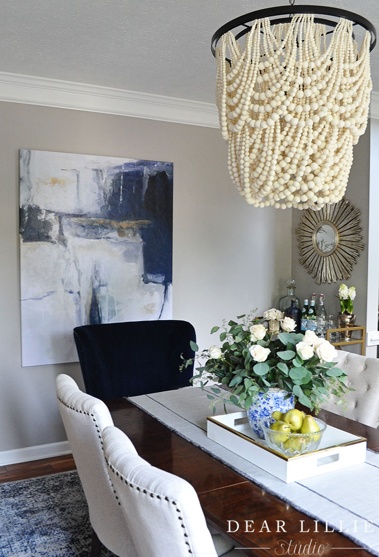
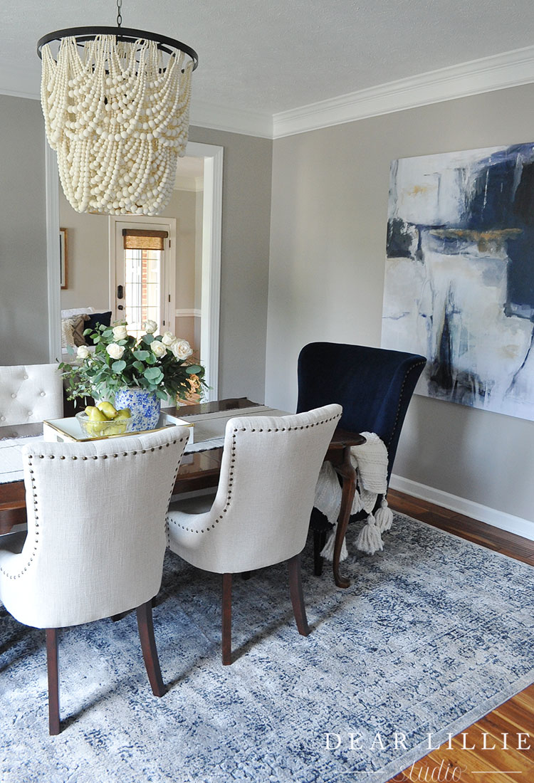
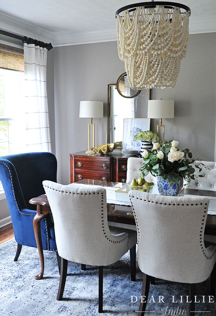
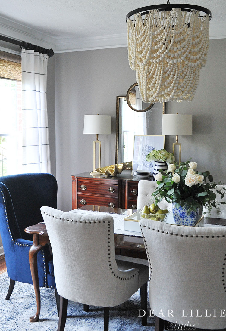
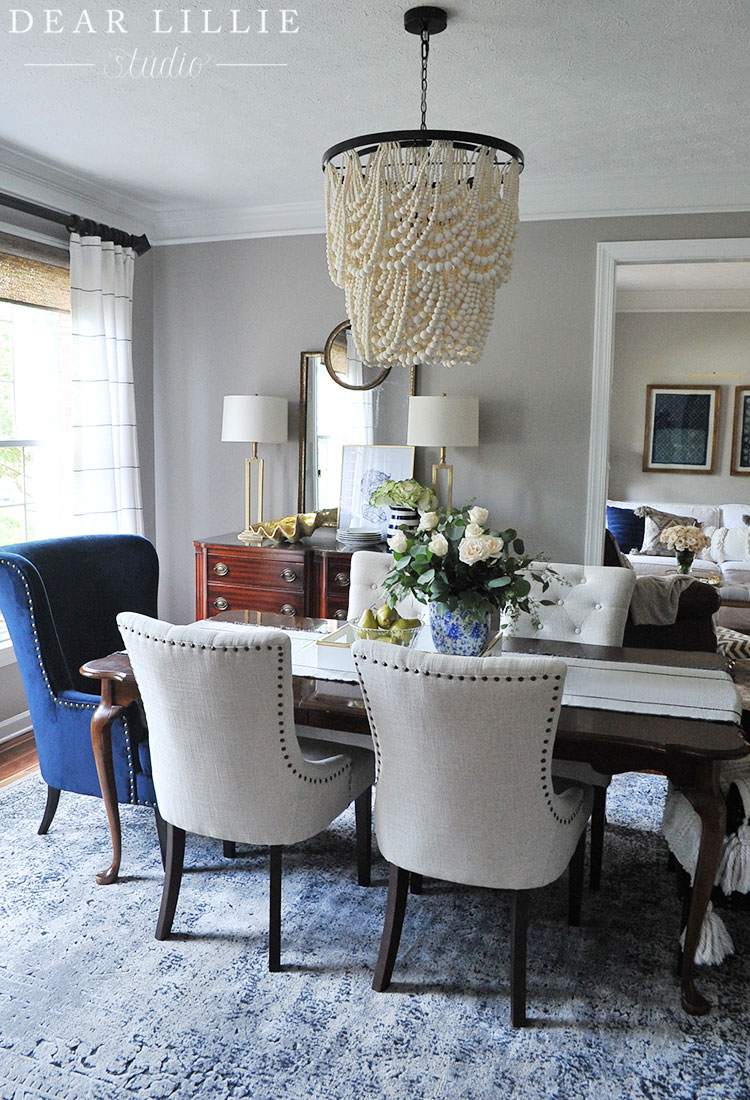
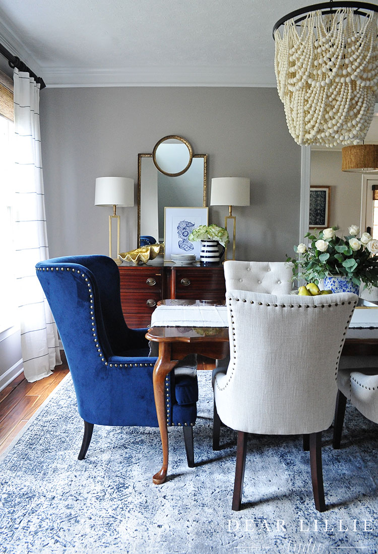
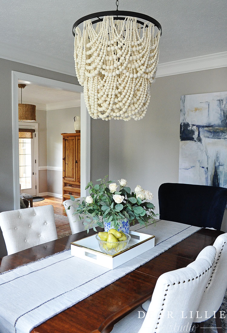
This rug is actually the one from my living room! Ha! We had tried a couple other rugs in here and they just weren’t right so I decided it couldn’t hurt to try mine and it was perfect! It really pulled the whole space together. So we decided to keep it here!
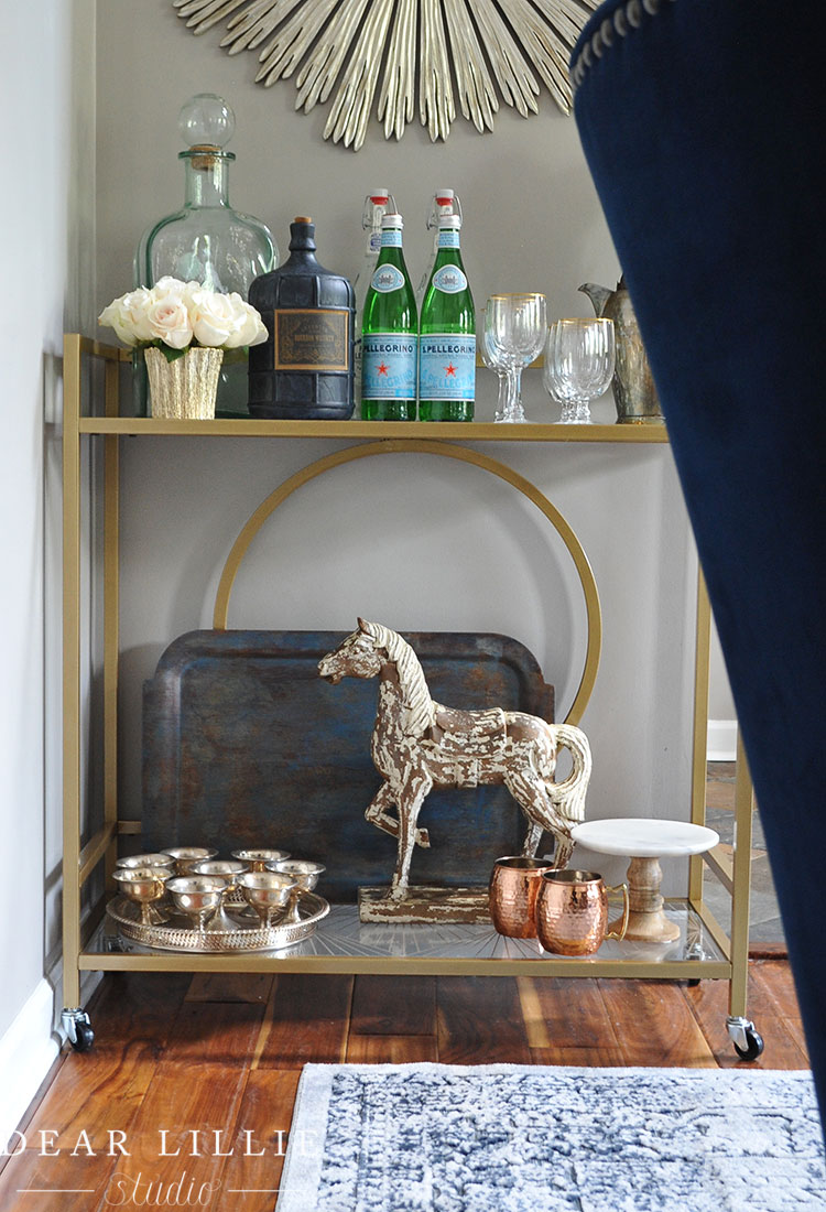
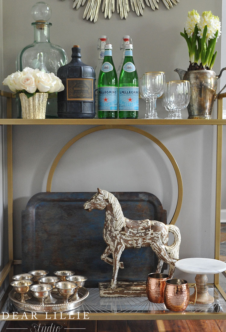
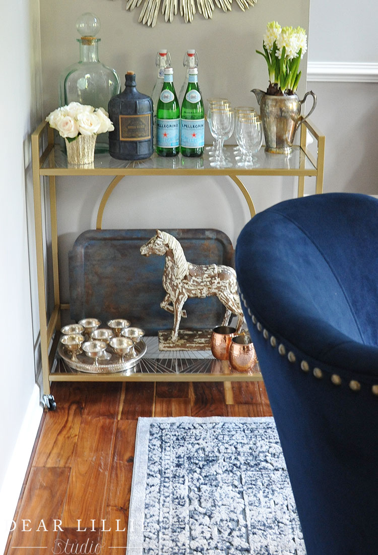
We are still playing around a little bit with what to put on the bar cart but I love the fun shape of it!


And here’s a peek of the adjoining sitting room which we shared last week.
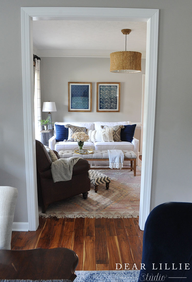
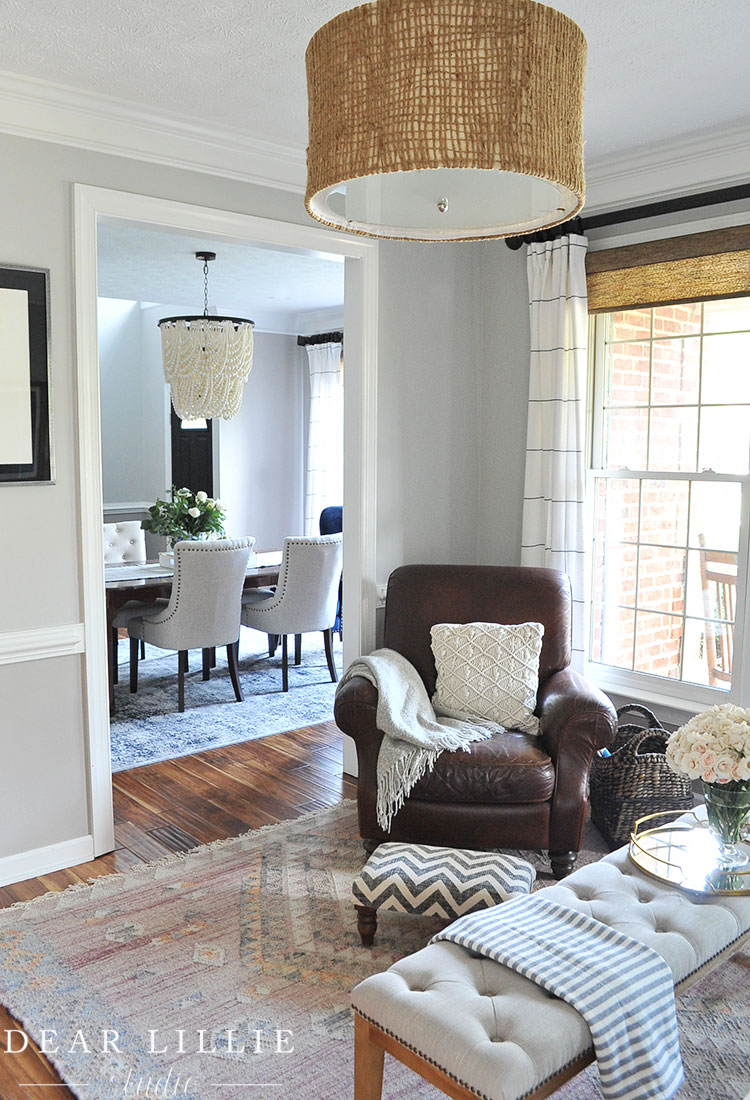
And here’s a view of the dining room from the sitting room:
Source List:
Walls and Trim – Existing
Table – Home owners (Family Antique)
Buffett – Home owners (Family Antique)
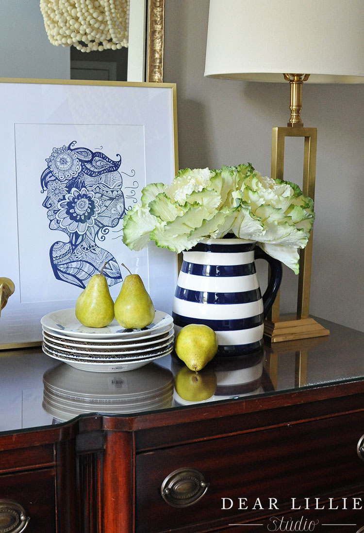
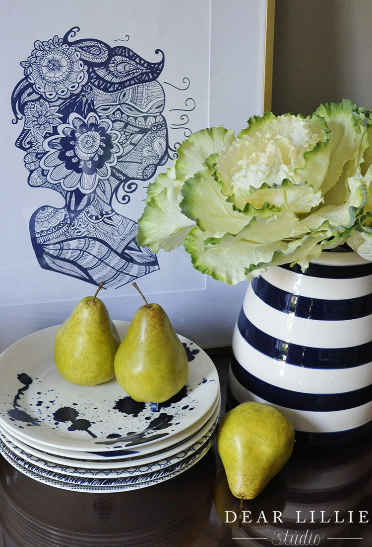
Drawing of Girl – Done by the Home owner’s talented daughter
Frame the Girl Drawing Is In – Target
Striped Pitcher – HomeGoods
Faux Lettuce – Seasons of Williamsburg
Gold Shell – HomeGoods
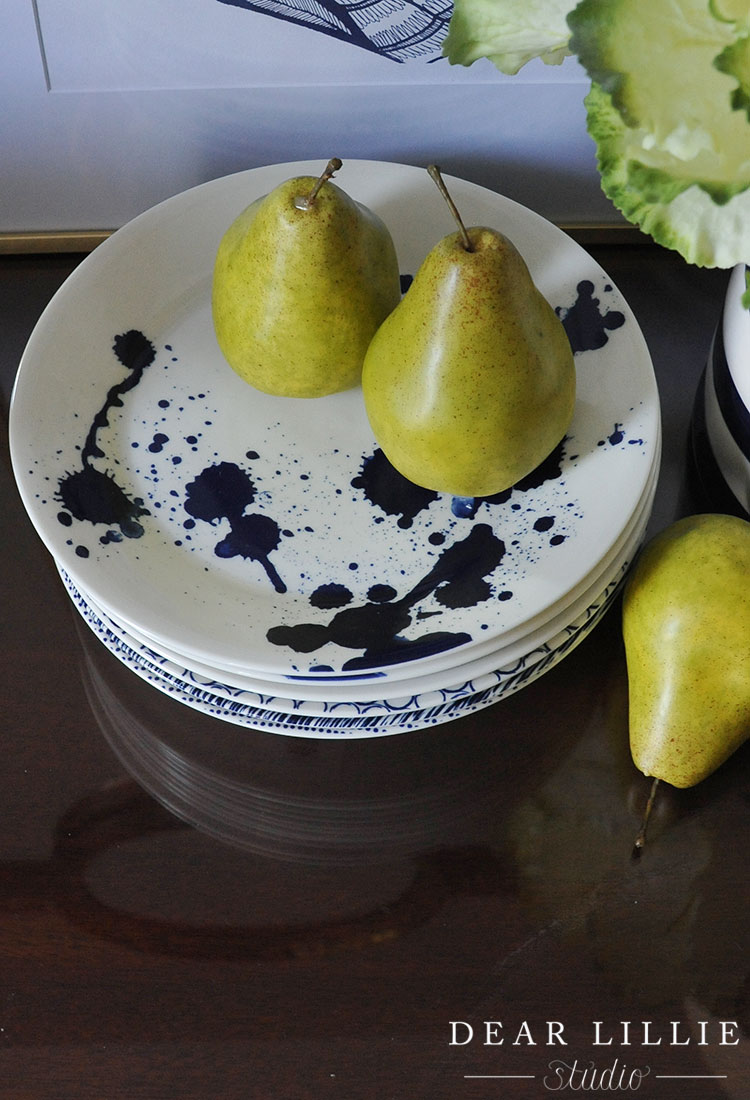
Plates – HomeGoods
Gold and Leather Tray on Table – HomeGoods
Cyrstal Vase – Home owners
Blue and White Planter with Flowers – Birch Lane
Drapery Rods and Rings – Existing
Drapery Panels – Ballard Design
Items on Bar Cart:
Larget Glass Bottle with Cork – HomeGoods
Blue Bottle – Blink
Everything else on their was already belonged to home owner



What a beautiful room. Love the color scheme. The simple stripe on the drapery panels is perfect. And as always, thank you for providing the links for the items used in the room.
Thank you, Lauren! 🙂
I just love this room but am confused about one of the pictures which appears to show that one long side of the rug (opposite the entry to your sitting area) seems to extend into the next room and go around the wall opening edges. Optical illusion?
Thanks, Linda! We weren’t positive which picture you were referring to, but our best guess is the one attached below. In this picture what you see in the bottom right corner is a chair rail a few feet off the ground (as opposed to a baseboard on the floor), meaning that the rug is only in the dining room area.
-Jason
https://uploads.disquscdn.com/images/5d358a81f47f937f23751b132855893c05e793414ebd3e81dbaf9da24d4387f7.jpg
I am laughing! Thanks for clearing that up. Its a beautiful room and I can see exactly what you are saying about the chair rail!.
Fantastic makeover. The colors are great and accessories beautiful.
Thanks so much!!!
what is the wall color?
Hi, Tiffany! The wall and trim colors were existing before we starting, so unfortunately we don’t have that information.
-Jason