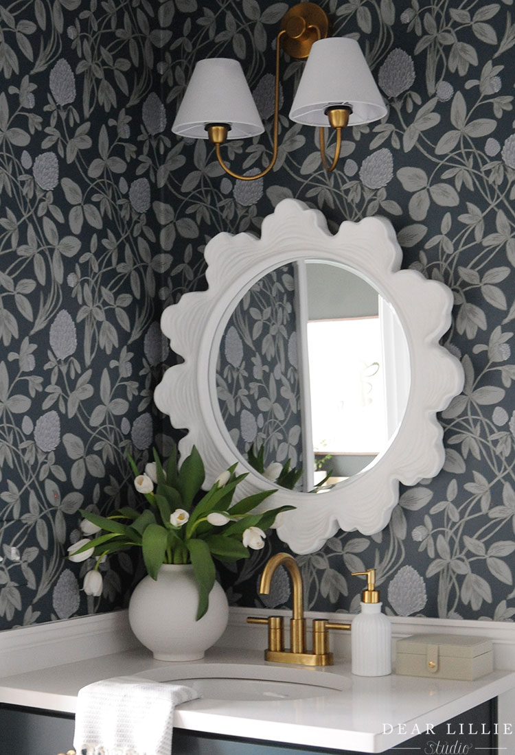
Good morning! Since moving into our home in September we’ve been slowing making over the downstairs to feel more our style. We took a little break from making over spaces during November and December to focus on the holidays and just did lots of Christmas decorating. Then in January we started tackling some of the smaller organizational downstairs spots like our hallway closet and pantry, in February I took a little pause on the downstairs to make over Lillie’s room and Lola’s room, and now that it’s March I switched gears and have spent this past week making over the last main space downstairs. The goal for this was to create a more welcoming guest bathroom.
We made over the guest room (which this adjoins) back in the fall and wanted to make sure it flowed with both that and the downstairs as a whole seeing how it has a door that goes to the guest room as well as a door that leads to the hallway off our main living space and is the only bathroom on the main floor. Therefore, I wanted to bring in both some of the lighter greens we’ve used in our main living space, as well as some dark green similar to the guest room. I also wanted to add a touch of a blue-gray color and then add in some gold accents.
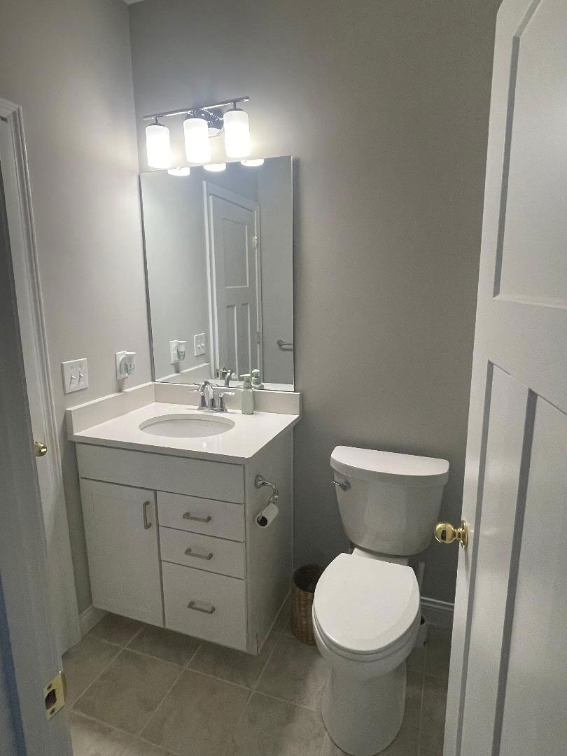
As much as I would love to have ripped out the tile and the vanity and put it something more custom and more my style, it seemed wasteful knowing everything was brand new so my goal was just to make cosmetic changes that would be inexpensive but would help make it a more welcoming guest bathroom and just kind of dress up the space in general. Here was what it looked like to start with:
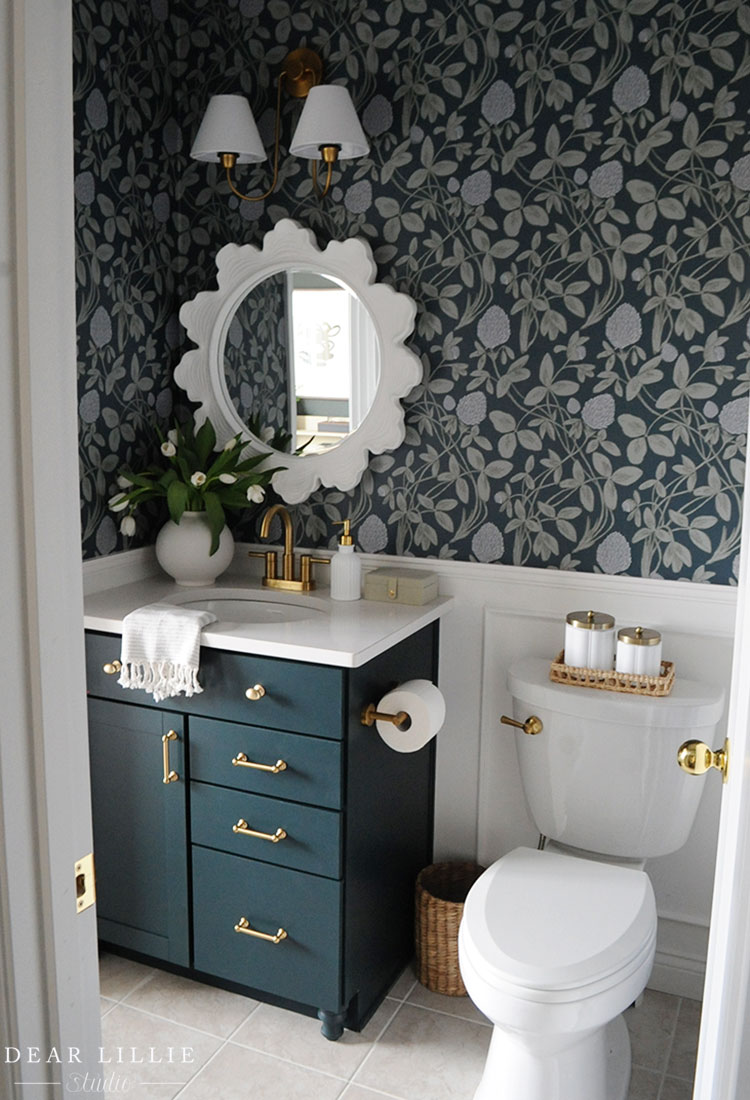
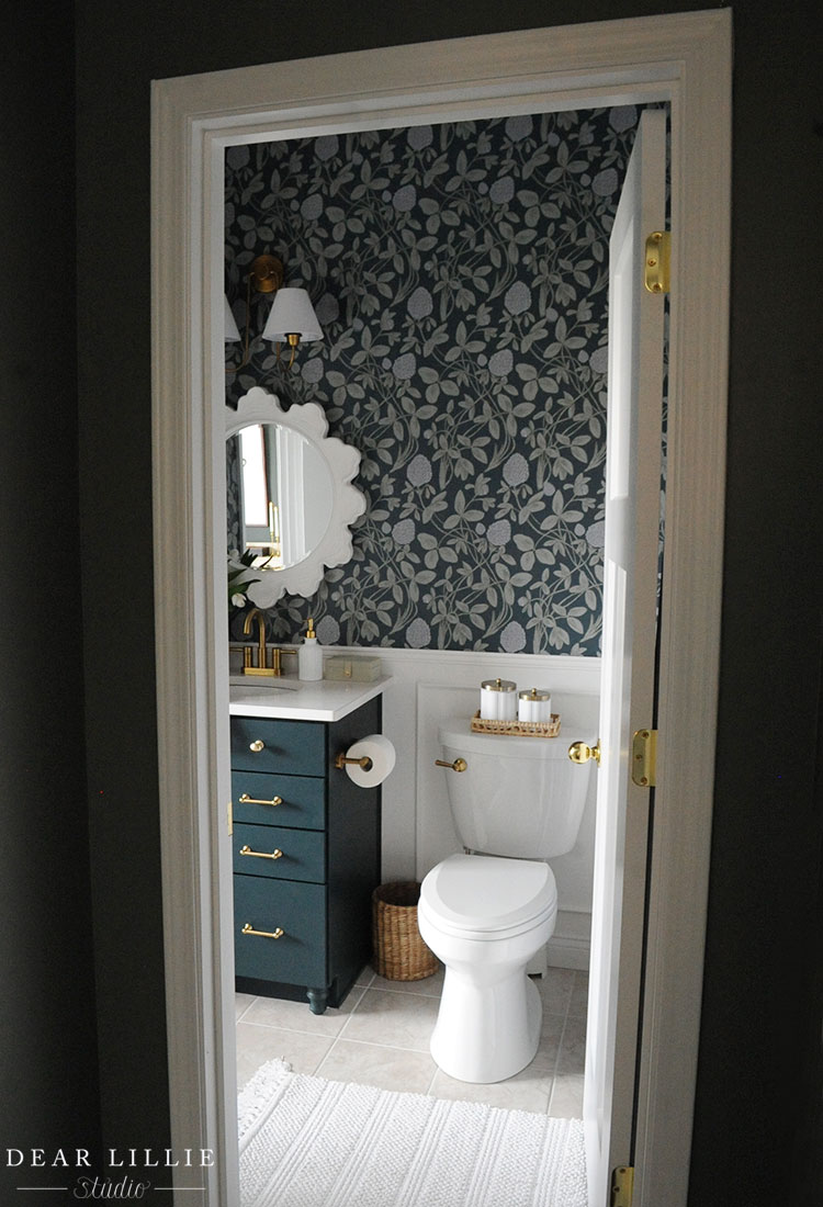
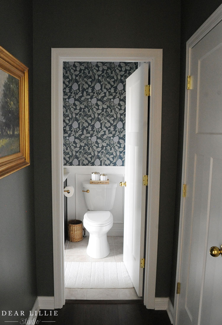
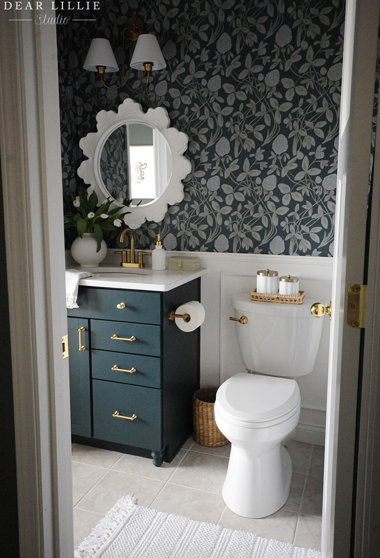
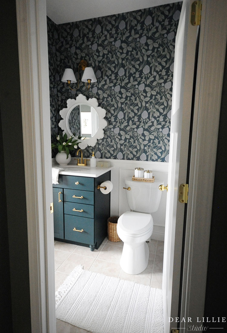
And here it is now:
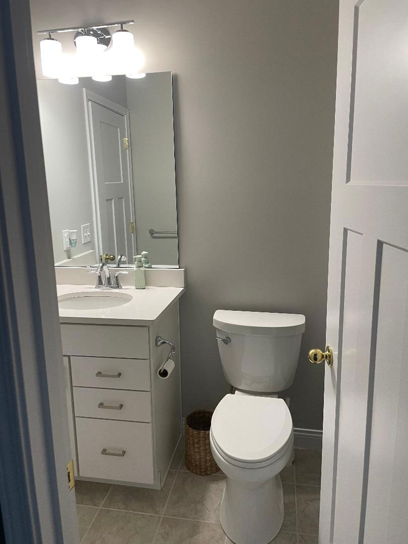
Another before:
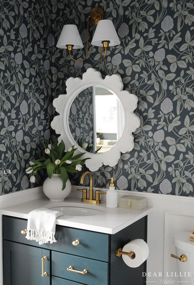
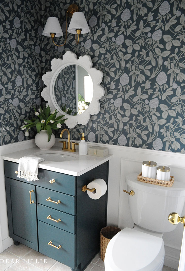
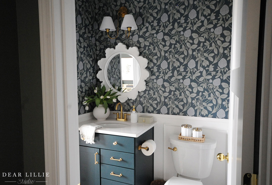
And now:
And here is a little video of the process:
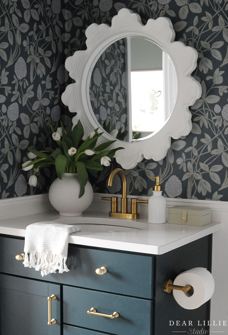
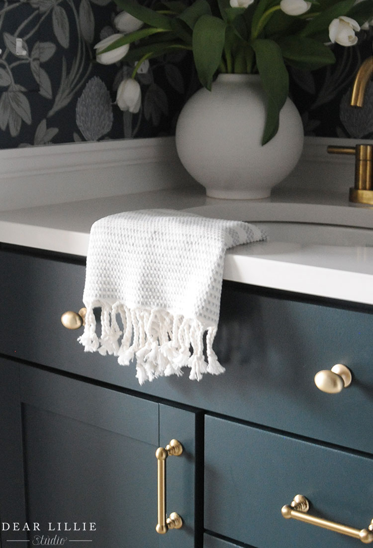
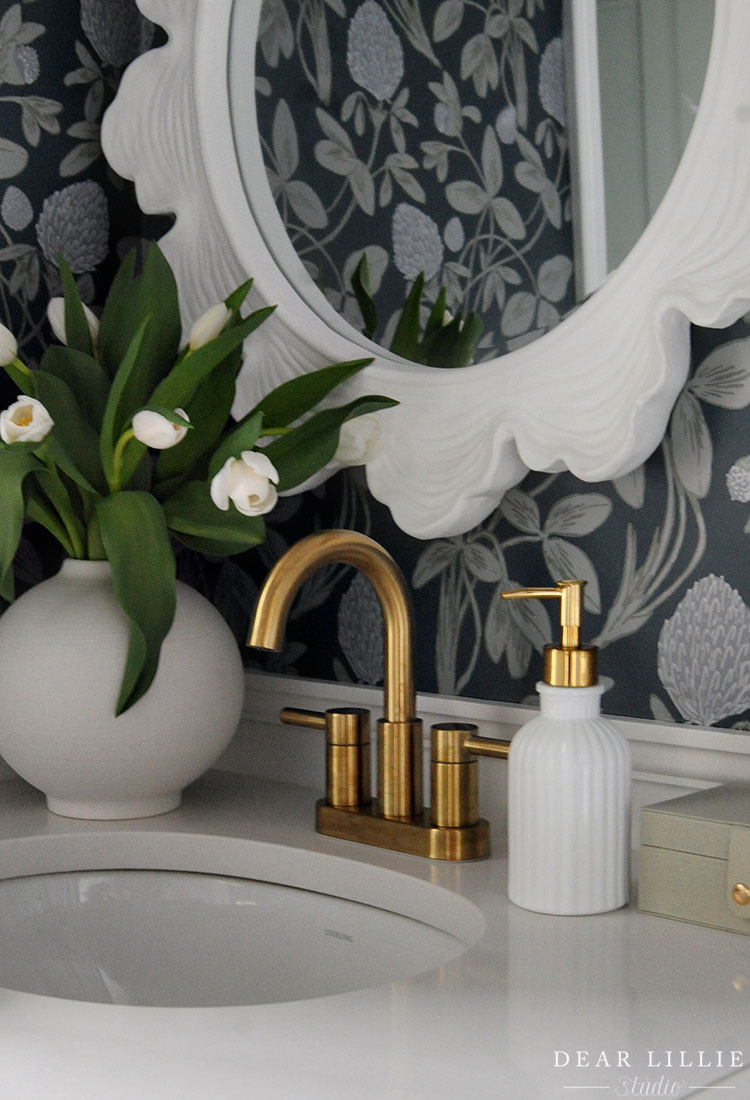
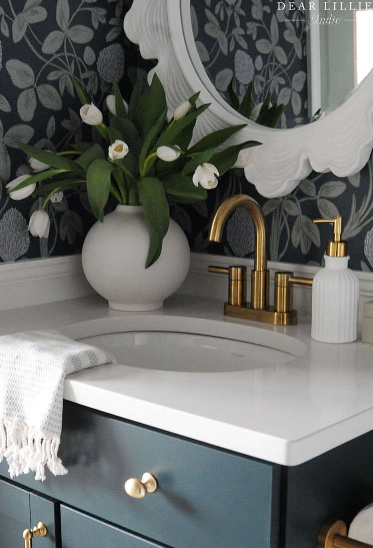
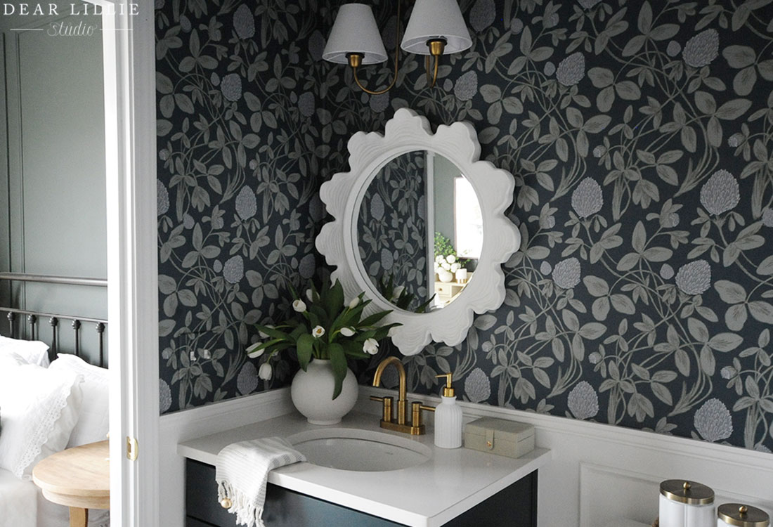
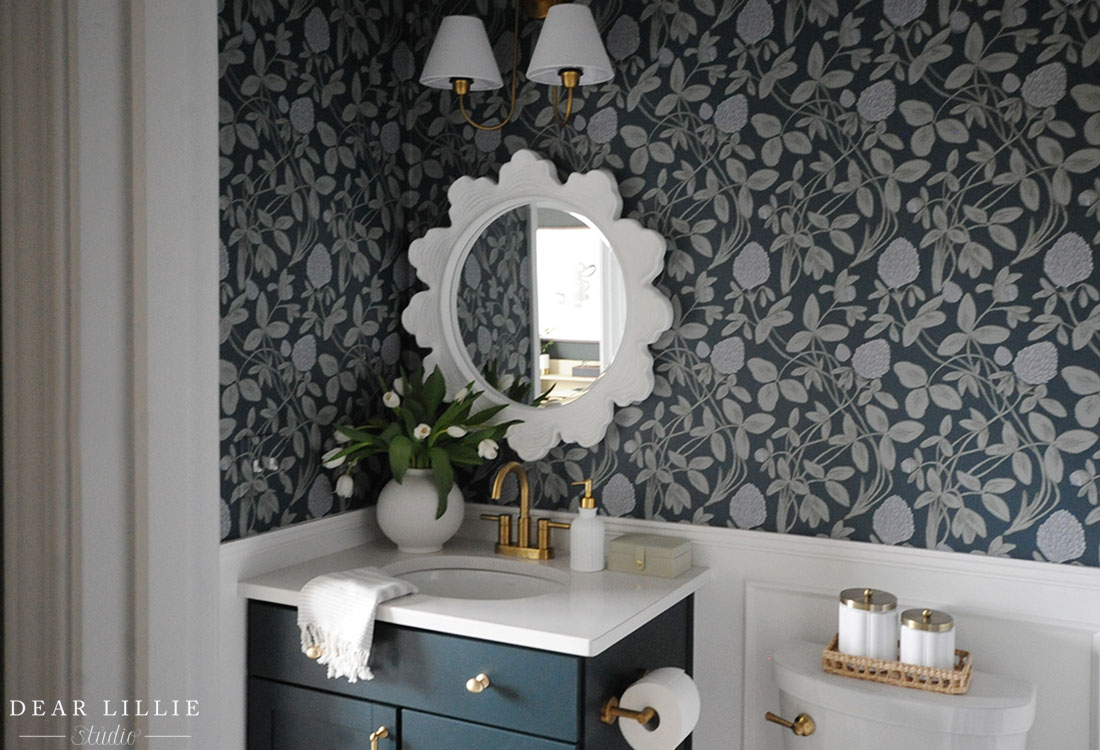
The very first thing I did was to swap out the sconce and remove the mirror and side and back splash. The sconce and mirror really make such a difference in making the space feel more custom and less “builder-grade”. I primed and painted the vanity Deep River Green by Valspar and then swapped out the pulls for these ones and then drilled holes into the top faux drawer and added knobs there as well. I swapped out the toilet paper holder and chose a new faucet that matched the rest of hardware and helped kind of dress up the space.
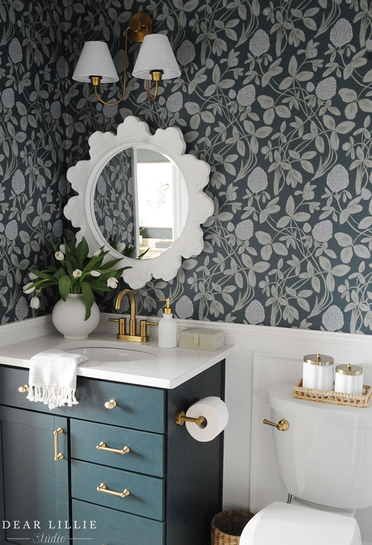
I also added chair rail and some picture frame molding to help add interest and give the space a more elegant feel. On the upper part of the wall I added wallpaper and colors that I was able to custom choose to really fit the overall space. I absolutely love how it turned out. (Wallpaper is from Love Vs. Design (Pattern – Clover Blossom, Colors: Army, Iron, Rosemary, Thunder, Velvet).
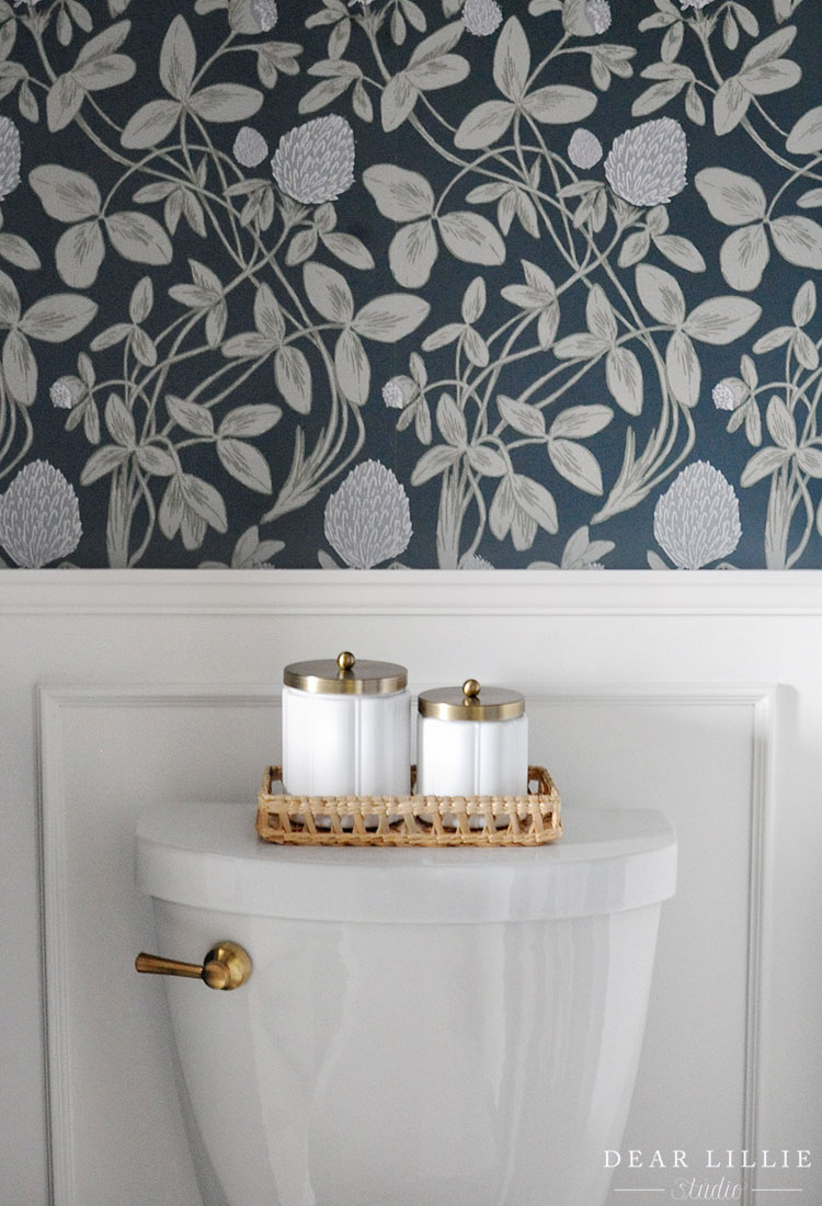
And then this is such a small little detail and was a bit of a splurge but I feel like it added the finishing touch – swapping out the toilet flusher for this gold one.
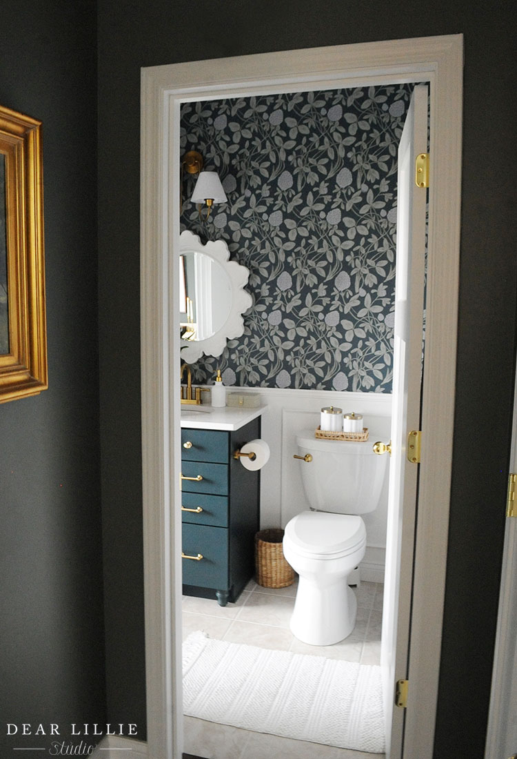
SOURCE LIST:
Sconce – Amazon (knockoff of this Studio Mcgee One)
Mirror – HomeGoods (similar ones here, here and here)
Wallpaper – Love Vs. Design (Clover Blossom, Smooth, Colors: Army, Iron, Rosemary, Thunder, Velvet)
Vanity Paint Color – Deep River Green by Valspar in a Satin Finish
Wall and Trim Paint Color – Pure White by Sherwin Williams
Pulls for Cabinet – Wayfair
Oval Knobs on Cabinet – Had leftover from a project years ago, think they were these ones
Legs on Cabinet – Lowe’s
Vase – Target
Soap Dispenser – Target
Hand Towel – Amazon
Faucet – Lowe’s
Little Green Box – Target
Tray on Toilet – Target
Milk Glass Canisters on Tray – Target
Toilet Paper Holder – Amazon
Toilet Handle – Amazon
Trash Can – Target (have had for years but similar here and here)
Bath Mat – Target
Door Knobs – Amazon
Artwork – Prints from Etsy here and here (have had frames for years)
Shower Curtain Rod – Amazon
Shower Curtain Rings – Amazon
Curtain Panels – IKEA Hannalill Blue Gray color 98″ four panels
Well, that’s it for today and creating a more welcoming guest bathroom. I’ll be back later this week with some more updated pictures of our adjoining guest room.
Warmly, Jenni



13 thoughts on “Creating a More Welcoming Guest Bathroom”
Comments are closed.