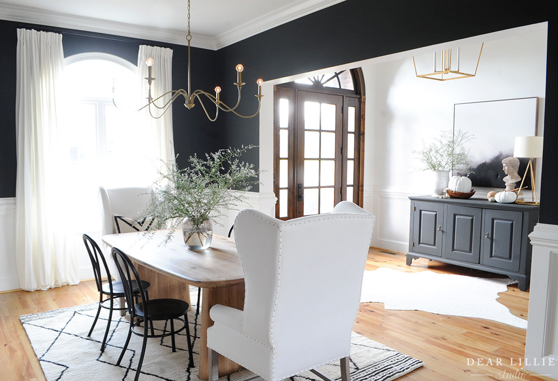
Well, I am in a little bit of a holding pattern right now on starting some new projects so while I wait on that I thought I would share the progress we have made on our current home since moving in last July.
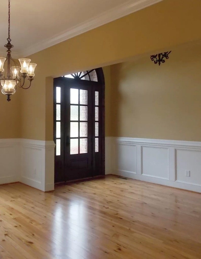
First up is our entryway – here is a before:
And here by just simply painting the walls and swapping the light fixture it feels so much more our style:
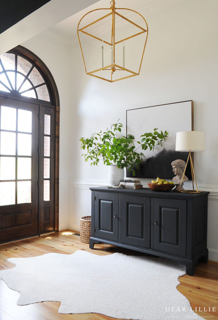
FOR ALL SOURCE INFORMATION INCLUDING PAINT COLORS FOR OUR ENTRYWAY CLICK HERE.
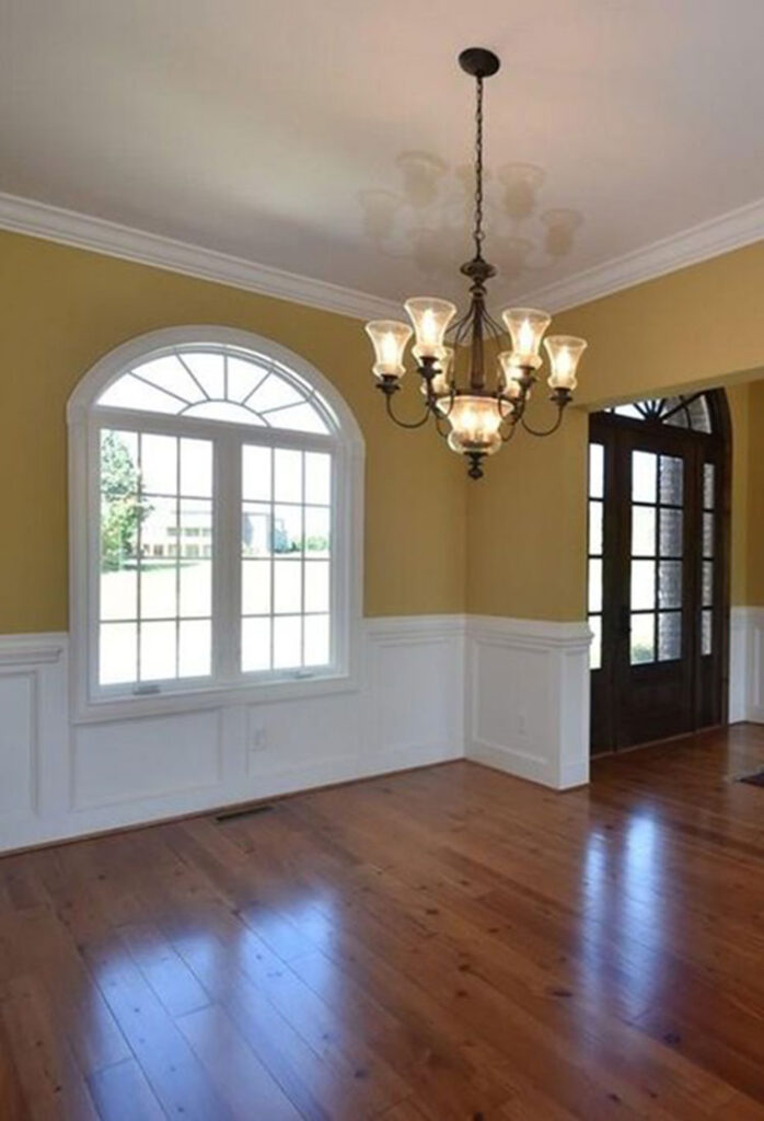
And right off the entryway is our dining room. Here is a before:
And again by just painting and swapping the light fixture we were able to make the space feel so much more like us:
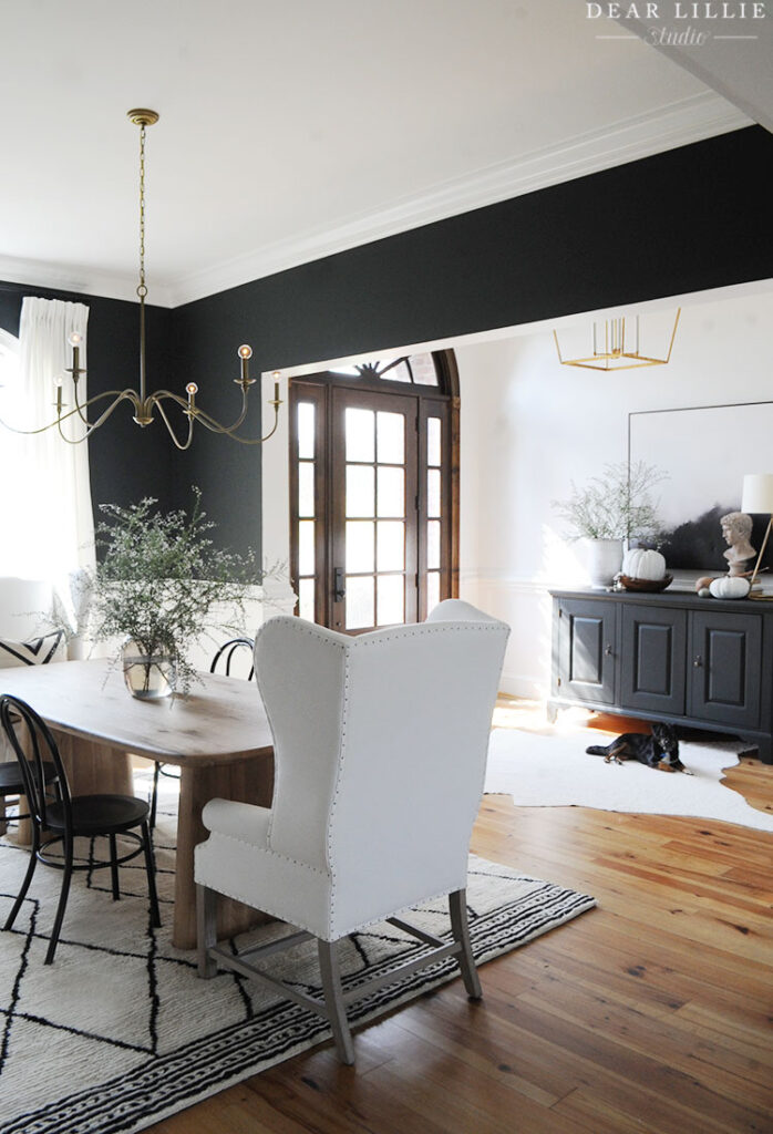
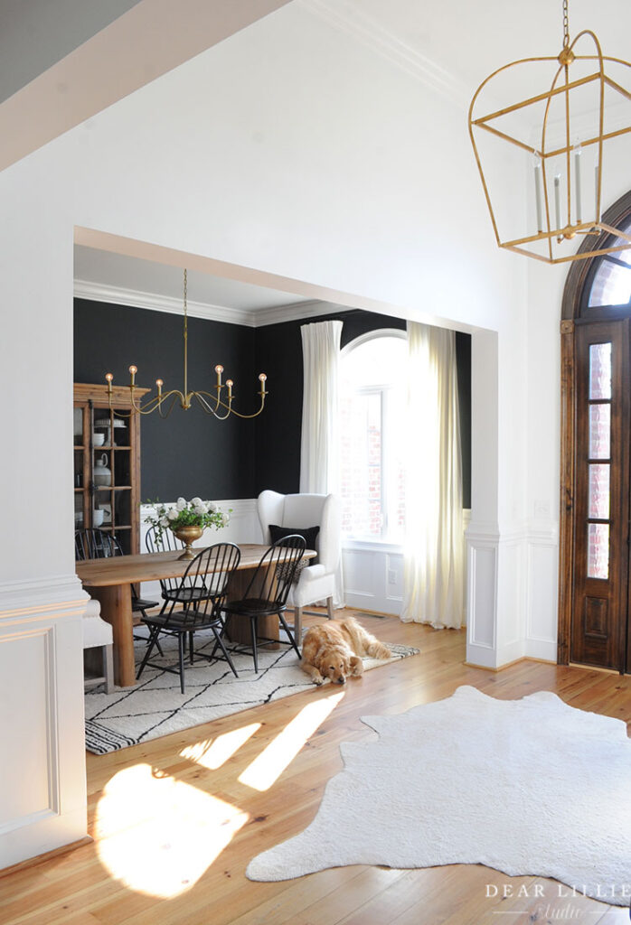
Here are some other angles of the dining room (these pictures below are more recent than the one above):
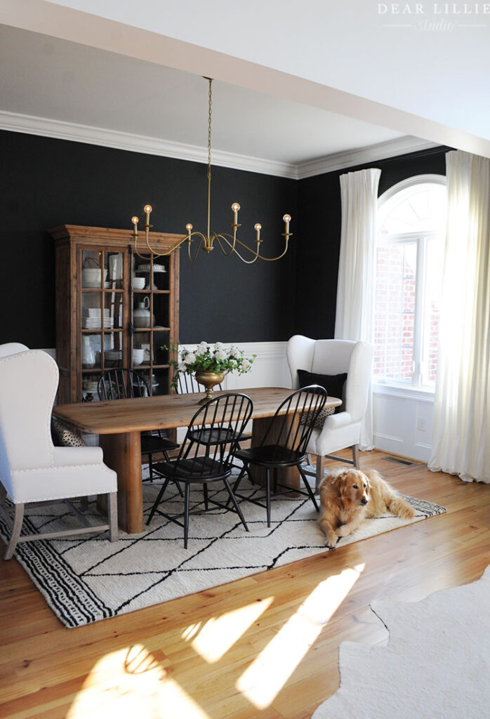
The chandelier in our dining room was such a great budget-friendly find! I initially ordered it with our bedroom in mind but changed my mind when it arrived and used it here.
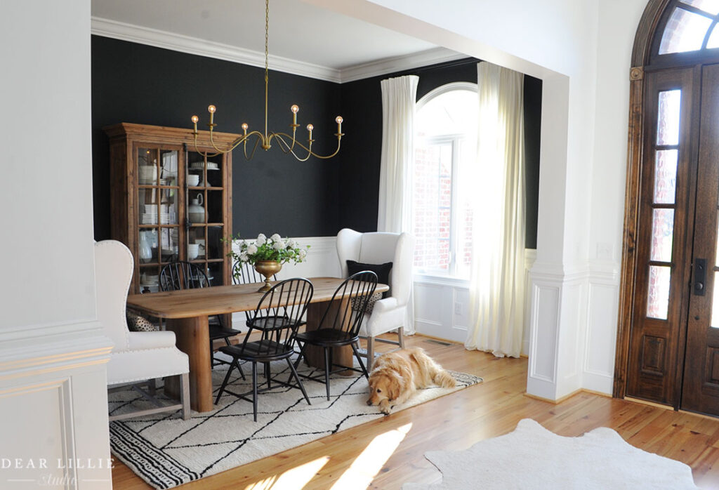
FOR ALL SOURCE INFORMATION INCLUDING PAINT COLORS FOR OUR DINING ROOM CLICK HERE
And a wider angled before shot of the dining room and entryway:
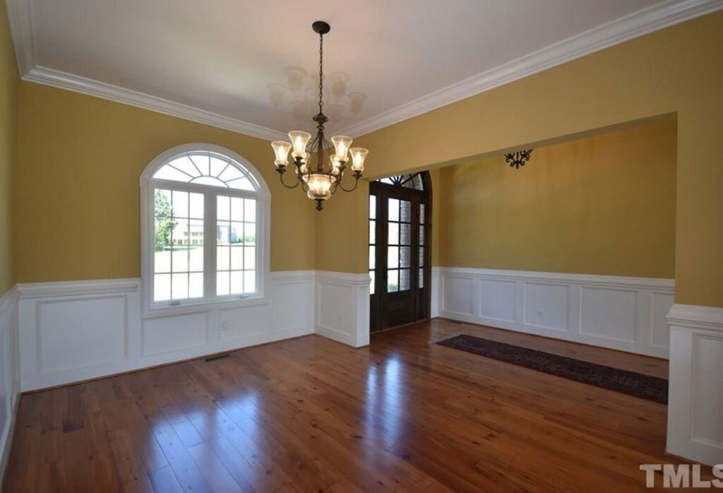
And now:
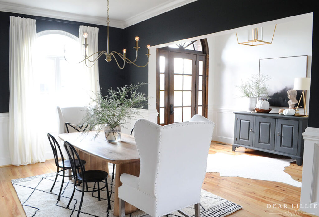
FOR ALL THE SOURCE INFORMATION FROM THE PHOTO ABOVE YOU CAN CLICK HERE.
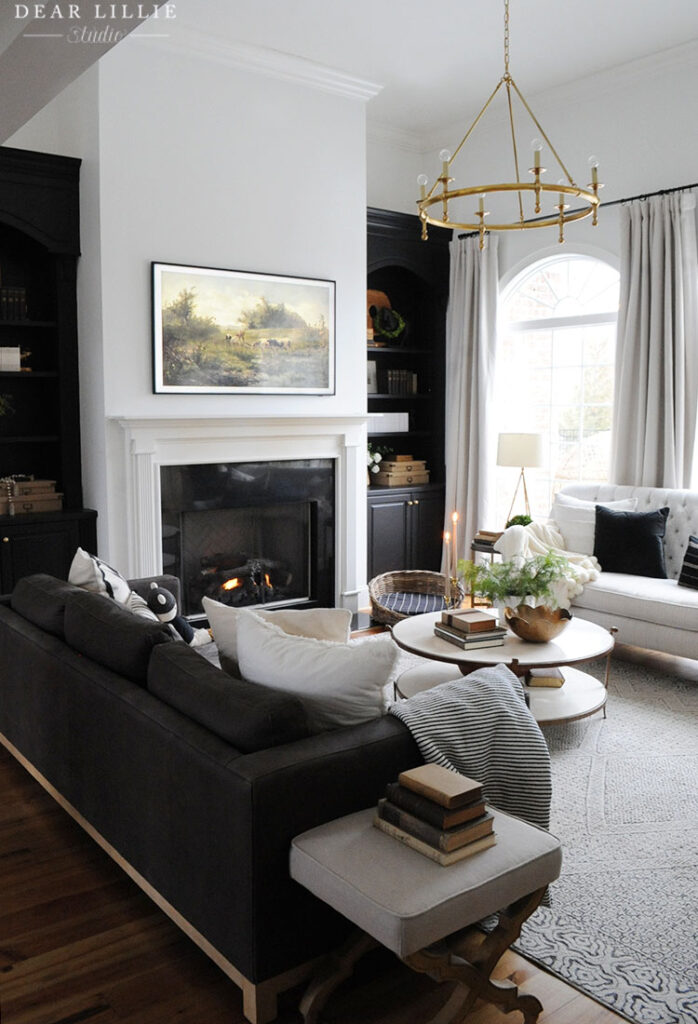
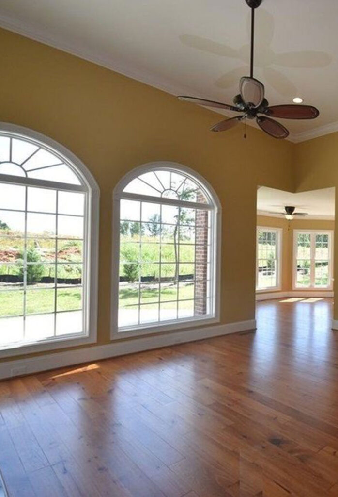
Across from the dining room and entryway is our living room. Here is the before:
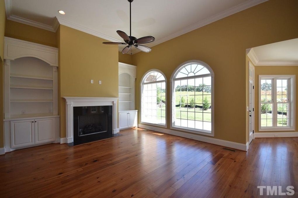
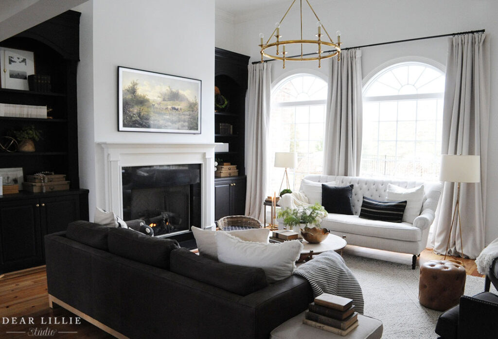
And here it is now. Again in this room we really just painted and swapped the light fixture to help feel more our style. Painting the bookshelves black really helped add interest to that side of the room:
And here is the other before angle of the living room leading into the kitchen area:
And here is that angle now:
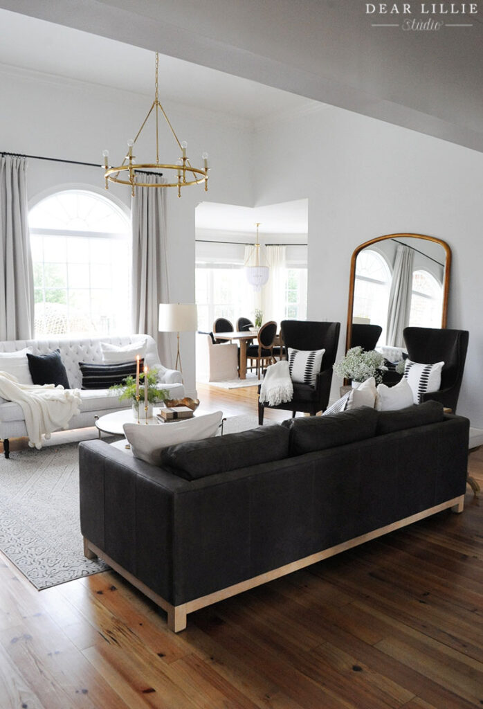
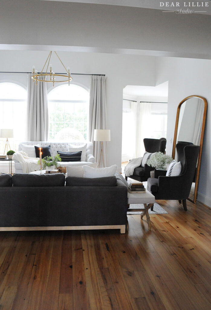
FOR ALL SOURCE INFORMATION INCLUDING PAINT COLORS FOR OUR LIVING ROOM YOU CAN CLICK HERE.
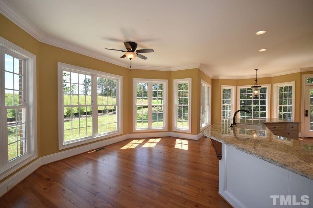
Next up is our eat-in kitchen. Here is the before:
And this is the same angle shortly after we moved in after I had painted and swapped light fixtures:
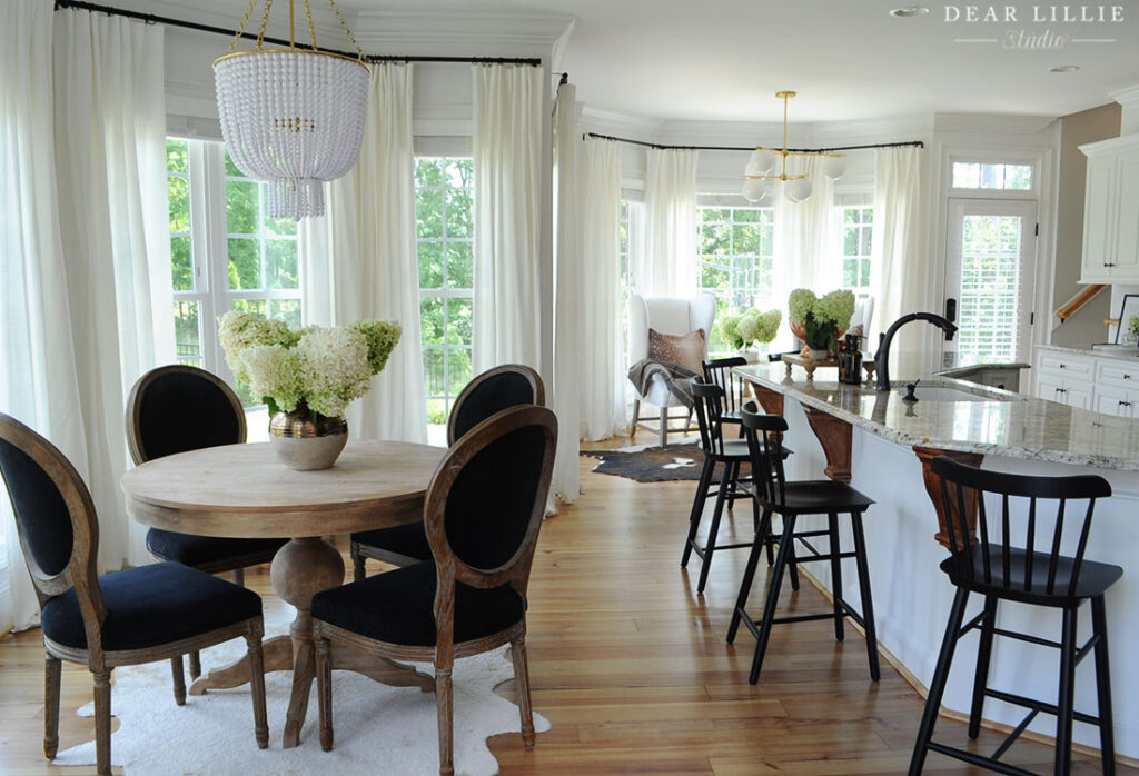
CLICK HERE FOR THE SOURCE INFORMATION FOR THE ABOVE PHOTO.
And this is how it looks now that we have been here a while longer:
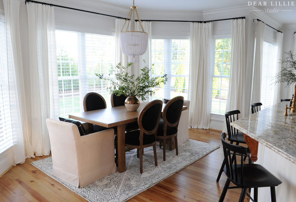
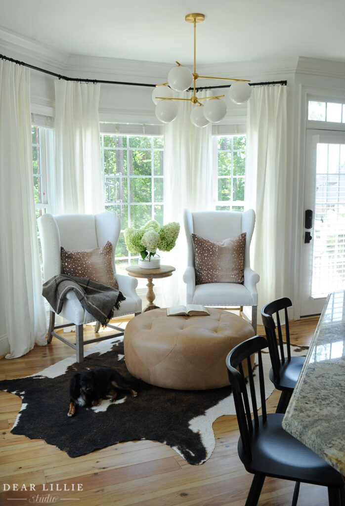
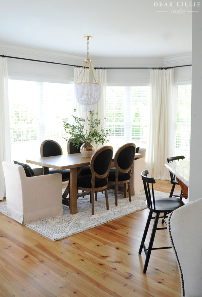
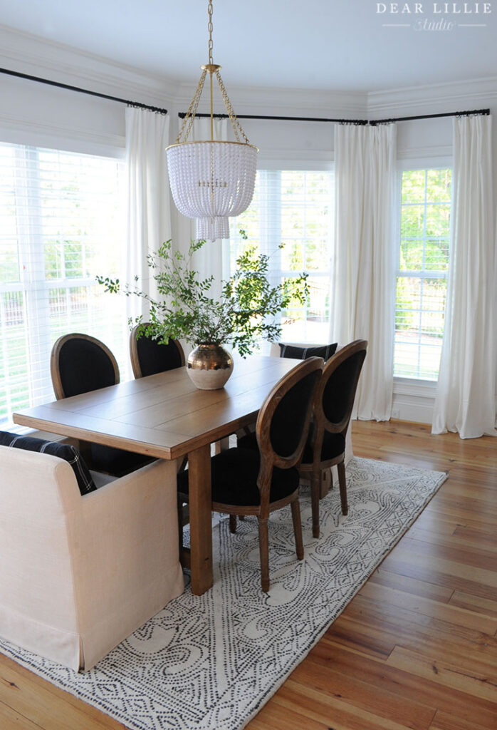
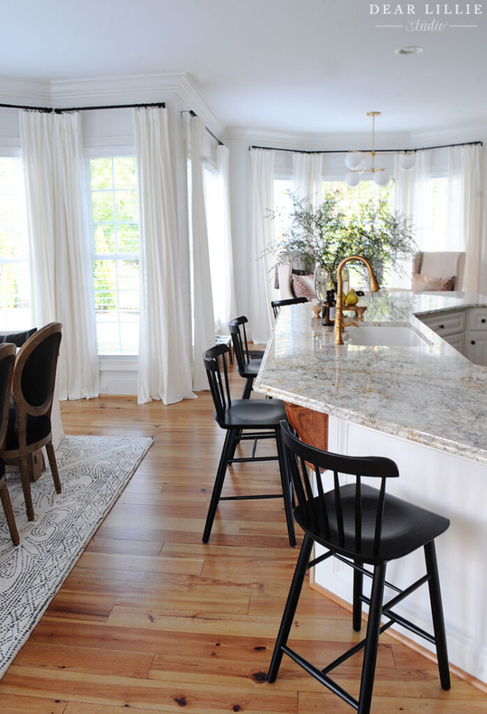
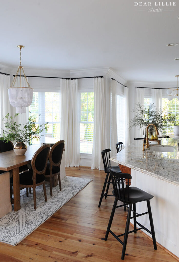
YOU CAN CLICK HERE FOR ALL THE SOURCE INFORMATION FOR OUR KITCHEN.
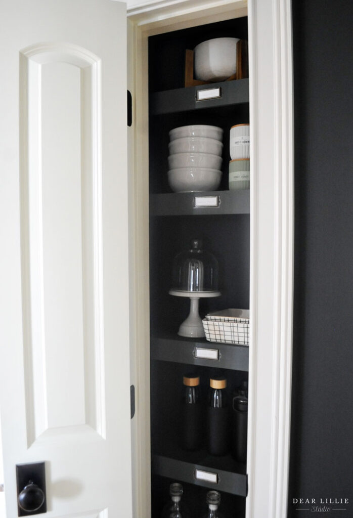
Another project I tackled was painting and organizing our pantry:
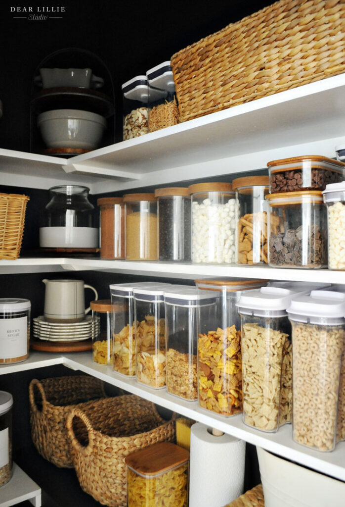
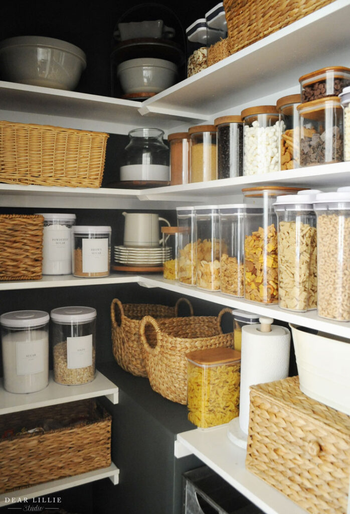
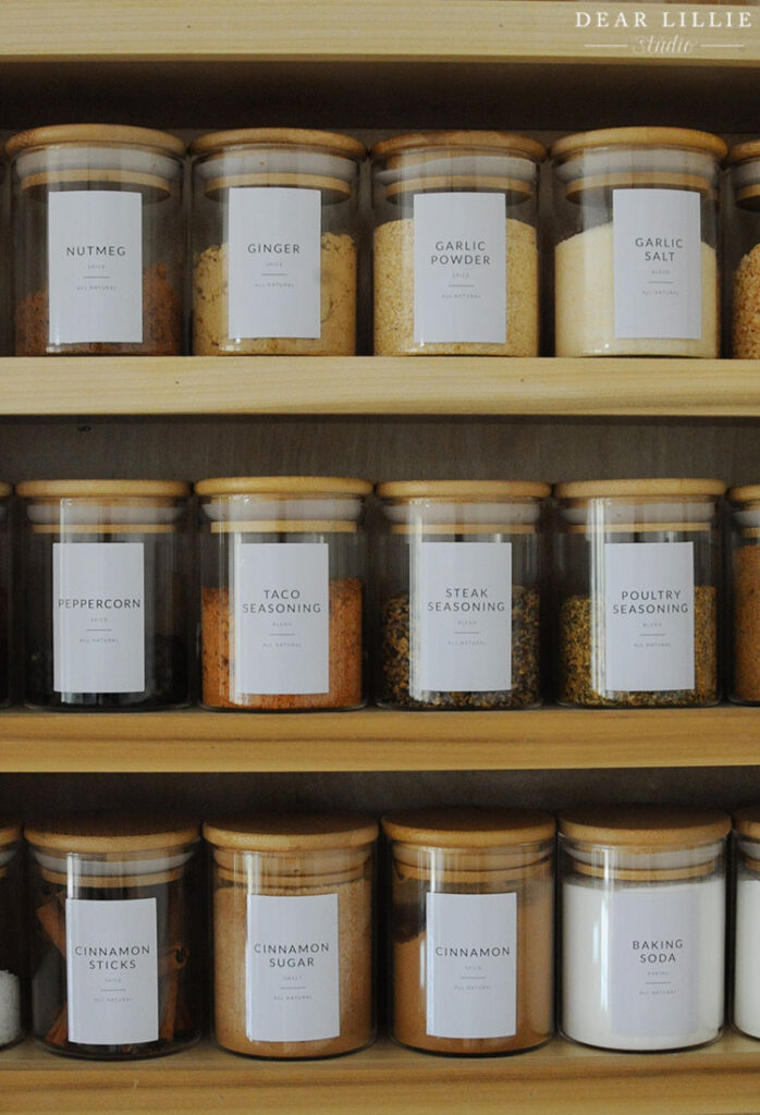
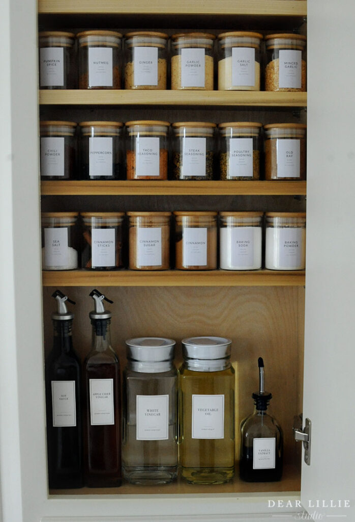
And I added some shelves to this narrow little closet to add some more kitchen storage:
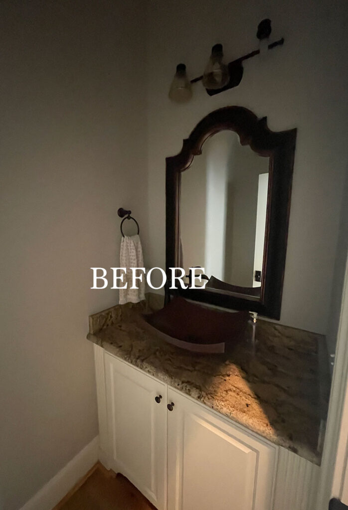
Next up is our powder room. For this I gave our powder room a quick makeover with the goal of spending under $200 while still freshening it up a bit. Down the road I have other plans for the space (you can read about them here) but for now I just gave it a quick little update. Here is the before:
And here it is now:
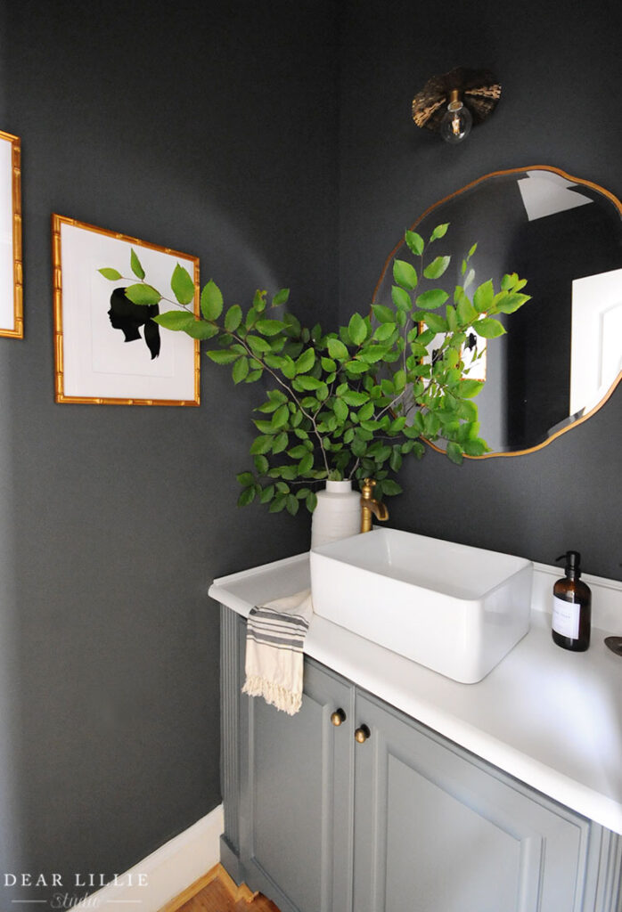
CLICK HERE FOR ALL SOURCE INFORMATION INCLUDING PAINT COLORS FOR OUR POWDER ROOM.
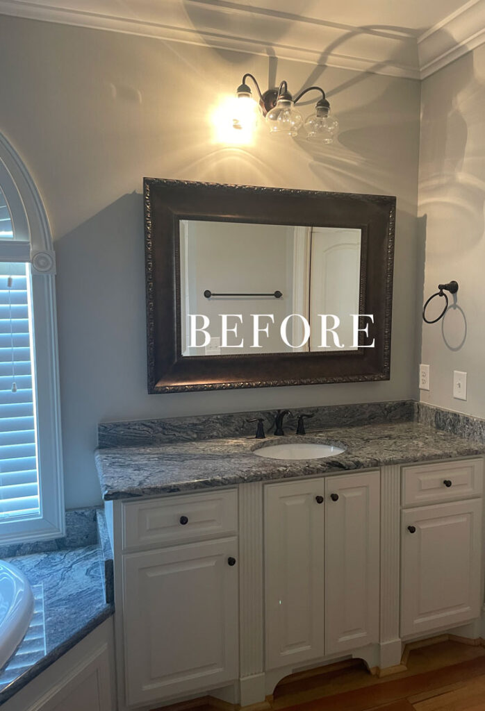
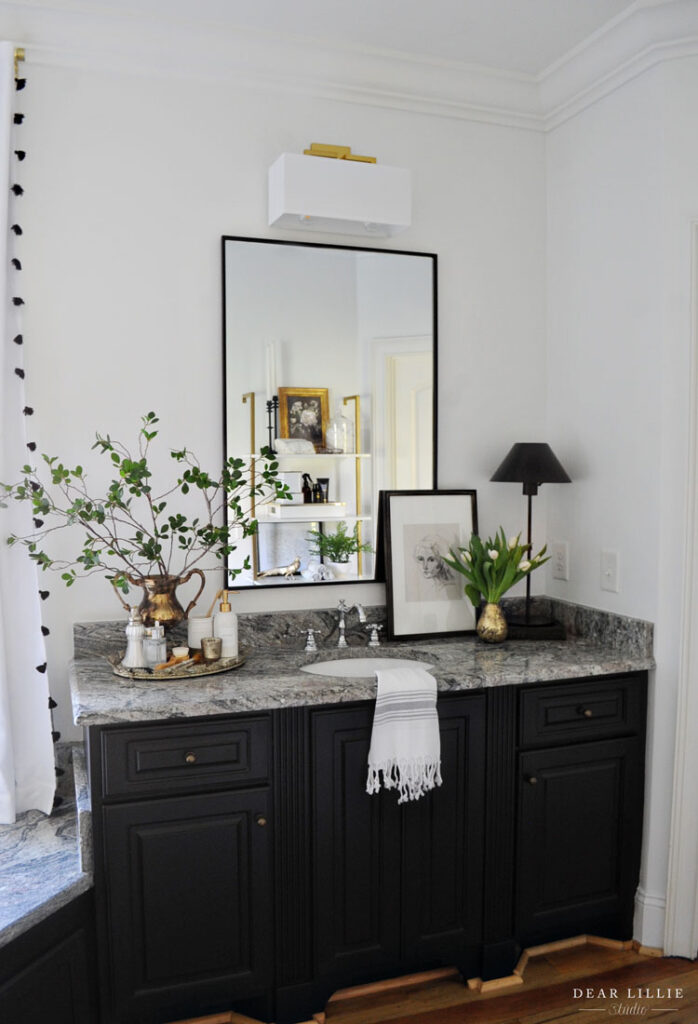
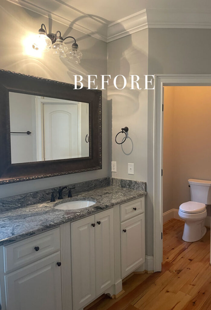
I also did a little cosmetic makeover in our primary bathroom. Here is the before:
And now:
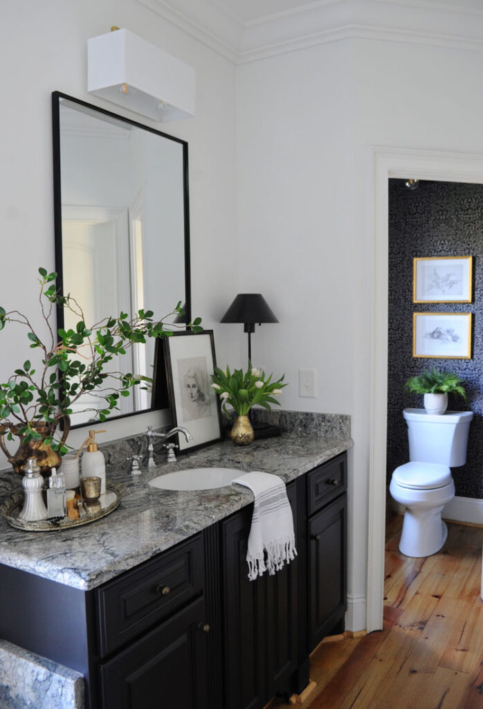
Another before angle:
And now:
Another before angle:
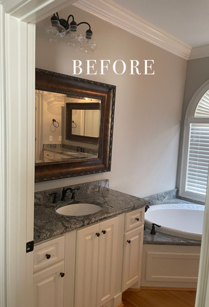
And now:
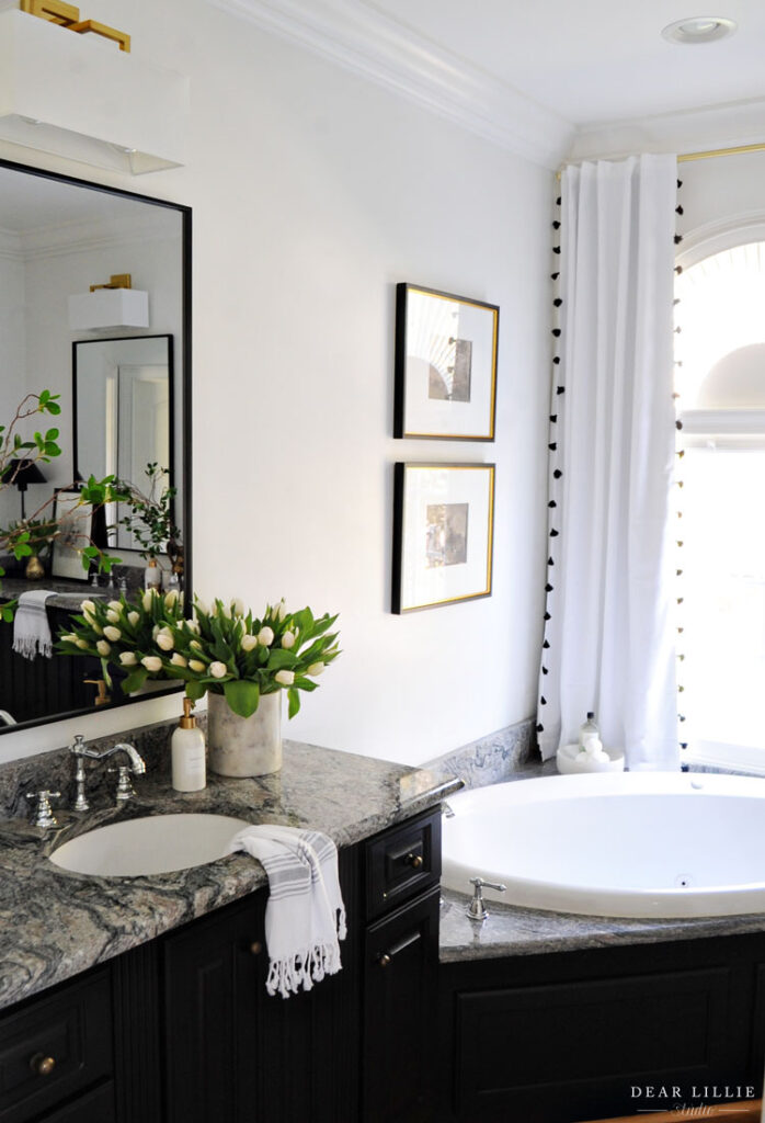
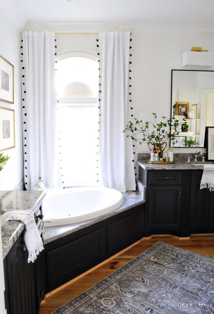
FOR ALL SOURCE INFORMATION INCLUDING PAINT COLORS FOR OUR PRIMARY BATHROOM YOU CAN CLICK HERE.
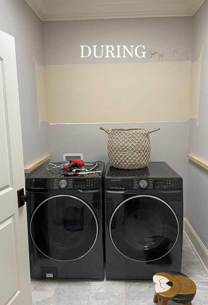
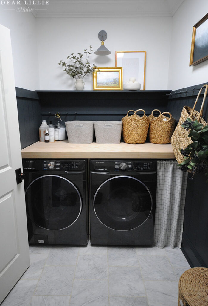
We also tackled a little makeover in our laundry room. The laundry room was a nice size but rather oddly laid out and not super functional. The cabinets were hard to reach and really shallow so not much could fit in them. I decided to remove them and add a countertop which would work better for us. I also added a shelf above to add visual interest and then lots of pegs that we could hang things from. Here is the before:
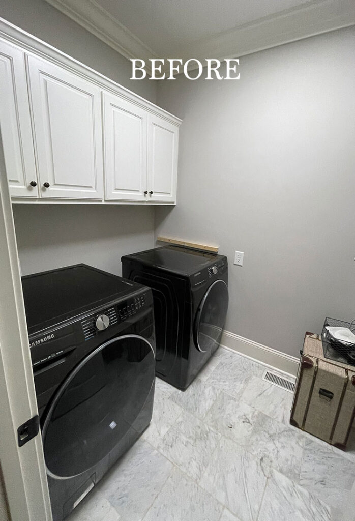
And here it is now:
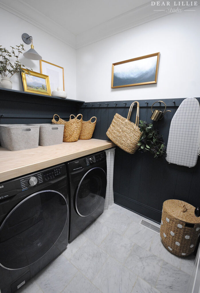
I forgot to take a before shot from this angle so this is after I had taken the cabinets down.
And now:
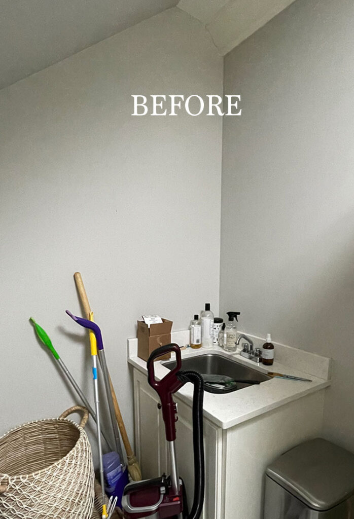
On the other side of the room was a nice little utility sink (it wasn’t this messy – I had just pulled stuff out of the tiny closet area across from the sink to start painting in there and remembered I still hadn’t taken a before shot of this angle so everything was just plopped there):
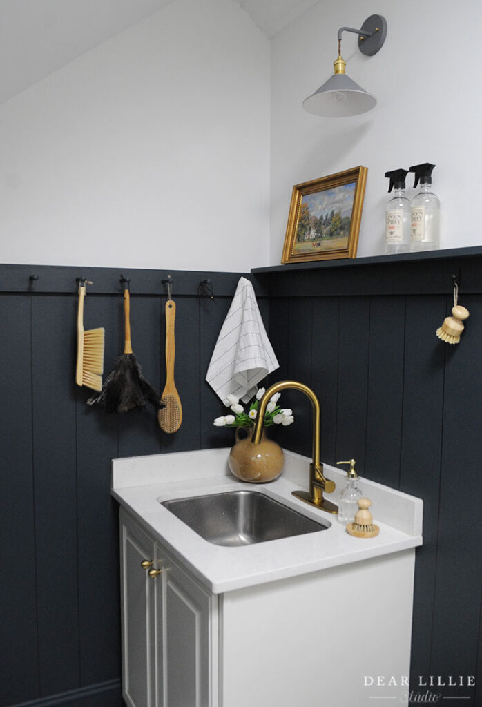
And now:
CLICK HERE FOR ALL THE SOURCE INFORMATION FOR OUR LAUNDRY ROOM.
In our guest bedroom I added floor to ceiling board and batten and painted the room white. I wish I had taken a before photo of this room. It feels so much larger with the vertical pieces of wood and the bright white paint color.
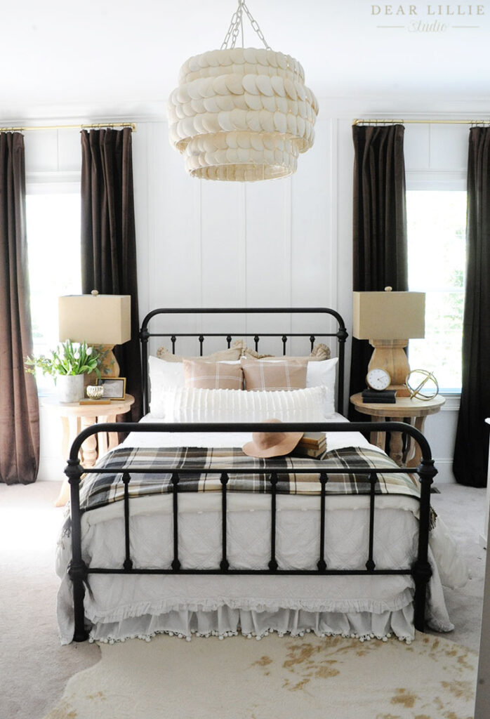
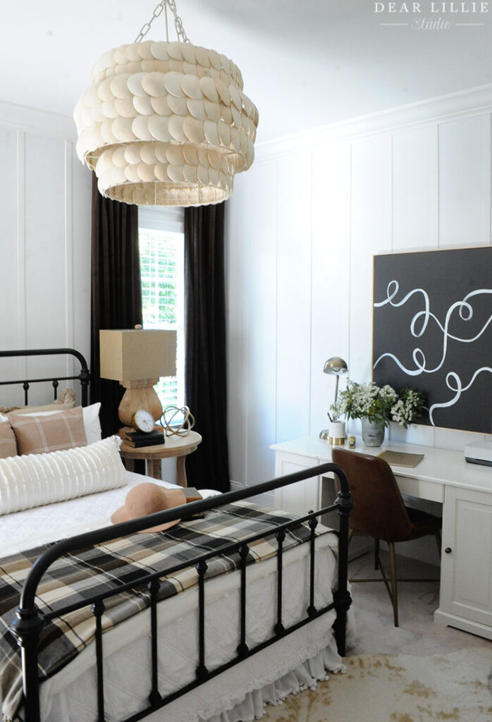
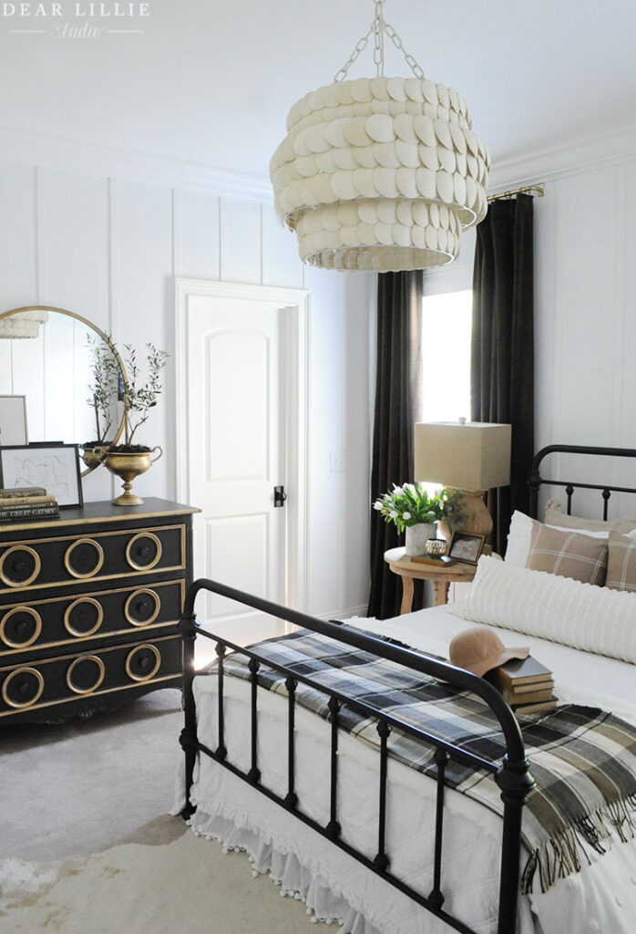
YOU CAN CLICK HERE FOR ALL THE DETAILS AND SOURCE INFORMATION FOR OUR GUEST ROOM.
One of my favorite parts of this house is that the guest room also has it’s own bathroom. I just made some cosmetic changes in here. I forgot to take a true before photo before I took down the mirror but it was that same dark heavy mirror that’s in the before photos of the other two bathrooms above.
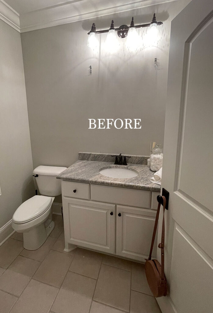
And here it is now:
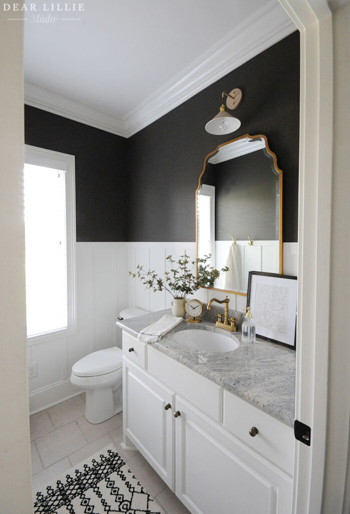
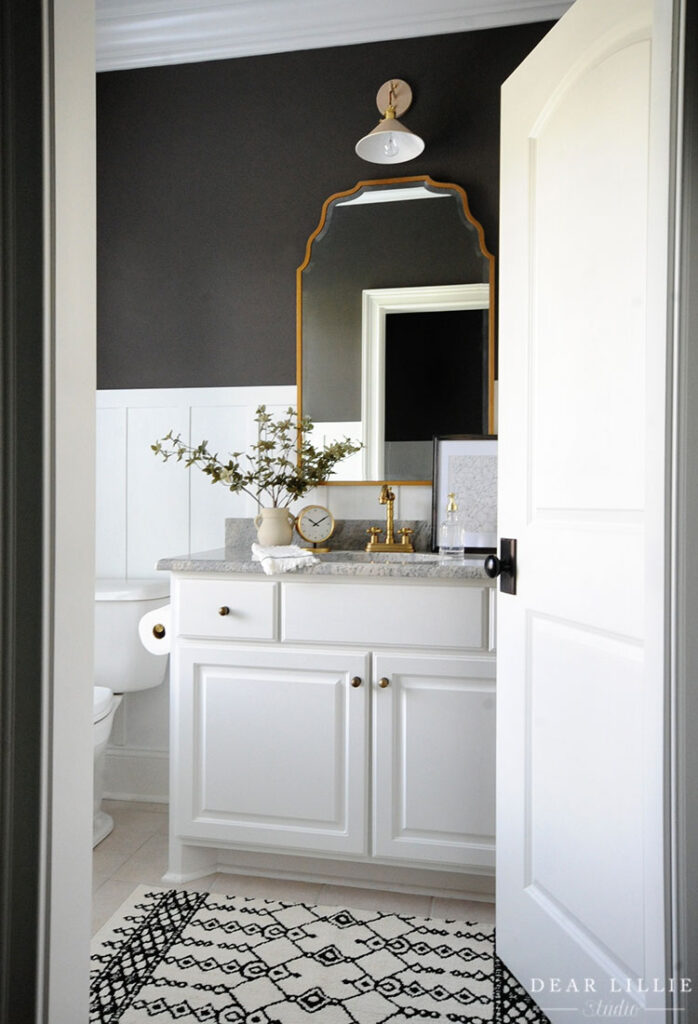
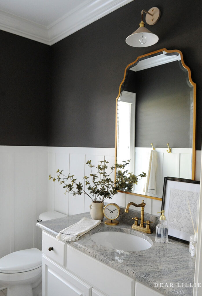
FOR ALL OF THE DETAILS AND SOURCE INFORMATION FOR OUR GUEST BATHROOM YOU CAN CLICK HERE.
Next up is our primary bedroom. Unfortunately I didn’t take a before shot of this space either, but here it is now:
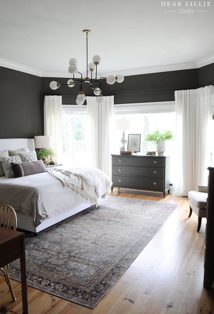
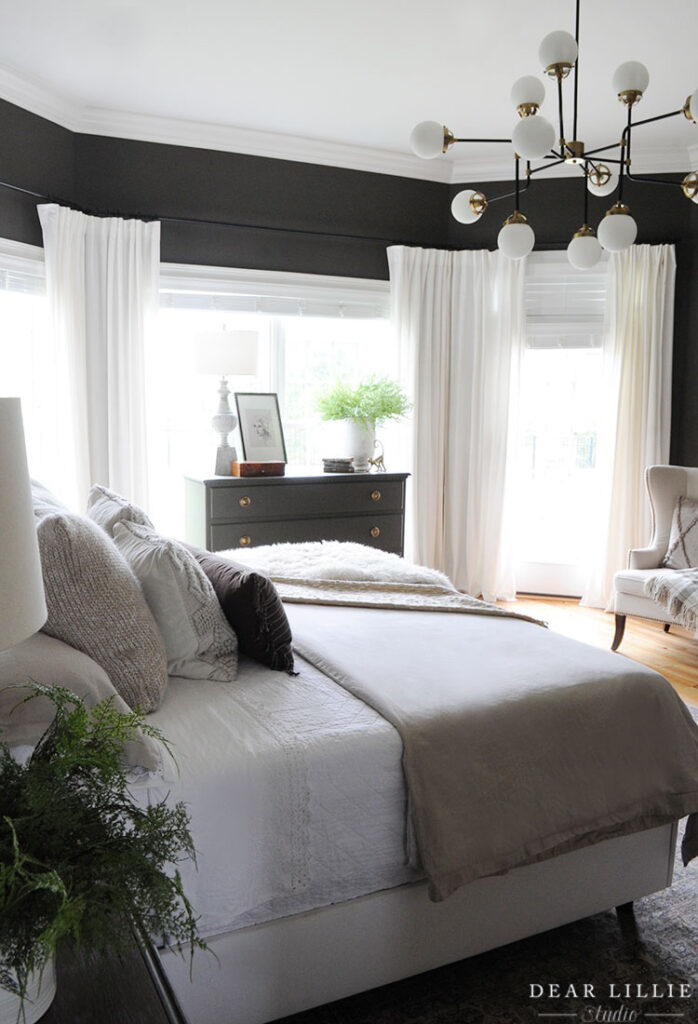
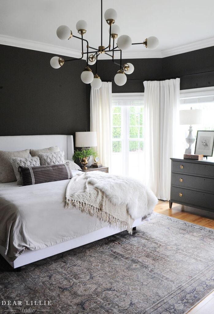
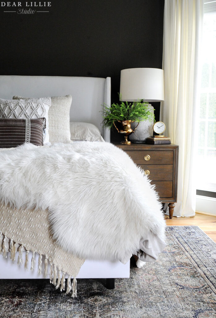
FOR ALL SOURCE INFORMATION INCLUDING PAINT COLORS FOR OUR PRIMARY BEDROOM YOU CAN CLICK HERE.
I do have one before shot from this angle before I painted the walls and the dresser:
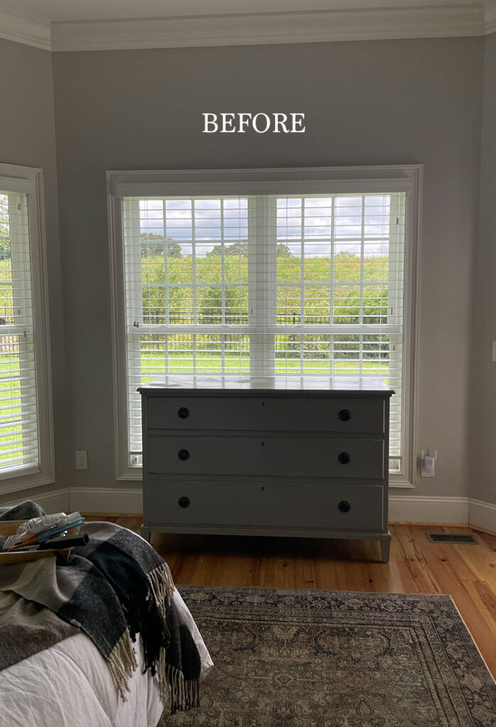
And here it is now:
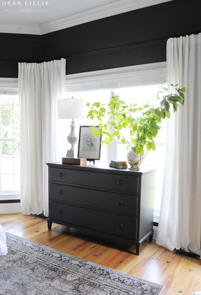
CLICK HERE FOR ALL THE DETAILS AND SOURCE INFORMATION FROM THIS PHOTO OF OUR PAINTED DRESSER.
Next up is Lola’s room which we didn’t do a whole lot to besides painting and she chose everything:
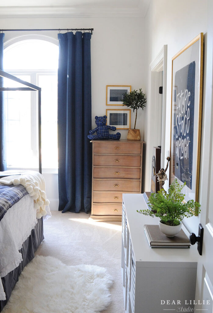
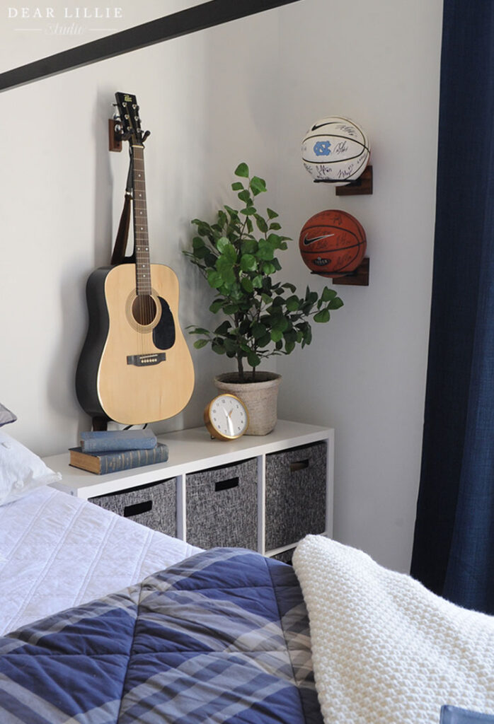
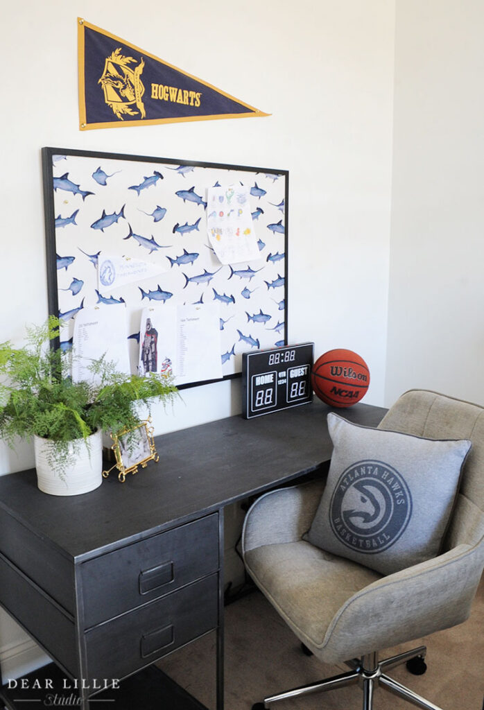
FOR ALL SOURCE INFORMATION FOR LOLA’S ROOM YOU CAN CLICK HERE.
Next up is Lillie’s room which was a lot of fun to work on and feels so much like her:
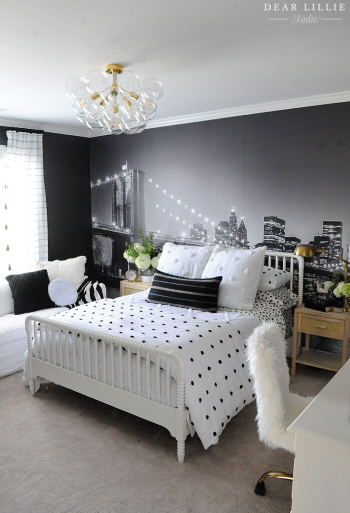
I love the timeless look of Lillie’s bed and the fun feel of her bubble light fixture.
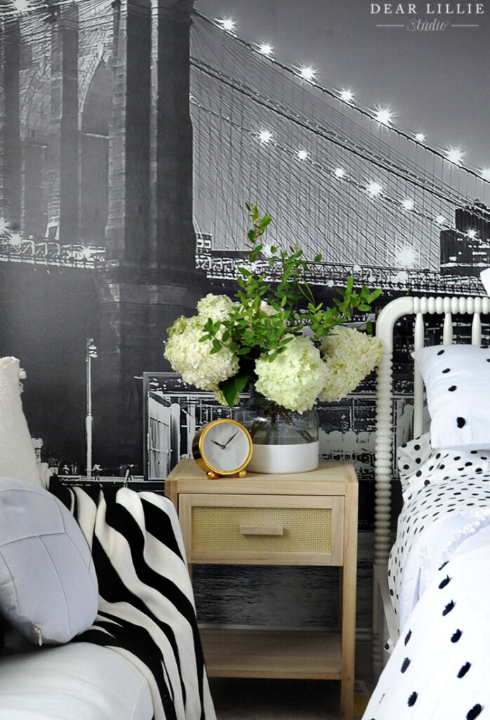
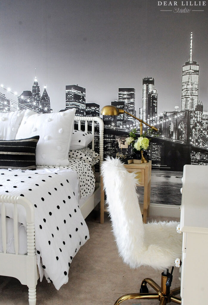
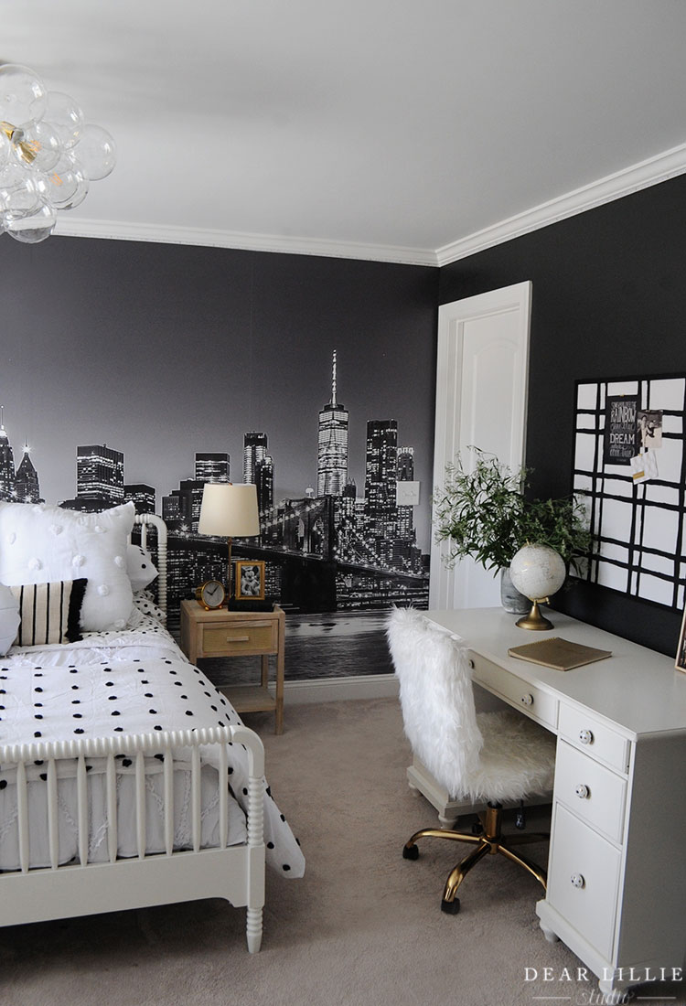
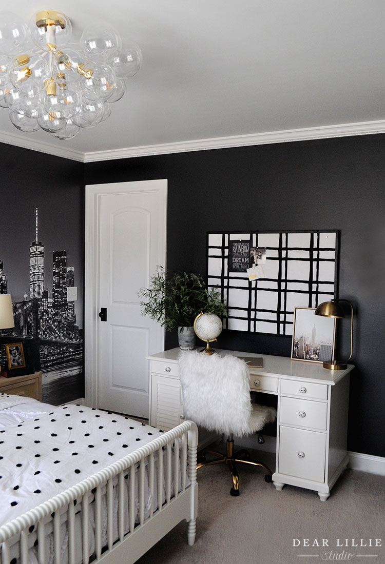
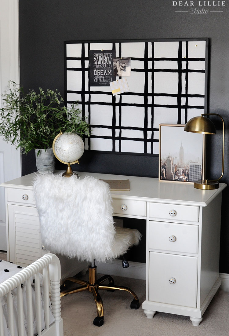
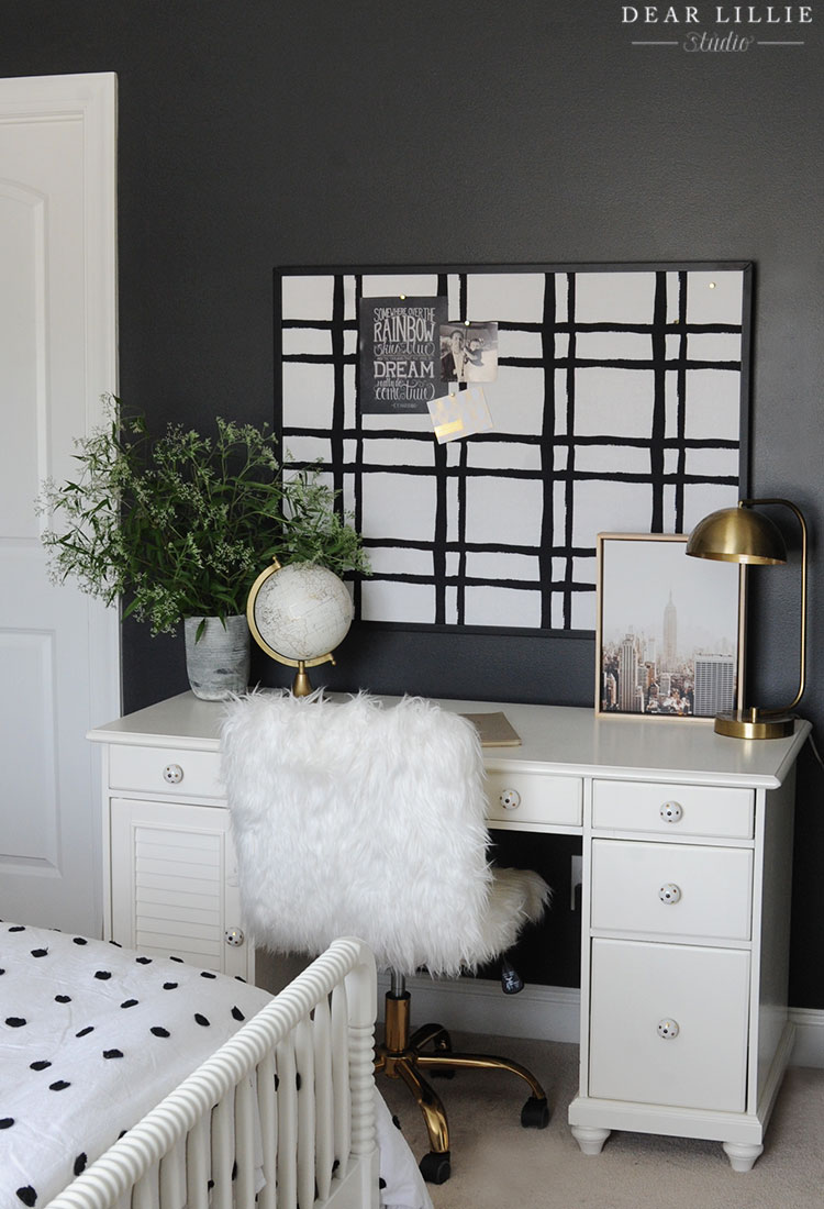
YOU CAN CLICK HERE FOR ALL OF THE SOURCE INFORMATION FOR LILLIE’S ROOM.
And last we have our little patio area:
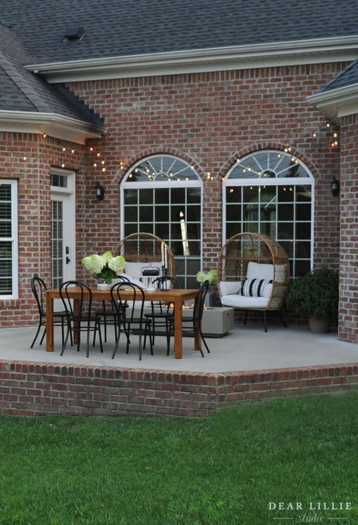
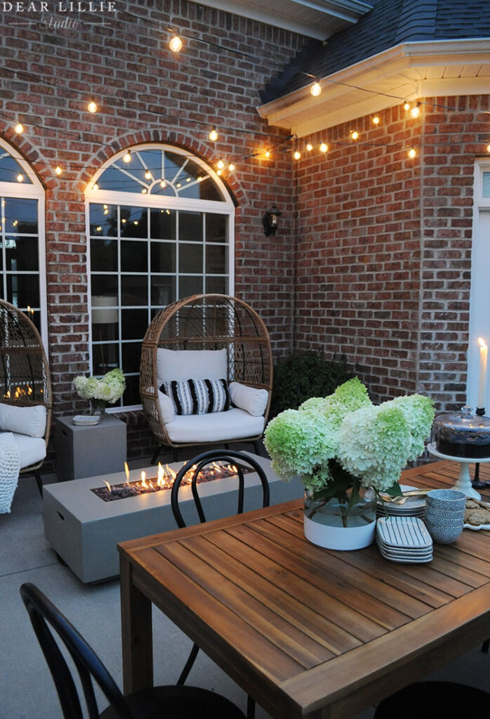
I cannot rave enough about these bistro lights. I hung them almost nine months ago and they have withstood storms and we have them turned on every single night and we haven’t had one single bulb break or go out! I have used a lot of different bistro lights over the years and these are by far my favorite and the most durable!
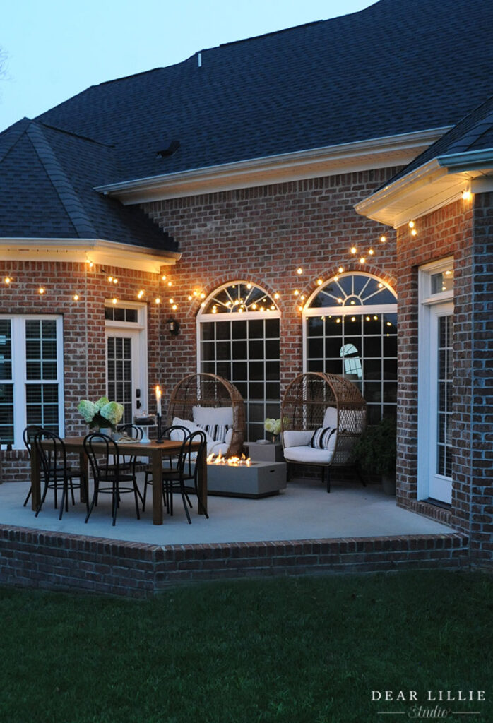
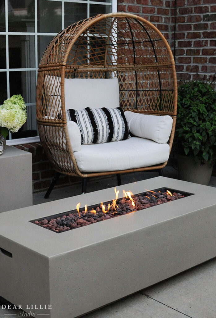
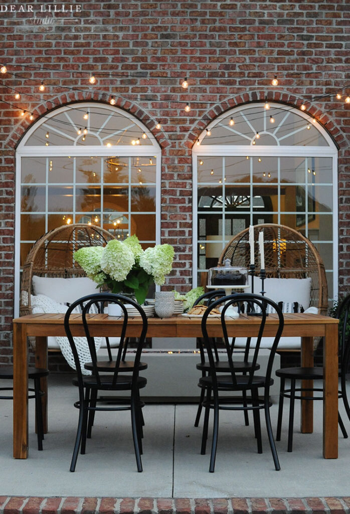
These black bistro chairs are my favorite! I highly recommend them!
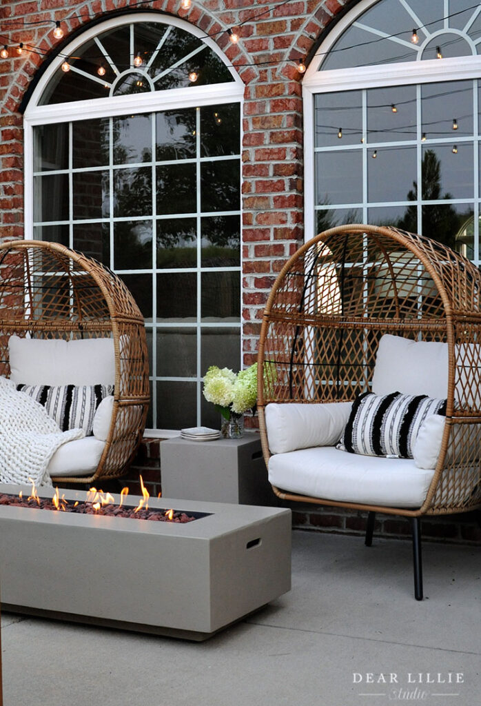
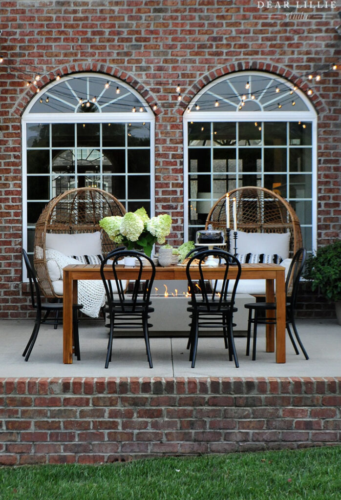
FOR ALL SOURCE INFORMATION FOR OUR PATIO YOU CAN CLICK HERE.
Well, that’s what we’ve done so far in this house. I hope you have a lovely week!
Warmly, Jenni

